

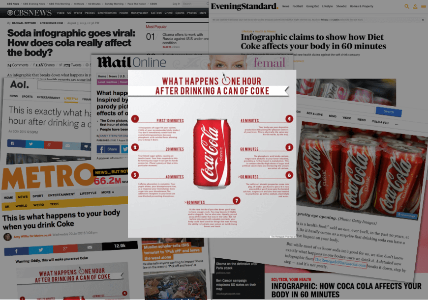
Despite having been on the scene for a while now, infographics are still a big part of the media landscape, as proven by the recent viral sensation ‘What Happens One Hour After Drinking a Can of Coke’ and its various spinoffs.
According to BuzzSumo, the original infographic has been shared over 108.9K times across social media since going live this July.
In this post, I am going to share with you how we as an agency make infographics that get picked up across the web. I hope our overview will provide the requisite knowledge and inspiration to produce your own results-focused infographics. When most people think of infographics they think of the design, but this is just one stage of the entire process. The first stage everyone needs to work on is what is the idea – what information/story are we looking to show?
[clickToTweet tweet=”When people think of infographics they think of design, but that’s just a stage of the full process” quote=”When people think of infographics they think of design, but that’s just a stage of the full process”]
In the example I’ve cited above, the basic premise for the idea was very strong and hooked into questions that many of us ask ourselves on a daily basis – just how unhealthy is Coca-Cola, and what effect is it actually having on my body? By addressing a curiosity gap and using strong triggers, it was always destined to be a viral hit. As Jonah Berger says, top of mind means top of tongue.
Step 1 – Finding the idea
In previous posts, I’ve gone into detailed explanations of what goes into a successful ideas process, so in this post I’ll just be providing a basic overview.
How to identify your audience

Before you produce any content, visual or otherwise, you need to identify the people that you want to communicate with. This is a very important stage, as this information will affect everything from the idea through to the final design.
At the outset, you will likely have an idea of the type of people you want to speak to. For instance, let’s say you’re a business who sells organic food supplements. You know from speaking to your clients that lifestyle choices such as dietary regimes and fitness routines are their main reasons to buy food supplements, so you could define a clear group of people you’d want to target with your content based on that information.
But where do these people hang out when they’re online?
1. Search Google
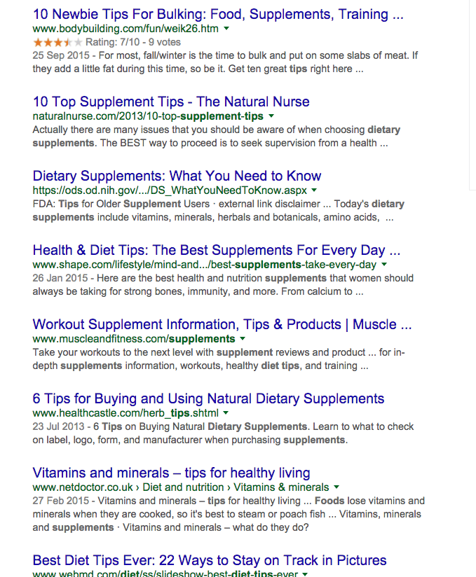
If you input a generic search term like “food supplements tips”, you’ll undoubtedly find lots of bloggers listed in the results. And while this is the demographic you’ll want to communicate with, you’d be better served by finding a place where lots of these people come together.
We come across sites like:
- http://forum.bodybuilding.com/ – the leading bodybuilding and fitness forum
- http://www.nerdfitness.com/academy-overview-page/ – an online course + fitness community for ‘real people’
- http://www.shape.com/ – a magazine that covers fitness and healthy eating for the general public
We can then input these websites into Buzzsumo.com, one of my favourite content marketing tools. Buzzsumo will then provide a comprehensive list detailing the most shared content for each website during the past year, providing data-driven insights into what works with this audience and how they’re engaging with it.
For this piece, we found the following articles had all worked well:
- 12 Mind-Blowing, Muscle-Building Protein Shakes
- How To Survive Sitting in an Office All Day
- Meal Planning Ideas & Dinner Recipes To Eat Healthy All Week
Now if you were creating an infographic for yourself, then you would want to dive deeper and explore other sources of inspiration, such as:
2. Go to Reddit
Doing a search for “food supplements”, we find that one subreddit is directly relevant: https://www.reddit.com/r/Fitness
Like Buzzsumo, you can rank content by the amount of upvotes (i.e. people who have voted to say that they like it).
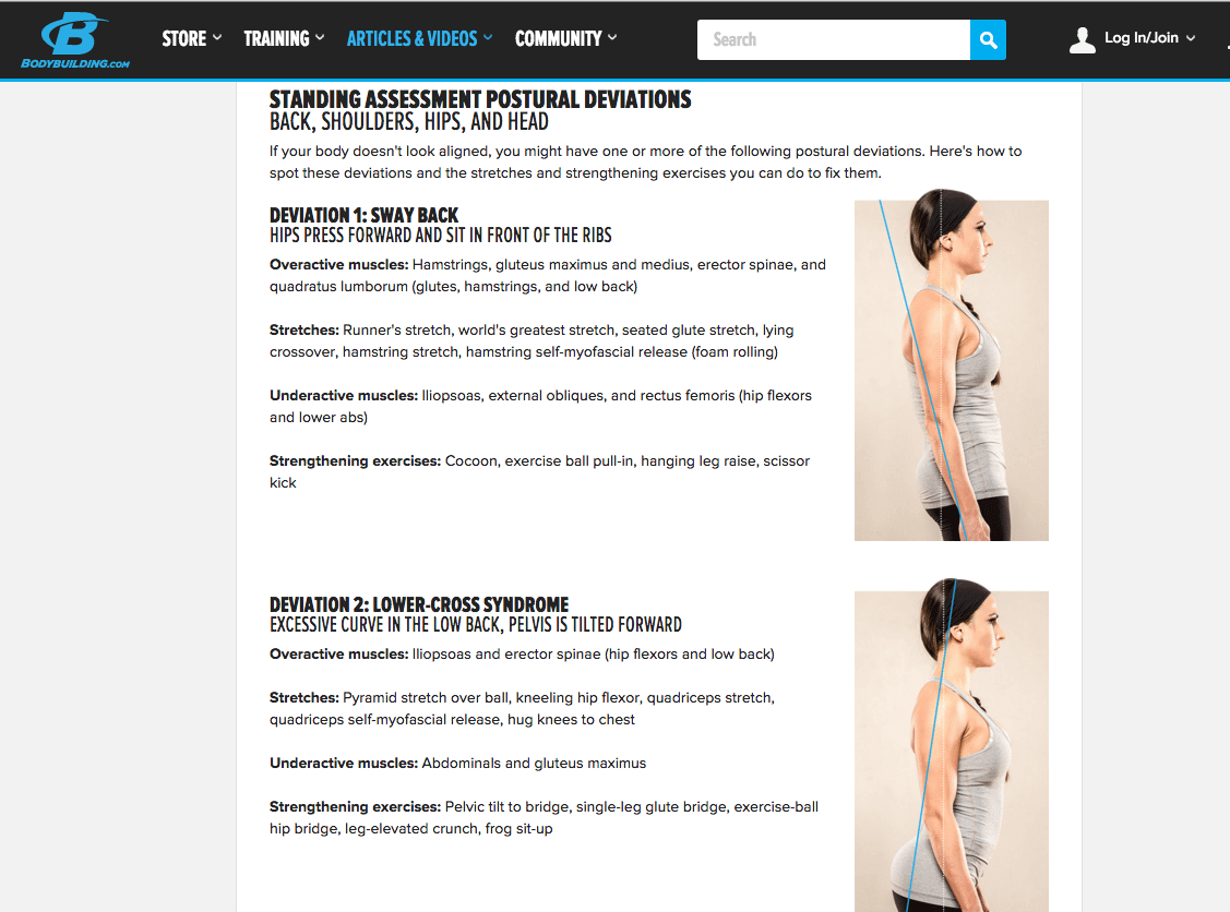
One piece of content stands out that has been shared very well: How to correct your body alignment
and: Fast food is just as effective as supplements
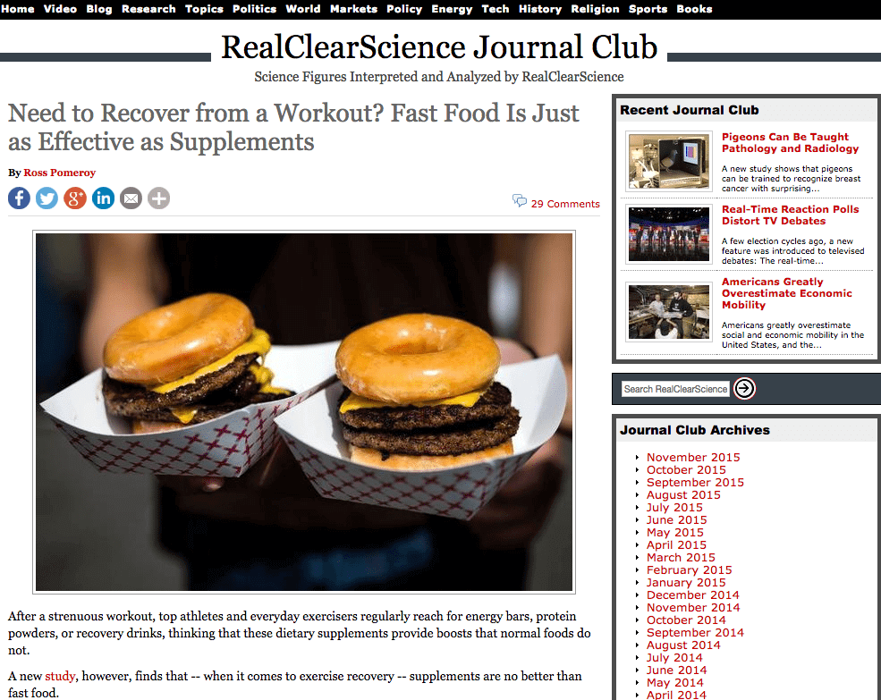
So we can see that practical value and science supported ideas could do very well with this particular audience.
3. Jump onto Quora
Quora is also a great way to learn what questions the audience are asking and the problems they face. We find questions like:
- What are some best food supplements to build muscle mass in about 3 months time?
- Which food supplements do you consume, and why?
- Are there any foods, drinks or supplements to increase blood oxygen levels for exercise?
- What are the sources of vitamin b12 for a vegetarian?
Each one of these questions has a number of answers, indicating a large interest for this audience. Once you have gone through this entire process, feel free to keep a note of the titles and URL’s in a spreadsheet. When you have finished this process, you will have a good idea of what emotions/content work well with this audience so that you are now informed-enough to start brainstorming.
But there are plenty of other areas you can search for information that might be more relevant for your industry beyond just Reddit and Quora:
- http://ask.metafilter.com/home/popularfavorites – Lifestyle/practical value
- https://uk.answers.yahoo.com – General, but not great quality, answers.
So be sure to keep an eye out and bookmark sites as you come across them.
To find a more detailed overview on how we use Reddit and Quora in our ideation process, check out my article: Identifying the Problems of Your Content Audience.
How to brainstorm infographic ideas

Now you understand your audience you’re ready to start brainstorming your own infographic ideas.
I always recommend the book Gamestorming to those who are new to brainstorming, but some basic tips are:
- Get a good whiteboard/pens/post-it notes
- Keep it fun and don’t shoot down any ideas
You will want to look the concepts that have come across during the research stage, asking questions and getting the whole group thinking critically.
1. How can we expand upon this idea?
More in depth research, better design or use alternative formats like images/video/interactive content.
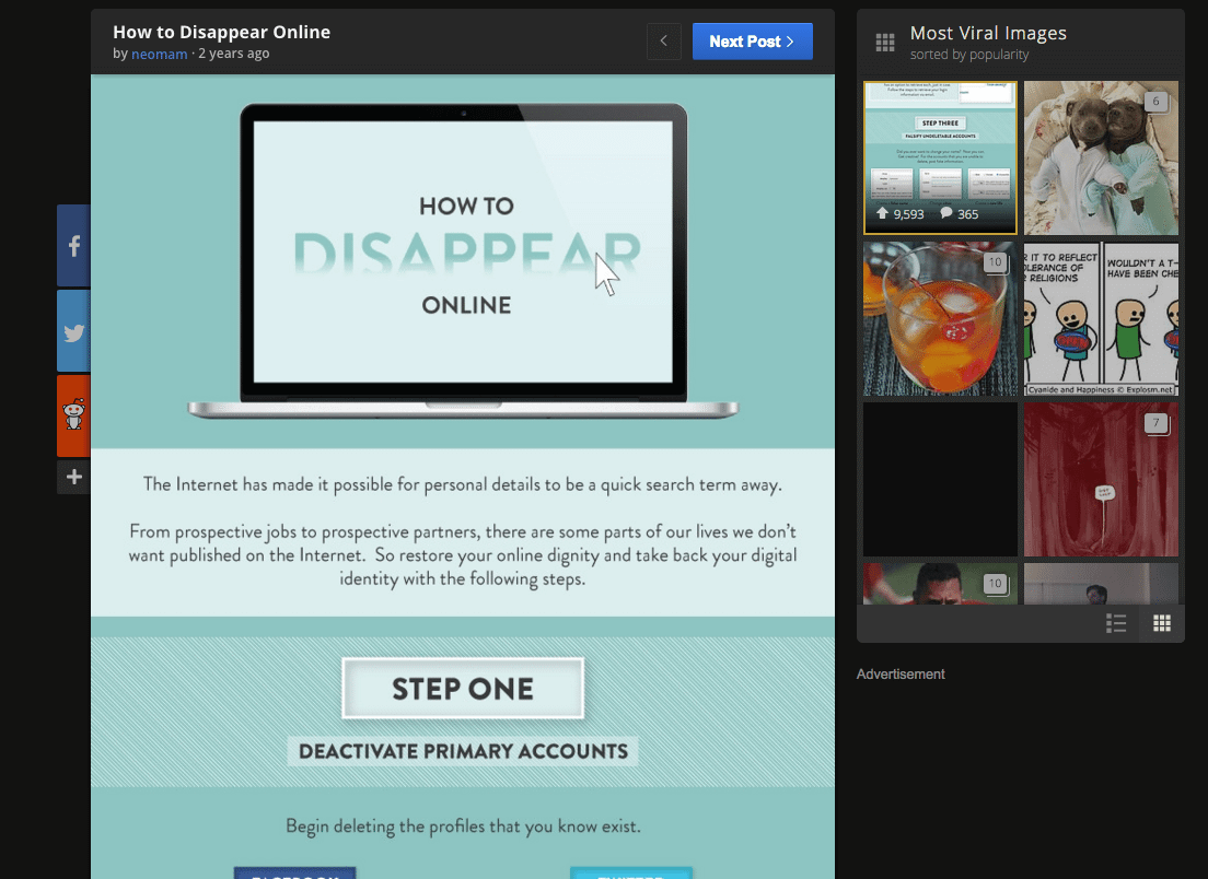
Example based upon the content: http://www.huffingtonpost.co.uk/2015/07/29/how-coca-cola-affects-body-infographic_n_7895304.html
Example improvements:
- What happens after 24 hours/1 year/lifetime of drinking Coca-Cola?
- What happens 24 hours after drinking 2 litres of Coke?
- X Scientific reasons why Coca-Cola is bad for you body
- … etc
2. Can we switch/swap out the subject to create something else?
For example:
- What happens 1 hours after drinking a pint of beer/eating a Pizza Hut Pizza?
- What happens after sitting for an hour at work?
- What happens to our body one hour after receiving an email?
- … etc
3. Can we improve upon the idea through research/design/functionality?
- Coca-Cola Quiz on how your specific intake affects your body
- GIF animation on how coke affects the body with illustrations.
- A guide to giving up Coca-cola
- … etc
Once you have brainstormed you will likely have lots of ideas to choose from. At this point it’s worth taking a break and then coming back to evaluate the ideas with a more real world view. This can be done with a smaller number of people and should be seen as a separate process from the brainstorming.
You want to ask how feasible these ideas are and then try and narrow the list down to three of your best ideas. Next you want to take these ideas back to the wider group and get them to vote on their favourite idea. Now we have an infographic idea that we know is something that our audience cares about and is the best idea we can come up with as a team.
To find out more about brainstorming, check out my article: How to Brainstorm Content Marketing Ideas.
Step 2 – Research and Copywriting

Once you’ve identified an idea that will resonate with your audience and the relevant publishers, you should set aside time to outline how your content will gain traction.
While every piece of visual content is different, there are some general rules to adhere to journalistic best practices.
1. Tell the truth
When you’re writing for content marketing, they may want the copy to lean towards the interests of your business and your existing customer. HOWEVER, it is critical that you preserve the journalistic integrity of the copy. Every assertion made in the copy must be accurate, verifiable, and drawn from reputable sources. As novelist Zadie Smith says, “Tell the truth through whichever veil comes to hand – but always tell it.”
2. Use credible sources
A ‘credible source’ is defined as one that could be used for an academic research paper.
The majority of research in an infographic should be of academic standard. White papers, research papers, government documents, official websites are all great sources; personal blogs, tabloid journals and websites full of banner ads are not. All the sources should be properly referenced, preferably in an internationally recognised style (e.g. Harvard, which we use in a slightly modified form).
3. Follow ‘the Iceberg theory’
Journalistic writing, particularly for newspapers, focuses only on events being reported, omitting superfluous and extraneous matter. The novelist Ernest Hemingway kept this style for his creative writing, and it’s a great model to use for infographics – focus on the key elements, and trim away everything else. If people want the details, then direct them towards the information through the sources.
Step 3 – Design

Now that you have gone through the research and copywriting stage, you are now ready to design the infographic.
At NeoMam we have identified at least 12 types of infographic that are worth looking at. Over the few thousand infographics we have produced, we find that the most successful infographics keep to one type rather than combining lots of different types. Using the example of the Coca-Cola infographic, we see a very simple chart that doesn’t try and do too much – and this certainly helped it share so well.
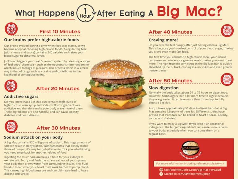
The design stage is all about making the information easier to digest, and if it’s not a glanceable read, then you have a problem. You can do this by following a strict set of rules when choosing your colour scheme and fonts. Using the Big-Mac piece as an example, a colour scheme of just 2-3 colours works well for a simple infographic. Next, your font size and weight should remain consistent throughout the piece. For example, the type is red and bold for each subtitle, this remains consistent for each section.
If you’re new to infographics, then I would recommend keeping to simple infographic types with basic illustrations that support the idea and as you become more experienced you can look at more complicated data visualisations.
If you don’t work with designers and don’t have the budget for an agency, then I recommend that you try to work with freelance designers. Be sure to only look at infographics in their portfolio as infographic work can be very different to web design, etc.
Some sites where you find graphic designers:
- https://www.behance.net/ – do a search for infographics and look at those that fit the style you have in mind. You will need to reach out directly and you never know what budgets each designer is looking for until you ask.
- https://www.upwork.com/Login – Formerly known as Odesk, this site allows you to post your job and candidates will then apply for the posistion. A good tip is to also reach out to applicants that look good and ask them to apply for your job posting.
- https://uk.fiverr.com – While it’s not for the faint at heart, Fiverr is actually a great place to find talent. The key thing is to find those who do small projects well in your style (design/illustration) and then ask them for a custom job for you that covers the entire infographic.
Working with freelancers is certainly time consuming, but tools like http://www.invisionapp.com/ can make life easier by alolowing you to post comments on designs which the designer canthen respond to.
Step 4 – Testing Your Infographic

After you have been through the editing process with your design, you will have your finished product. At this stage, most people would tell you to post it on your site and start sharing it with the world.
At NeoMam we do something slightly different… And that is how we test our content on Reddit before we even think about publishing it.
It’s a very simple process:
1. Post your final design to Imgur.com and you will get a Imgur URL like: http://imgur.com/gallery/AgPciEh
2. Then post this Imgur link to a relevant subreddit, for example:
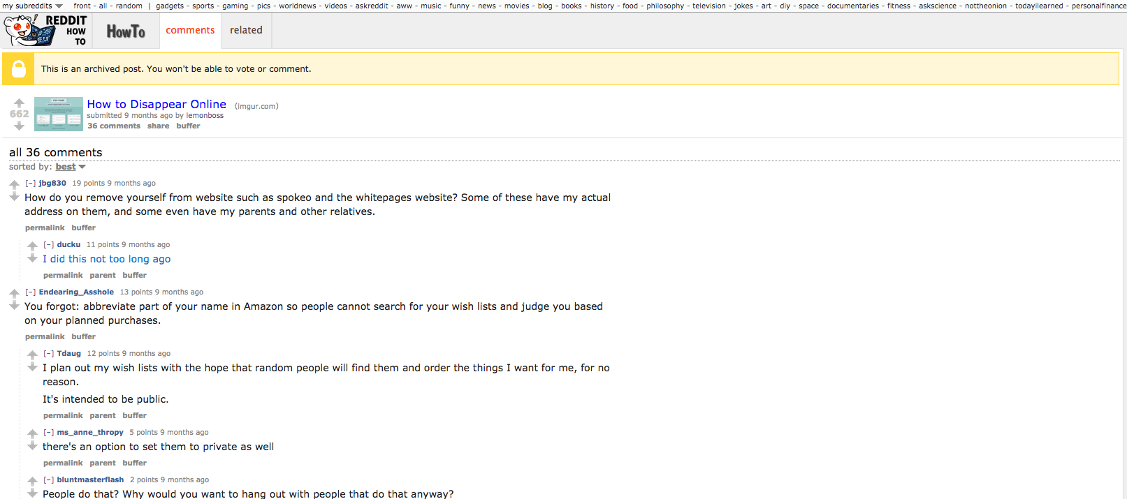
3. Watch as you get a few thousand people to view your infographic and tell you exactly what doesn’t work
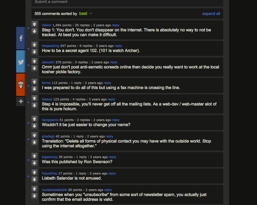
4. Make notes of the comments
5. Adjust the copy and design in line with feedback
6. Produce an infographic that has benefited from crowdsourced feedback.
7. Then hit publish.
Conclusion:
Despite their humble appearance, infographics are far from easy – especially if you want to get picked up by big media. Like any carefully-considered major content marketing campaign, they require significant time, patience and skill to get right.
I hope this blog post can help you start off with a bit more knowledge and not make the same mistakes we did.


