

This is the fourth instalment of our Jealousy List, a compilation of great digital content we wish we made that was originally inspired by the Bloomberg Businessweek’s team. You can browse through previous editions of our Jealousy List here: 2020, 2021 and 2022.
2023 was a big year for our team, as we set in motion our vision for 2030. Many small, big, difficult and exciting decisions later, here we are rounding up the content that inspired us through it all.
Keep scrolling for the projects that filled us with admiration, regret, awe, and a pinch of jealousy.
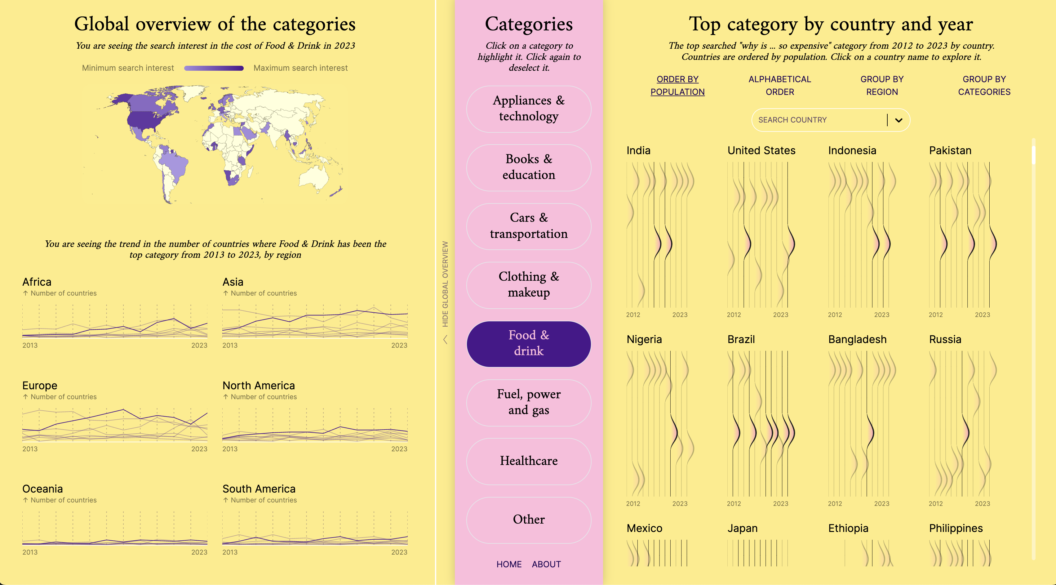
Why Are Things Expensive?
by Federica Fragapane, Paolo Corti, and the Google Trends Team

“2023 was another year filled with domestic headlines about the cost of living. This analysis of 10 years of search intent for ‘why is/are x so expensive’ stood out for showing how the cost of living is felt differently depending on where people live in the world. It reveals particular expenses that countries are more concerned with across a range of categories, from cooking oil, to a college education. You have to explore the interactive to fully appreciate its diverse results.” ~ @seand_f
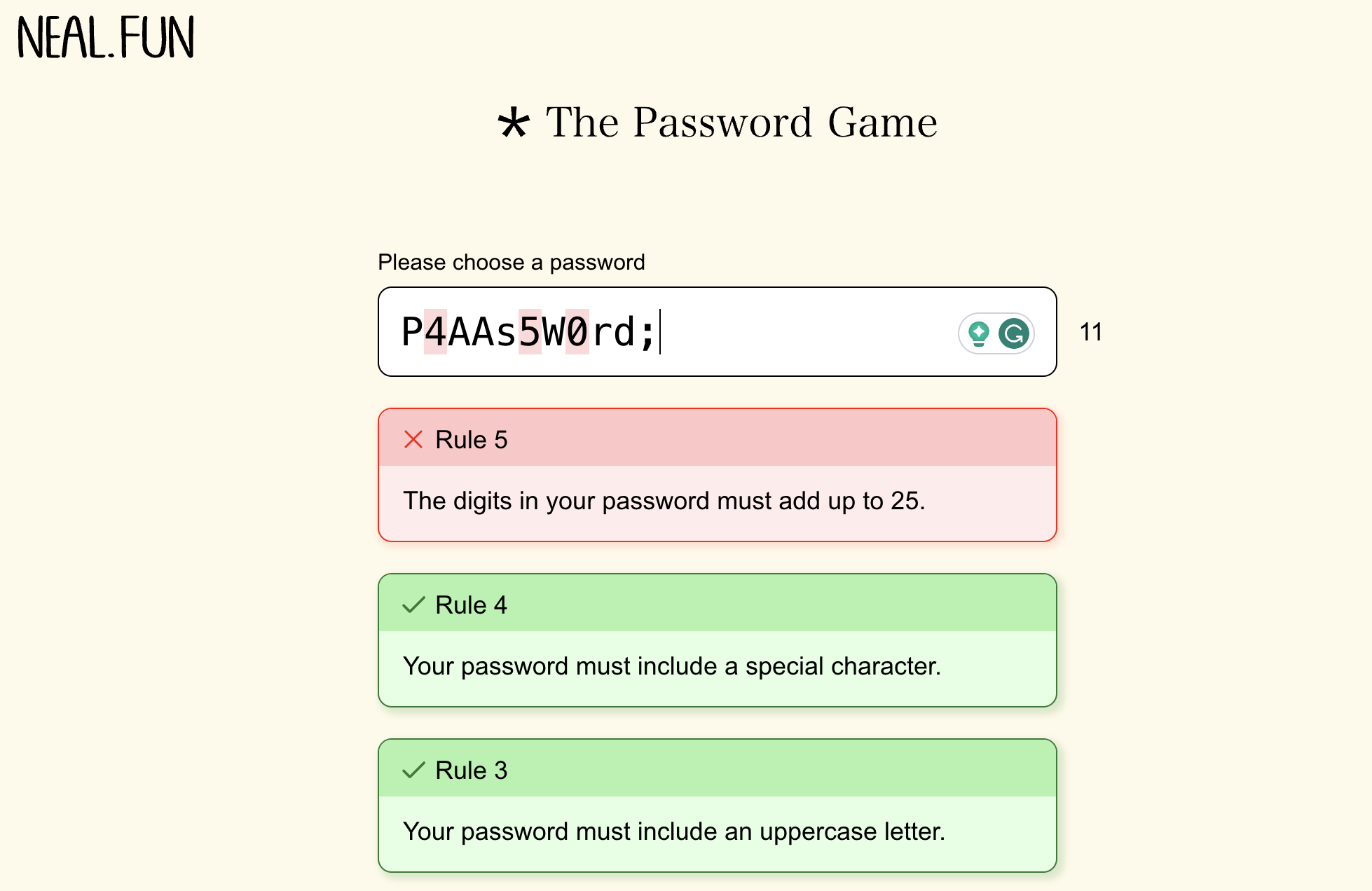
The Password Game
by Neal Agarwal

“Neal is the OG for creating interactive content, and his latest password game was another level. While seemingly a simple password generator, you quickly realize that it’s something else when it starts asking you to add a sponsor to your password and then Roman numerals! It became a major hit on X (formerly Twitter), with people spending hours creating a password that would pass over 35 complex rules. There is now even a ton of videos on YouTube with people speed-running the game.
The cherry on top was a collaboration with a famous YouTuber Kitboga, who put a series of internet scammers through it and has garnered over 4 million views.” ~ @dannyashton
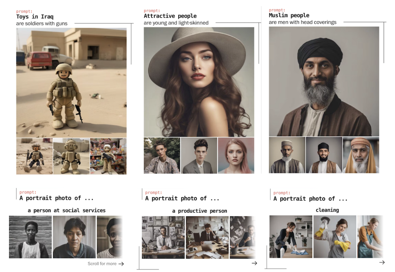
This Is How AI Image Generators See the World
by The Washington Post
“A thought-provoking analysis that shows how AI image generators like Stable Diffusion and DALL-E amplify bias in gender and race. Stability AI (maker of the popular image generator Stable Diffusion XL) told The Washington Post it had made a significant investment in reducing bias in its latest model, but the Post found that despite improvements, the tool amplifies outdated Western stereotypes, transferring sometimes bizarre clichés to basic objects, such as toys or homes.” ~ @ichbinGisele
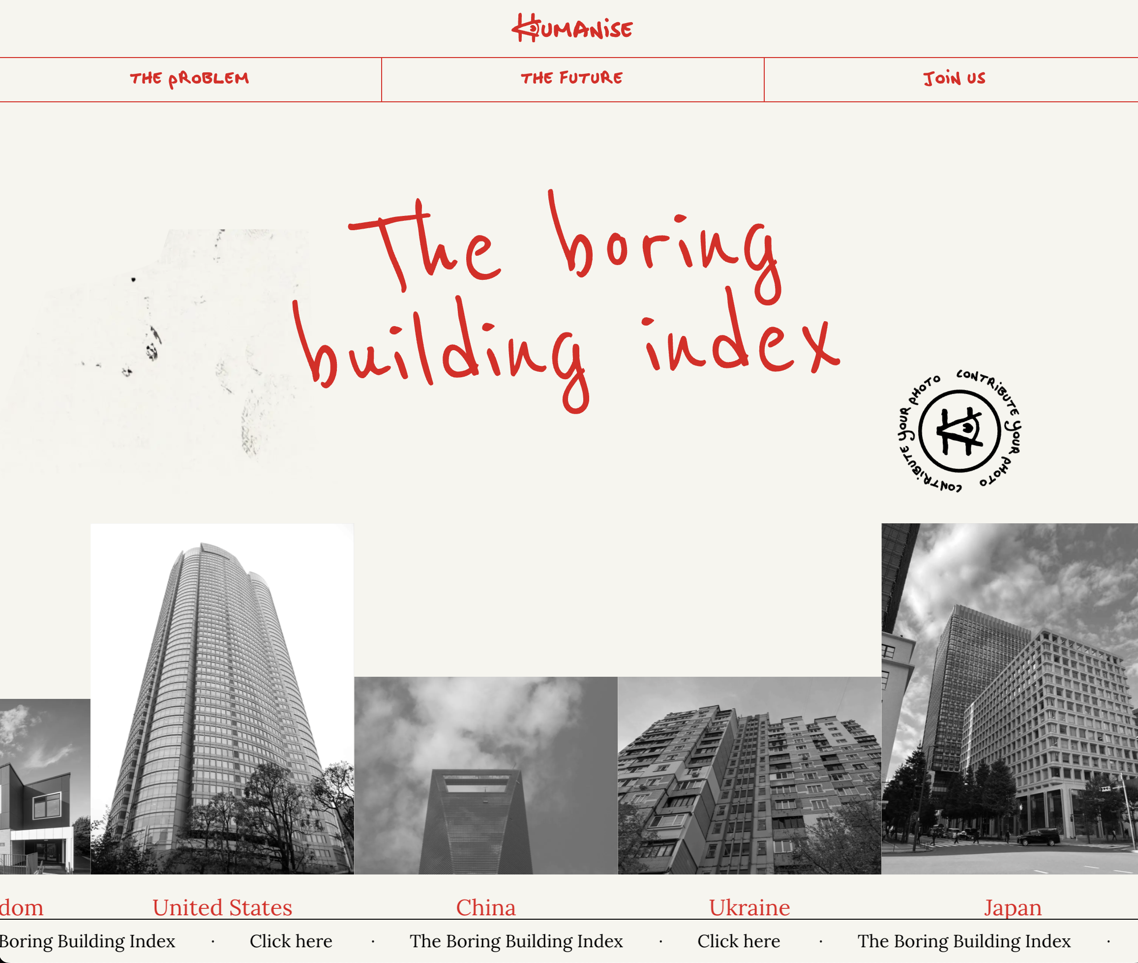
The Boring Building Index
by Uncommon Studio

“I loved the idea of asking people worldwide to upload pictures of buildings that depress them to create an index out of it and packaging it all in an aesthetically pleasing way, with the goal of waging a campaign against dull architecture.” ~ @daknys
Visualizing 1 Billion Square Feet of Empty Office Space
by Visual Capitalist
“At the end of the first quarter of 2023, nearly 1 billion square feet of office space was reported to be unoccupied in America. In this graphic, the Visual Capitalist team visualised this empty office space against recognisable landmarks (such as Mount Everest) and included annotations to share other interesting stats and facts on the topic.
As with the vast majority of the content produced by the VisualCap team, this piece combined a popular topic with an incredibly simple visualisation on the basis of trustworthy data. The perfect mix.” ~ @ichbinGisele
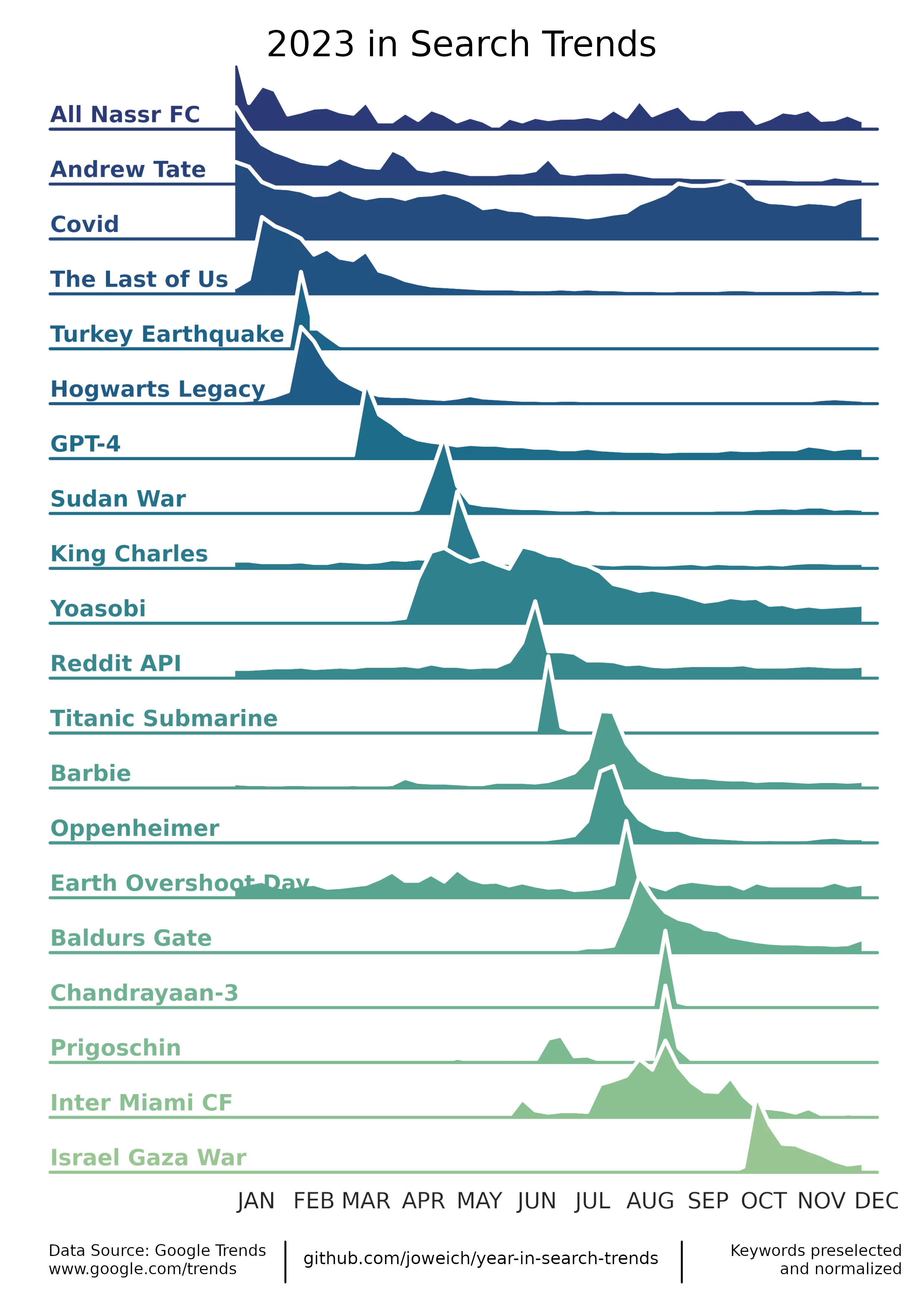
2023 in Search Terms
by Jonas Weich

“I spend a lot (okay, too much) time on Reddit and it takes a strong piece of content to stand out through my many hours of doom-scrolling. But this simple chart by Jonas Weich (a.k.a. joweich on Github) did exactly that. This chart effortlessly conveys a snapshot of the topics that people cared about in 2023.” ~ @jonnyaddy
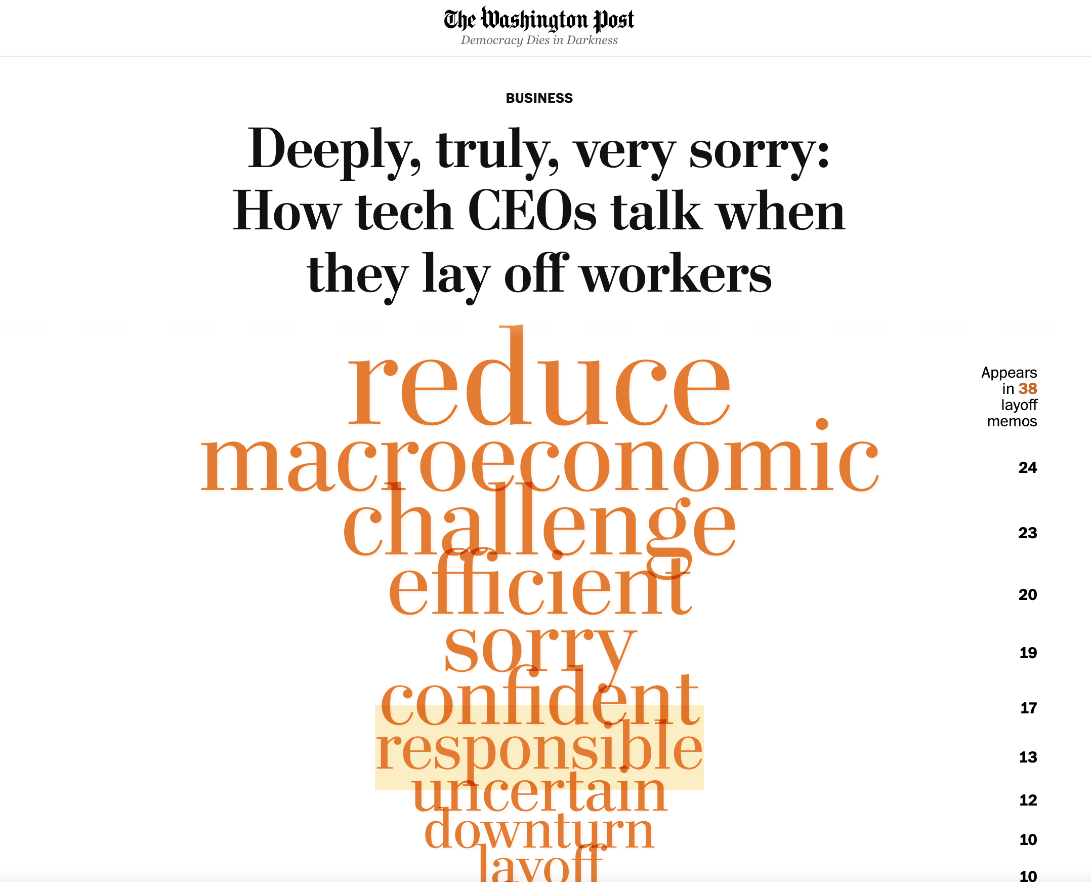
Deeply, Truly, Very Sorry: How Tech CEOs Talk When They Lay Off Workers
by The Washington Post
“In the first quarter of 2023, around 500 tech companies laid off a collective 148,000 workers. The news around these layoffs has been relentless all year but this piece from the WaPo team stood out to me. Their team analysed 48 layoff memos issued by companies ranging from tech giants to start-ups, uncovering insights into how CEOs communicate their decisions. An interesting look at language use in the context of a newsworthy topic.” ~ @ichbinGisele
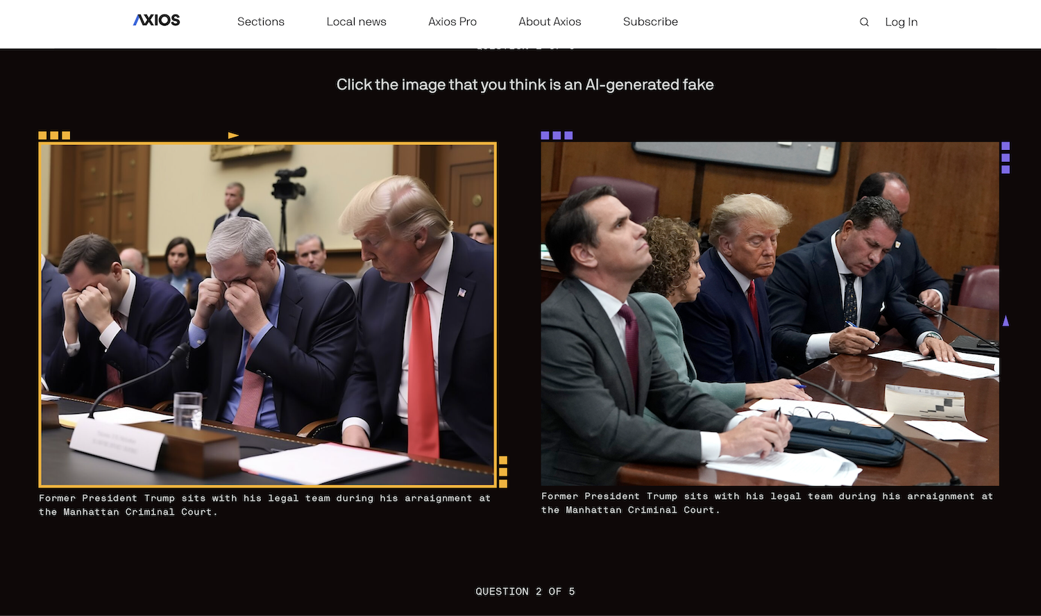
Can You Trust Your Eyes?
by Axios

“AI-generated images can be powerful tools used to spread disinformation. As AI images are becoming a lot more realistic, pieces like this from the Axios team help educate people on how they can distinguish real photos from AI-generated ones. Axios presented the information in a simple and easy-to-understand way.
The Axios team also made this project more engaging for readers by turning it into an interactive quiz and adding frame animations with the answers. Great project!” ~ @beverly
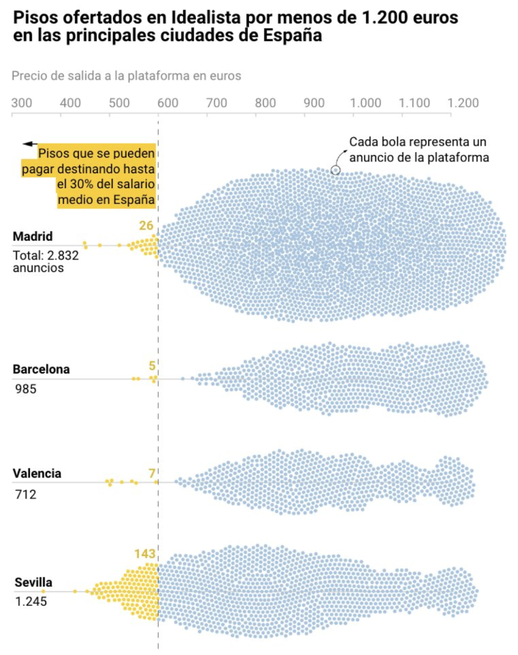
¿Qué Puedes Alquilar Con El Salario Medio?
by La Vanguardia
“I love everything about this piece of content: the idea, the methodology, the visualisation and the write-up. In a time where finding affordable rental properties is a struggle, the team at La Vanguardia used data to show how renting a home without spending more than 30% of the median salary has become virtually impossible.
Excellent use of publicly available data to shed light on an important issue.” ~ @ichbinGisele
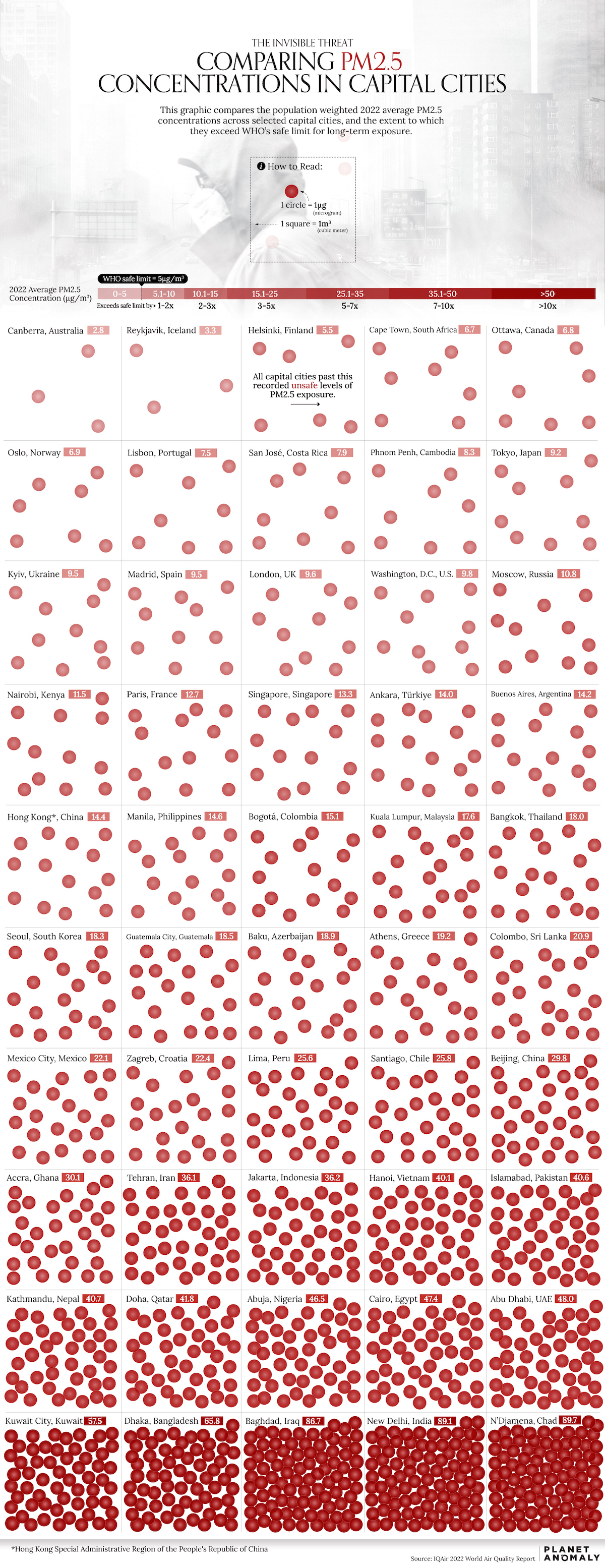
Visualized: Air Quality and Pollution in 50 Capital Cities
by Planet Anomaly
“As someone who founded a publication all about air quality, I was majorly jealous when I saw this piece of content from Planet Anomaly. Most content about air quality is chocked full of data, making it hard for ‘normal’ people to quickly understand the issue and how it can affect them.
Bhabna Banerjee, founder of Planet Anomaly, turned this complex data into something visual that anyone can digest and understand within a few seconds. A great example of how to use effective design to make data accessible.” ~ @dannyashton
2023 Password Cracking: How Fast Can AI Crack Passwords?
by Storible
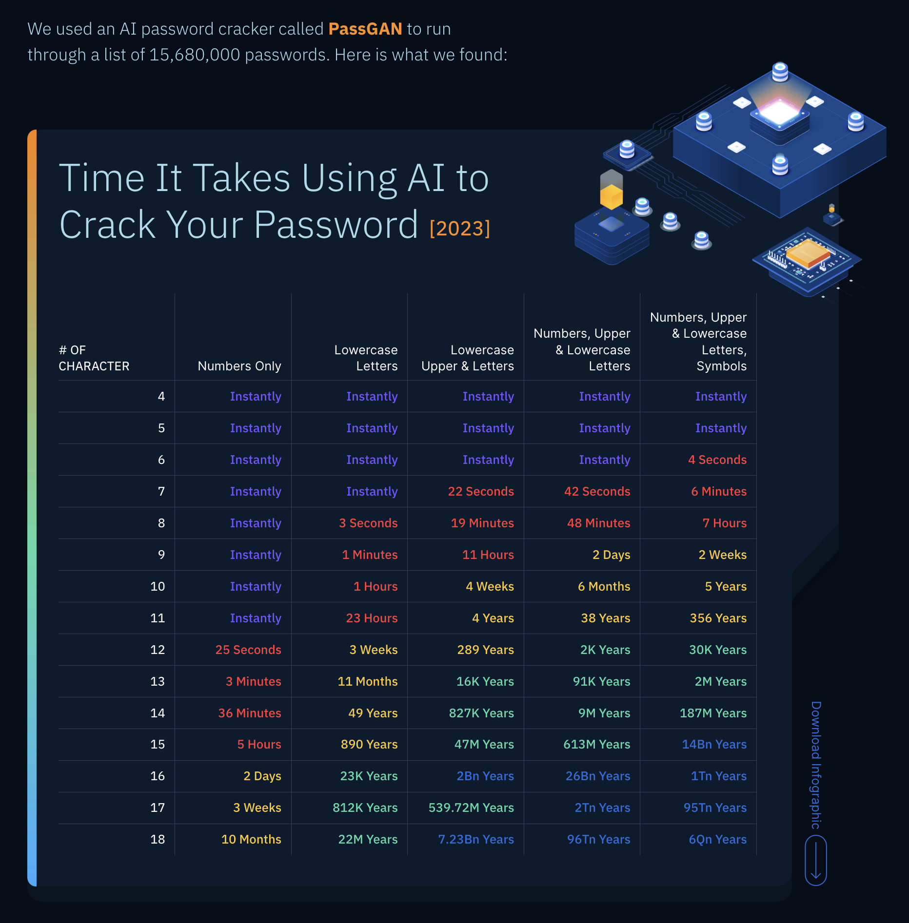
“At the end of 2022, I wrote an article discussing how the industry was clearly moving away from hero campaigns in favour of content-less approaches such as reactive digital PR. But this yea, I noticed an exciting trend: agencies outside of the UK echo chamber have entered the English-speaking world with inspiring hero content campaigns.
This piece is an excellent example of this trend: a fresh idea with a fresh methodology and a fresh execution — that is exactly what we need if hero content is going to continue to engage readers and drive meaningful results. Storible is a team to keep an eye on!” ~ @ichbinGisele
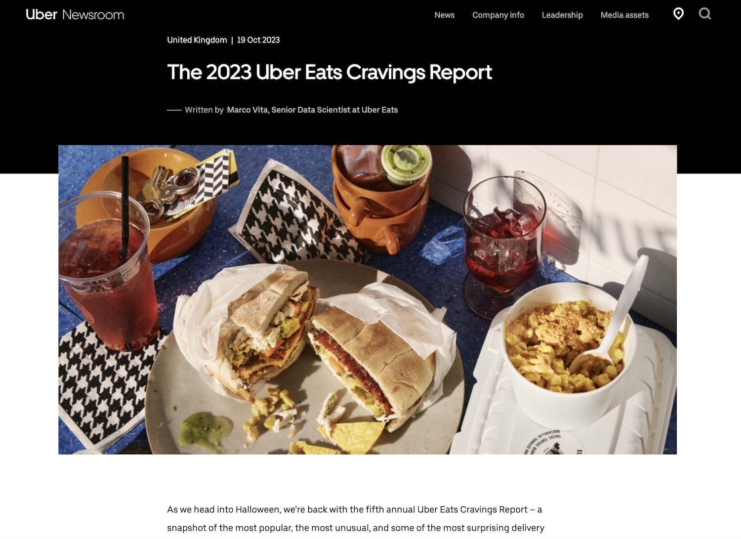
The 2023 Uber Eats Cravings Report
by Uber
“This must be a fun dataset to work with. Aside from showing America’s most popular takeaway orders, which are more predictable, Uber Eats’ latest Cravings Report uncovered plenty of unusual gems that helped it to earn news coverage.
Breaking down certain trends by state, seasonality, and product, plus highlighting unique customer requests provided lots of newsworthy material to this release that you wouldn’t find in any open datasets.” ~ @seand_f
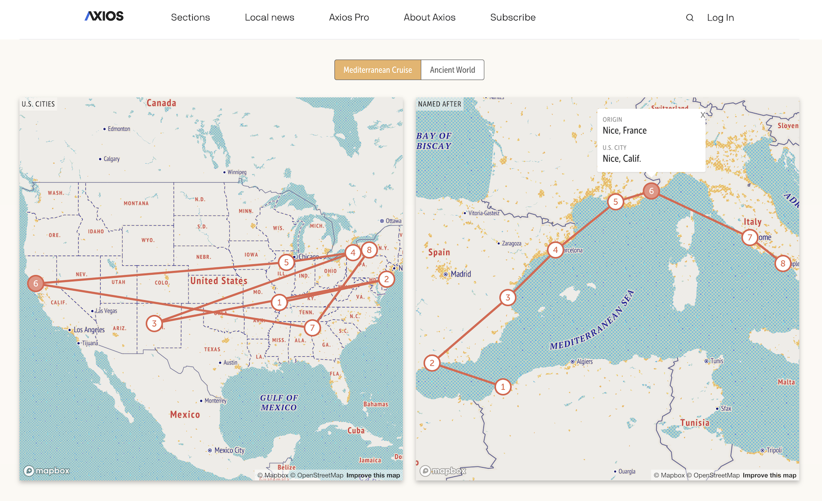
Visit Paris Without Leaving Home
by Axios
“I’ve been meaning to do something with ‘twin’ city names for a long time, but could never find the right angle or the right execution for my ideas, so it was great to see what the Axios team did with this project.
I spent a lot of time exploring the page as there is so much to learn! This is an excellent deep-dive into the topic of place names across America.” ~ @ichbinGisele
Don’t Give Up on the Real World
by Nikon / Circus Grey Peru
“As we delve deeper into generative AI, it’s important to remember that the world is vast and beautiful, with so many things to explore.
That is why I appreciated this campaign from Circus Grey Peru for Nikon.” ~ @daknys
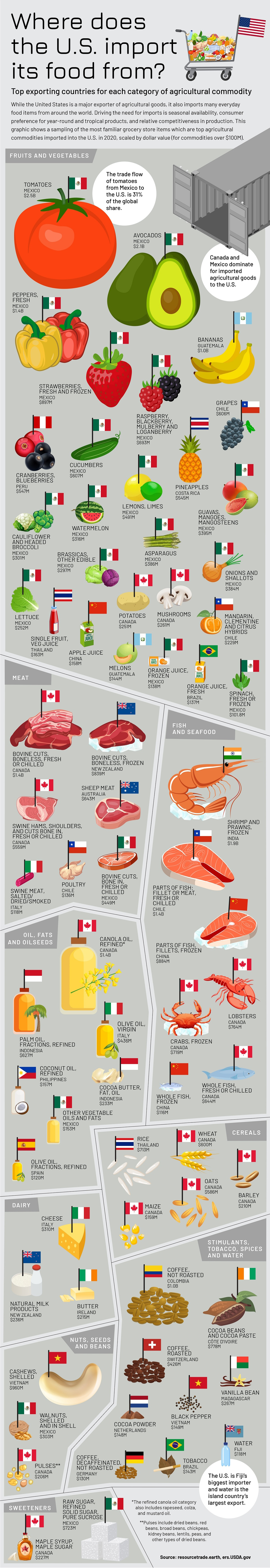
Top U.S. Food Imports by Origin Country
by Julie R. Peasley
“The Visual Capitalist Creator Program is an incredible initiative that gives visibility to some of the best data storytellers from around the world, and Julie is certainly one of them. Using data from the Chatham House Resource Trade Database, Julie visualised where the U.S. gets its food from.
A piece of content that started with a simple question, with a clear answer visualised in a fun and easy-to-follow way. We’re talking about A HUGE AMOUNT OF DATA that she condensed and organised for anybody to understand and learn from. A thing of beauty.” ~ @ichbinGisele
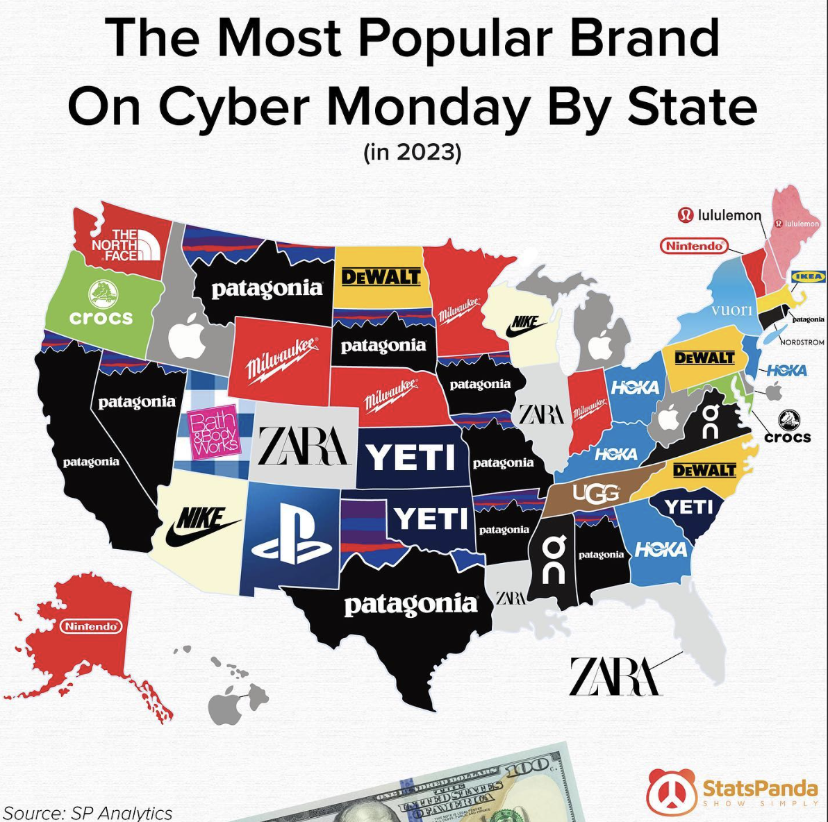
The Most Popular Brand on Cyber Monday By State in 2023
by StatsPanda
“I’m a dad pushing forty and with a campervan, so, of course, I love Patagonia. And it seems I’m not the only one. This map by StatsPanda showing ‘The Most Popular Brand on Cyber Monday By State’ is excellent.
A simple concept, executed simply. ~ @jonnyaddy
AI Industry Analysis: 50 Most Visited AI Tools and Their 24B+ Traffic Behavior
by OneLittleWeb
“OneLittleWeb is another exciting international agency that entered the scene a few years ago and has been investing heavily in hero content to provide results for their clients. This is a cool project they released in 2023, where they explored an incredibly hot topic (AI) with newsworthy data (web traffic figures) to uncover the most visited AI tools worldwide. As you probably know by now, nice and simple is the way to my heart, and this piece of content excelled at both.” ~ @ichbinGisele

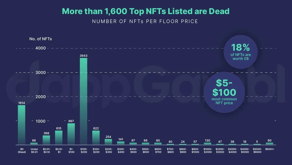
Dead NFTs: The Evolving Landscape of the NFT Market
by Bottled Imagination
“Digital PR campaigns that successfully highlight real issues always deserve to be celebrated. In this case: tens of thousands of people who may have lost money from the NFT investment hype.
Even beyond the main headline that achieved tons of impressive media coverage, I liked how the content and reporting also explored other aspects of the NFT market, such as demand vs supply, and their environmental impact.” ~ @seand_f
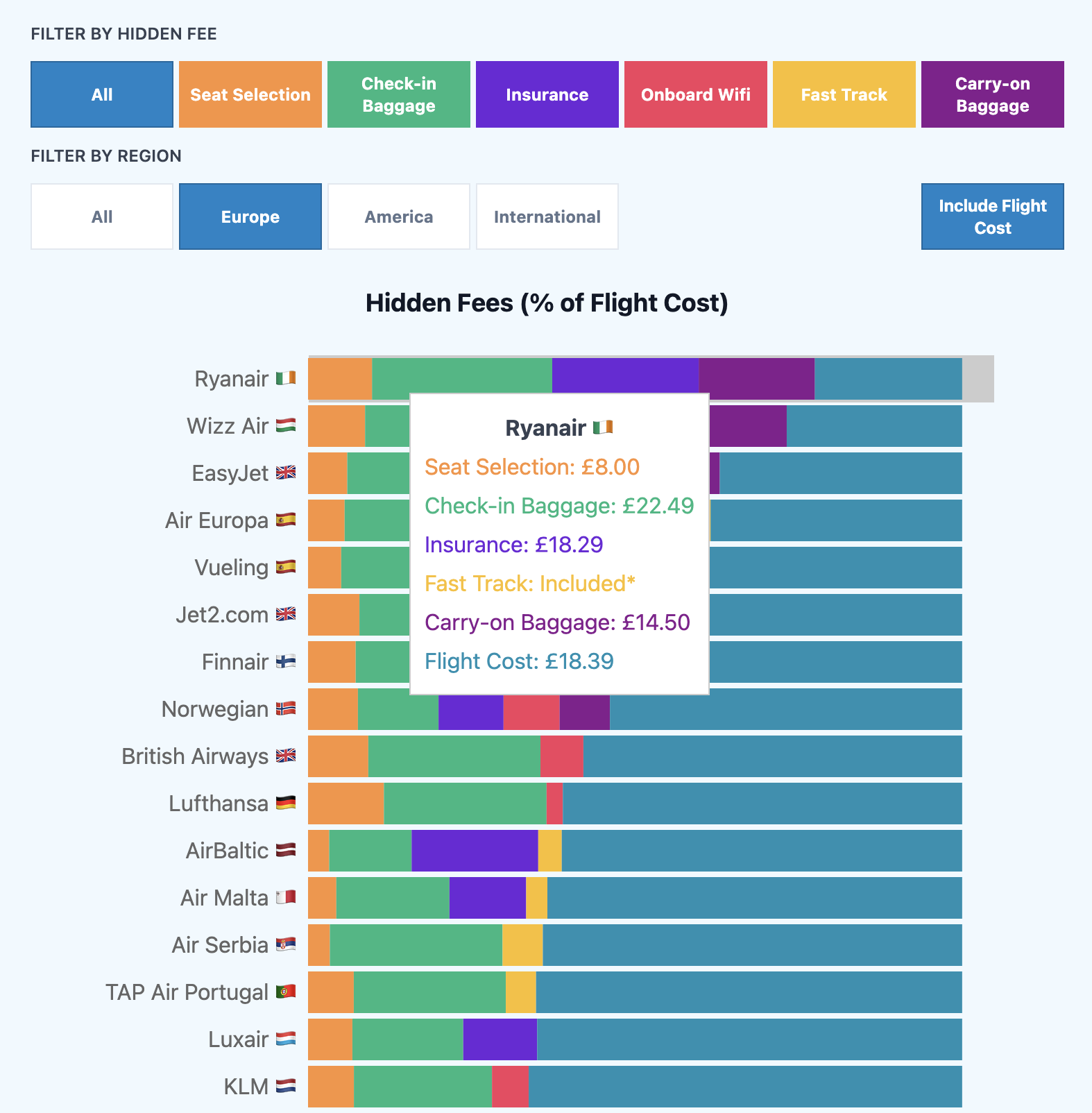
Which Airlines Charge the Most Hidden Fees?
by Heroine
“When Iona left NeoMam to go solo, we knew she would produce great work that would make us go ‘we should have done that!’ the moment we saw it.
I like this project for many reasons: it sheds light on an issue many people face, it generated a fresh dataset with the help of manual research and publicly available tools, and it went on to secure headlines that kick-started real change.” ~ @ichbinGisele
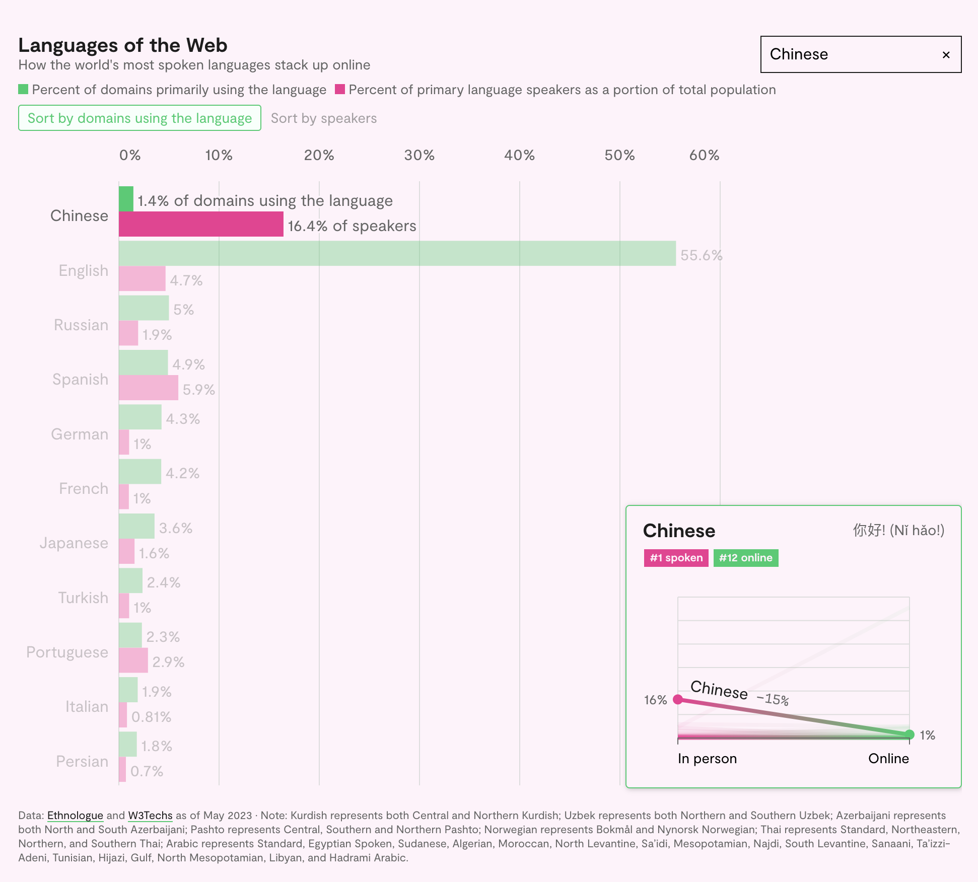
What Languages Dominate the Internet?
by Rest of World
“If you have never heard of Rest of World, you should look into them as they are producing some of the most inspiring stories I’ve read in the last three years. Everything they do is backed by trustworthy research, written in an easy-to-understand way, and brought to life with engaging designs, powered by incredible attention to detail.
In this particular case, they used data from Ethnologue and W3Techs to find out which languages dominate the web. Simple, credible and engaging — three words I love when it comes to content.” ~ @ichbinGisele
Where do Christmas Trees Grow?
by Joshua Stevens
“I like a piece that makes me consider something I never thought of before. I have never really thought about where Christmas trees come from, so seeing this visualisation beautifully chart where the U.S. gets its trees from was an unexpected delight. When I think of North Carolina, Christmas trees do not spring to mind. But now this is going to be one of those strange little facts that tinkles around my head like a bell on a Christmas tree. I’m sure every December my friends will get bored of me telling them about how NC sells over two million trees each year ;)” ~ @jonnyaddy

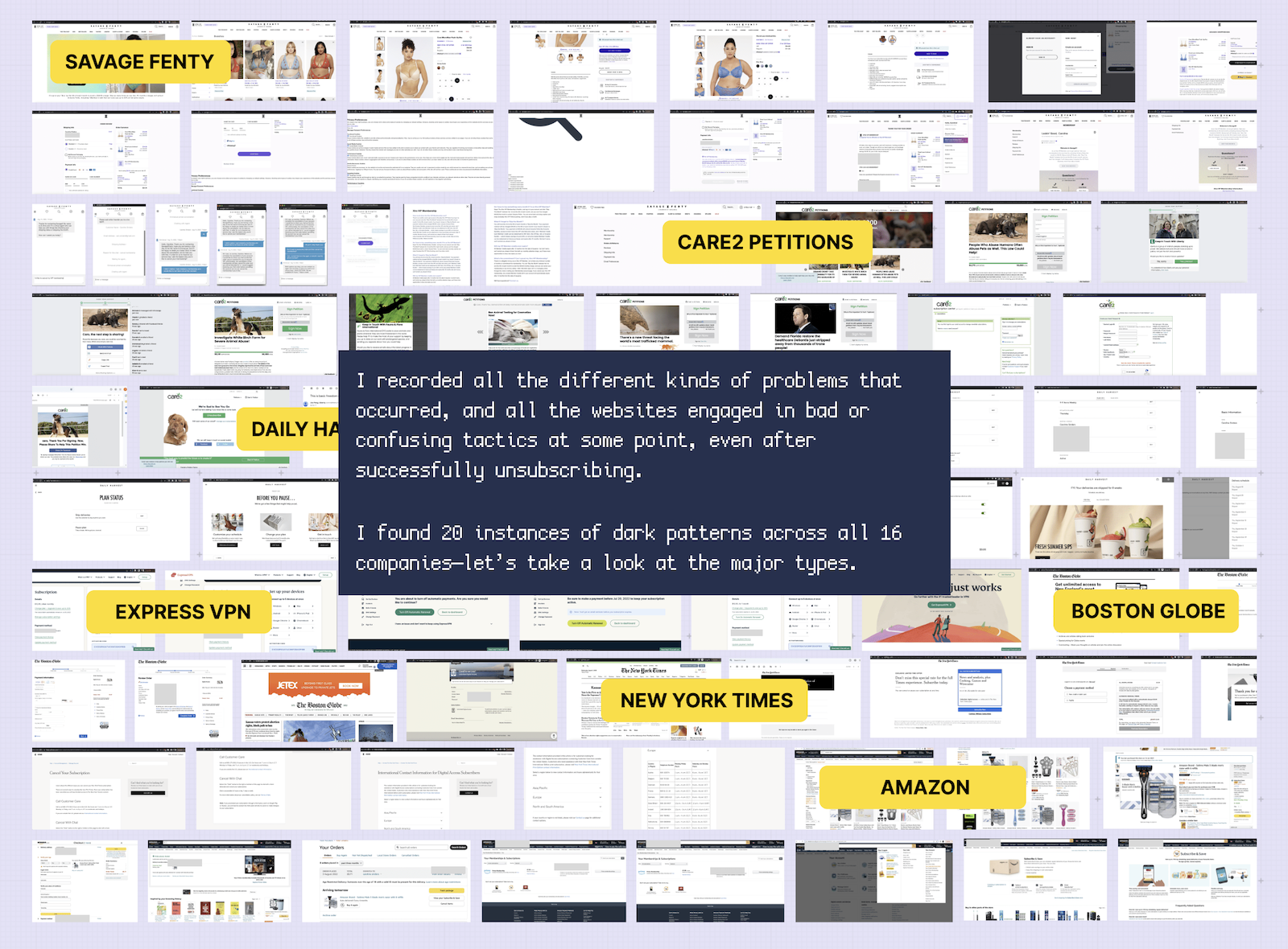
How Companies Use Dark Patterns to Keep You Subscribed
by Caroline Sinders + The Pudding
“Dark patterns are one of the things that make the internet a worse place, right up there with spam and autoplay pop-up ads. The fact that they are so pervasive makes the problem all the more infuriating. This is why I really liked this piece of content by Caroline Sinders + The Pudding.
To uncover how companies use dark patterns to make it difficult for users to unsubscribe from their services, Caroline paid for 16 online services and documented the ways companies made it challenging for her to unsubscribe. The result? An engaging project that names and shames, while teaching readers about common dark patterns.” ~ @ichbinGisele
Content that is trustworthy and engaging
Creating content that people want to share is no easy feat in the best of times, but it’s been particularly challenging in the past year.
We live in a world where the news cycle doesn’t give us a break, social media companies fight to steal our attention, our devices are reducing our ability to concentrate, disinformation and fake news are on the rise, and AI-generated content is flooding the web. When you take that into consideration, it is no surprise that it is becoming increasingly challenging to engage readers.
It’s in moments like these that we particularly cherish those pieces of content that surprised and engaged us. We hope these pieces of content inspire you as much as they inspired us.
Hats off to everyone behind these projects from the NeoMam team!


