

Last year, we took a page out of the Bloomberg Businessweek team’s book and created our own compilation of the great pieces of digital content produced by other teams that made us feel a slight pang of jealousy.
The response to the 2020 Jealousy List was overwhelmingly positive, so we decided to make a yearly tradition out of it.
But before we take you for a spin down we-wish-we’d-made-that lane, I want to clarify a few things:
1. This is not a list of the best link building or digital PR campaigns of the year
The NeoMam Jealousy List is about ideas, methodologies, and executions. We don’t look at link counts or awards or who made what before deciding to include a piece of content on our list.
2. We haven’t seen every piece of content produced in 2021
We discussed asking people to suggest content, but we decided against it to stay true to the idea of the Jealousy List: a compilation of content we found in the wild and we wished was our work.
I am positive that we have missed A LOT of great content from many creators and teams out there, the same thing happened last year.
3. If your amazing campaign didn’t make the list, please don’t take it personally
Last year, we received messages from people who were disappointed not to find their award-winning campaigns among the shortlisted content.
We discussed taking the time to look for examples across all agencies, projects listed in award entries, and content produced by the most active in-house teams. We wanted to make sure we weren’t only highlighting the work of some, giving the impression that these are the only people producing great work.
But in the end, I felt that would be missing the point of this list. We don’t want to pretend to be somehow judging the work of an entire industry. Who are we to do that?
Okay, now that housekeeping is out of the way, it’s time to enjoy some inspiring content that made all of us feel a liiiiitle envious in 2021.
The Naked Truth
Team: The Pudding

“The Pudding never misses. This project looked at a topic that many of us have the luxury of not thinking twice about. The beautiful landing page and data visuals are great, but the telling research is really the highlight of the piece.” ~ @IonaJTownsley
https://pudding.cool/2021/03/foundation-names/

“The Pudding team have a great way of presenting data in a way that is both visually pleasing and easy to digest. With this piece, they shed light on potential bias within the beauty industry simply by analysing data which is already out there. Not only was the landing page a visual treat, but the data shocked, it raised questions and it highlighted that the beauty industry still has a way to go in terms of inclusivity and representation.” ~ @peaceyyy
The Climate Threat To Our Cultural And Natural Landscape
Team: Digitaloft

“When I first saw this campaign, it made me feel a mix of awe and sadness. The execution is flawless and it made a stronger point because of it. Fantastic use of a slider to help clearly visualise how each of the landscapes is expected to change if current climate change trends continue.” ~ @ichbinGisele
https://outforia.com/losing-landmarks/
Global River Runner
Creator: Sam Learner

“Sam Learner’s River Runner web project prompts you to drop water anywhere in the world and follow its journey through rivers and states all the way to the ocean.
It’s a mind-blowing use of the River Runner API using real geographic data, it’s fun to use plus it’s educational. You can spend a lot of time playing with this tool and it’s a nice reminder of all the interconnected systems that exist across countries.”
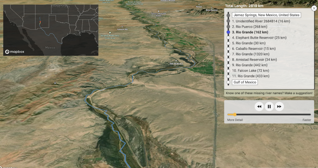
https://river-runner-global.samlearner.com/
Box Office Blockbusters: The Top Grossing Movies in the Last 30 Years
Team: Visual Capitalist

“This could have been a boring bar chart but instead the guys Visual Capitalist created something unique that also provided extra information through the use of color grading for the distributor.
This is a great example of a fairly simple dataset but with an interesting and engaging execution that turns it into something special ” ~ @dannyashton
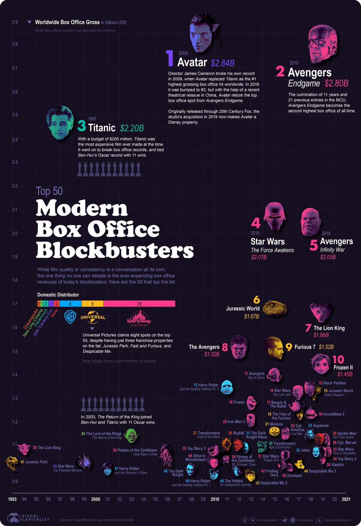
https://www.visualcapitalist.com/top-grossing-modern-movies-worldwide/
An Ocean of Books
Team: Google Arts & Culture

“A breathtakingly impressive site. The design and UI is phenomenal. Of course, it’s Google so you expect nothing less, but where this really shines is how engrossing and in-depth the subject matter is. I could easily spend hours just panning from island to island. I’ve discovered quite a few new books just by going to my favourite authors and seeing who is nearby.” ~ @jonnyaddy
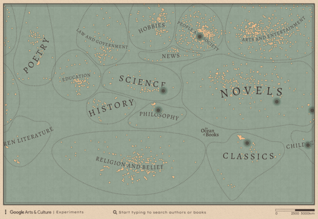
https://artsexperiments.withgoogle.com/ocean-of-books
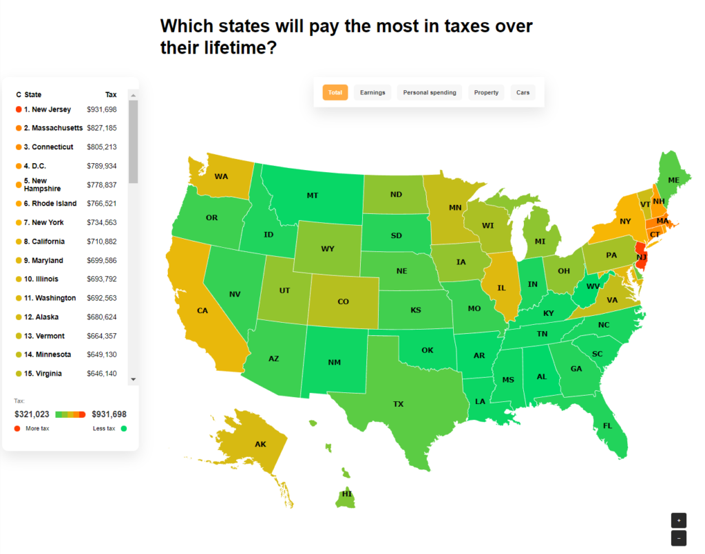
Life of Tax: How Much Tax is Paid Over a Lifetime
Team: Root Digital
“Our creative team must have heard me talking about this project many times since I first saw it.
The idea behind it is clear and straightforward, so it wouldn’t take a complicated subject line to convey the study when pitching a journalist. The execution is clean and simple, breaking down the findings into a handful of visual assets that give the reader the full picture and offer clear angles for the outreach team.
And when you get to the methodology, you can see the amount of thought and hard work that went into the study – but they made the whole thing look effortless! That’s a superpower right there.” ~ @ichbinGisele
https://www.self.inc/info/life-of-tax/
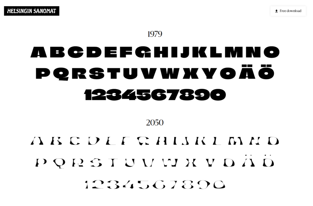
Climate Crisis Font
Team: Helsingin Sanomat
“This project has quickly meant I’m now obsessed with fonts that do more. The creativity in font format has meant that they’ve been able to highlight the issue of climate change in a way everyone can emphasise with, showing its impact through animations, graphs and chilling posters.” ~ @IonaJTownsley
https://kampanjat.hs.fi/climatefont/
Heinz Draw Ketchup
Team: Rethink Canada

“A nice example of a collaborative campaign based on simple insight, which was perfectly suited for the client.” ~ @daknys
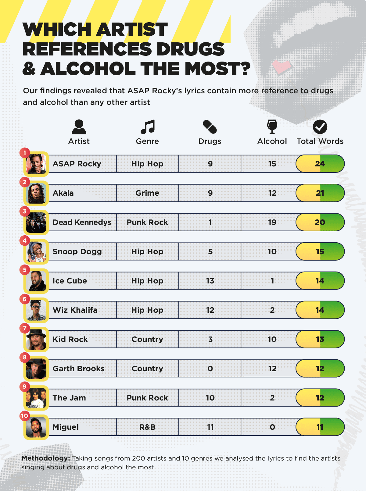
Analysing Taboo References in Music Genres
Team: JBH

“This project uses data to find out which musicians and genres mention sex, drugs and alcohol the most. It’s an interesting look at popular music and it’s also relevant to the client.” ~ @LukeDoylePR
https://delamere.com/blog/sex-drugs-and-rock-roll-analysing-taboo-references-in-music-genres
The Jargon of Jobs
Team: Verve Search

“From the robustness of the methodology to the client relevance to the breadth of angles, this project did a lot of things right.
What made it stand out for me, though, was how they rounded off the narrative at both ends, answering the “why is this important?” and “what can we do differently?” questions with well-curated studies and commentary from a linguistics professor, leading to a story complete enough for a standalone feature in The Guardian.” ~ @JBarnesyy
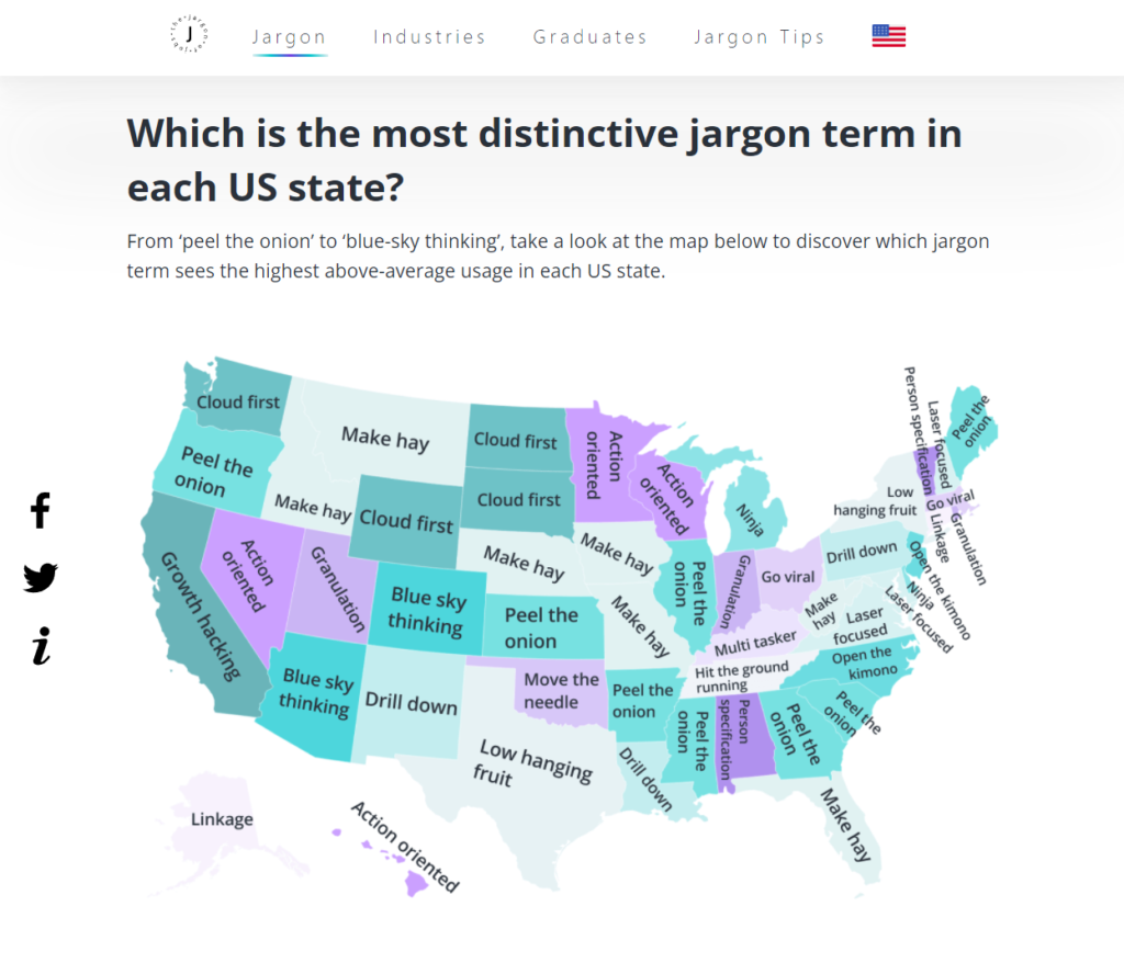
https://www.canva.com/business-cards/jargon-of-jobs/
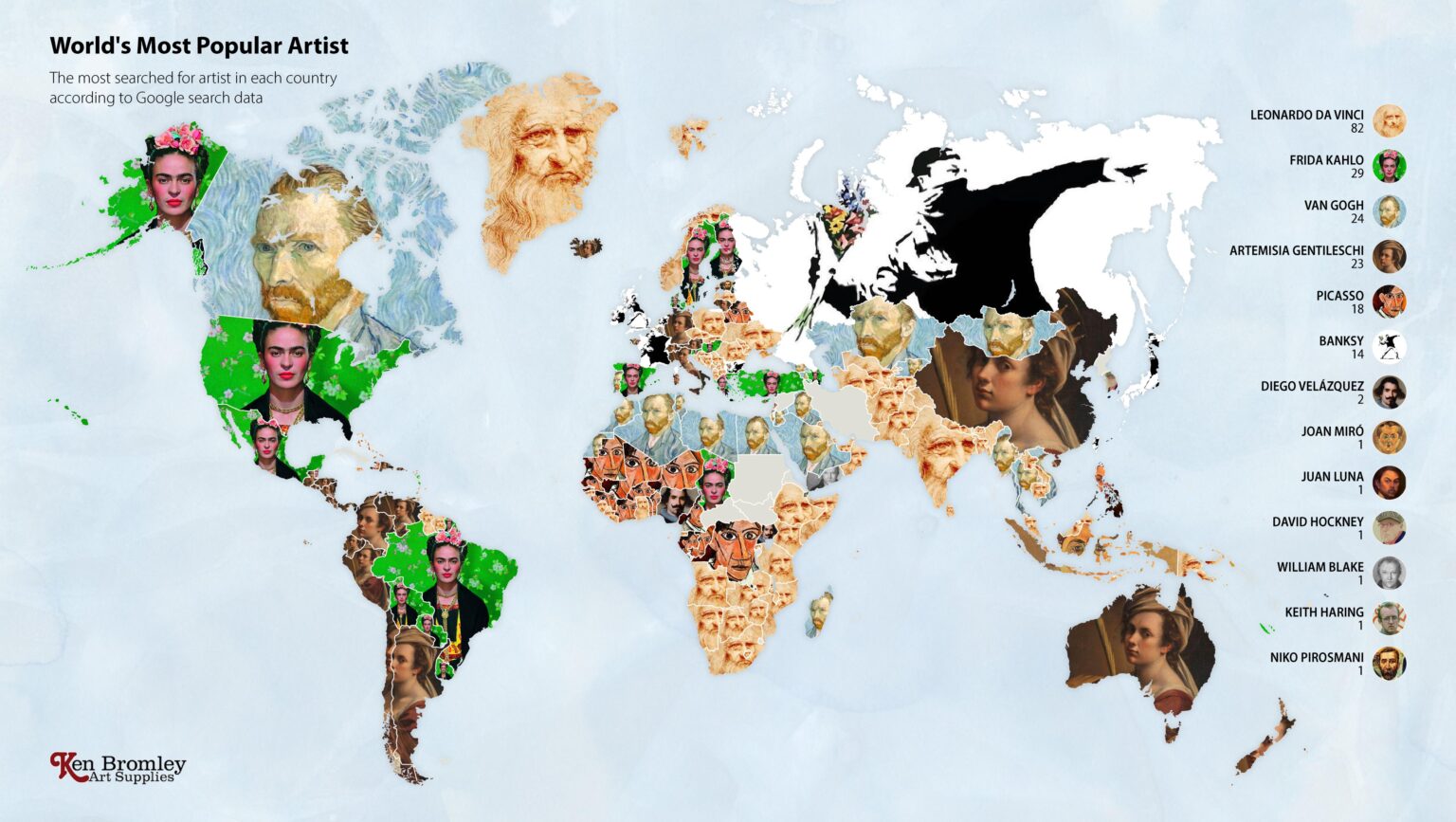
The Most Googled Artist in Every Country in the World
Creator: Gareth Evans
“Back in March 2021 this map was EVERYWHERE. It was one of those projects that kept being shared on social media, Google Discover, newsletters, Apple News – you name it. As new countries uncovered the content, you could see a new flurry of shares happening all over again. It was exciting to see, and it wasn’t even our project.
This is what we mean when we say we want to create content that people want to share. We try to trigger this snowball effect with every single one of our projects. Man, I really wish this was one of ours… ” ~ @dannyashton
https://www.artsupplies.co.uk/blog/the-most-googled-artist-in-every-country-in-the-world/
Empower Flowers
Team: Rise at Seven
“Sometimes the best ideas are the simplest, but simple doesn’t have to mean small. Interflora’s International Women’s Day campaign used the medium of flowers to visualise shocking gender inequality statistics.
The creative-first campaign, which included social assets and OOH ads, depicts gender bias in business using a blend of red and white roses. Smart, visually stunning AND it got people talking.” ~ @peaceyyy

https://www.interflora.co.uk/blog/empower-flowers
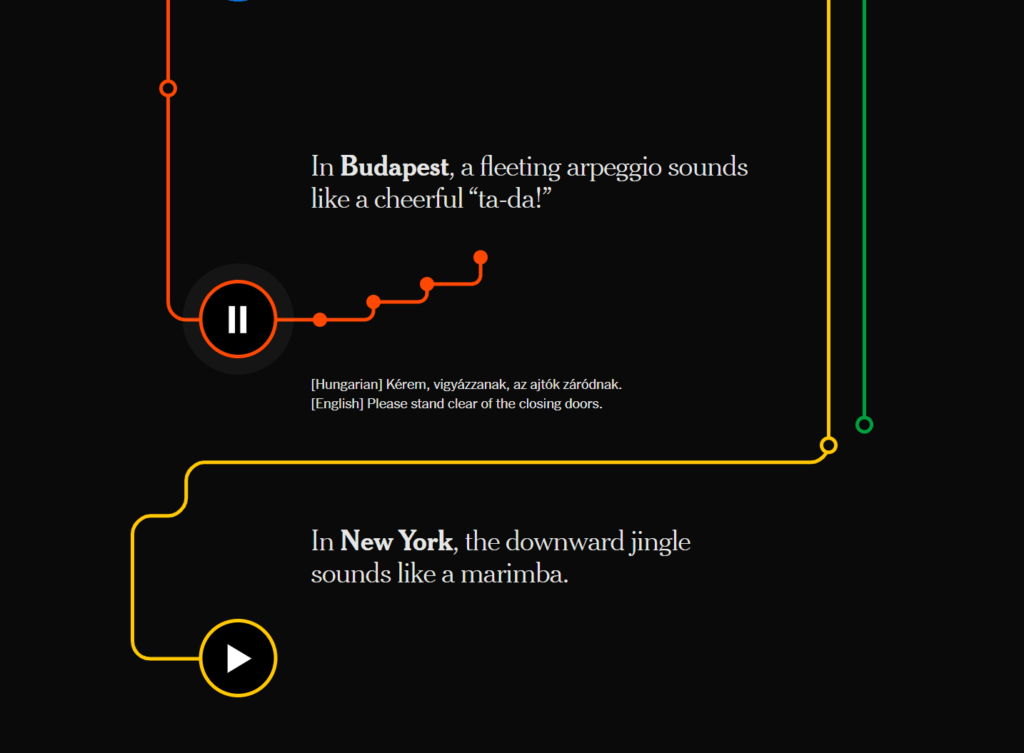
The Hidden Melodies of Subways Around the World
Team: The New York Times
“This engaging interactive piece made me feel I was travelling across the globe without leaving my chair.
The NY Times team collated a selection of subway announcements and door chimes from cities from around the world. This is the kind of simplicity I strive for when creating content.” ~ @ichbinGisele
https://www.nytimes.com/interactive/2021/08/13/arts/subway-train-sounds.html
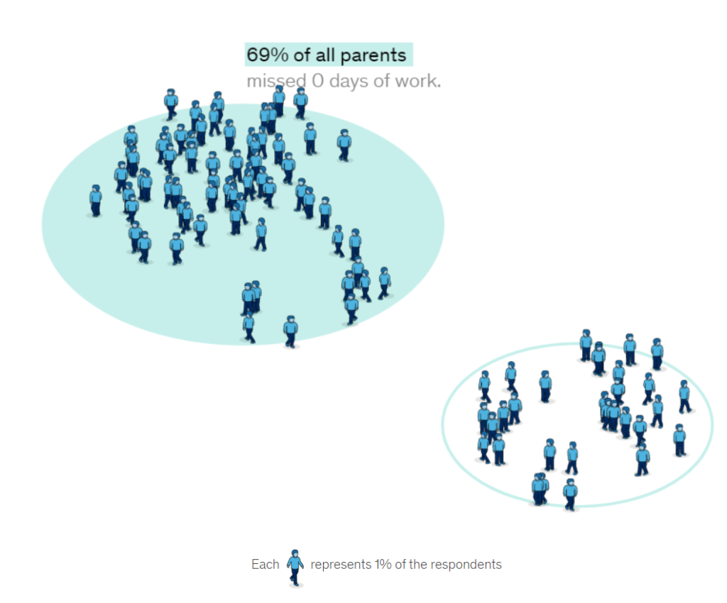
The Wellbeing of Working Parents
Team: McKinsey & Company

“This piece has everything: easy-to-navigate layout, well-organised data that will resonate with the audience, great visuals that show the human side of the campaign, and testimonies of people from all over the world to support the stats.
Jealousy list material through and through.” ~ @JazBatisti
https://covid-tracker.mckinsey.com/working-parents
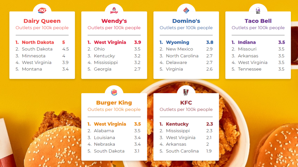
The Fast Food Capitals of America
Team: iProspect UK
“This project is a dream for outreach. The data can spawn great headlines for both national and regional press. I like how each fast-food chain has its own capital within the US, which again is great for regionals. This is reflected in the number of links it scored.
Plus the simple interactive design is easy on the eye and nice and straightforward.” ~ @thetweetinglee
https://www.nicerx.com/fast-food-capitals/
Twisted Toys
Team: 5Rights Foundation
“This project takes something that is often talked about in the news but presents it in a new and shocking way that makes the reader feel really uncomfortable.
A creative execution for an important topic.” ~ @IonaJTownsley
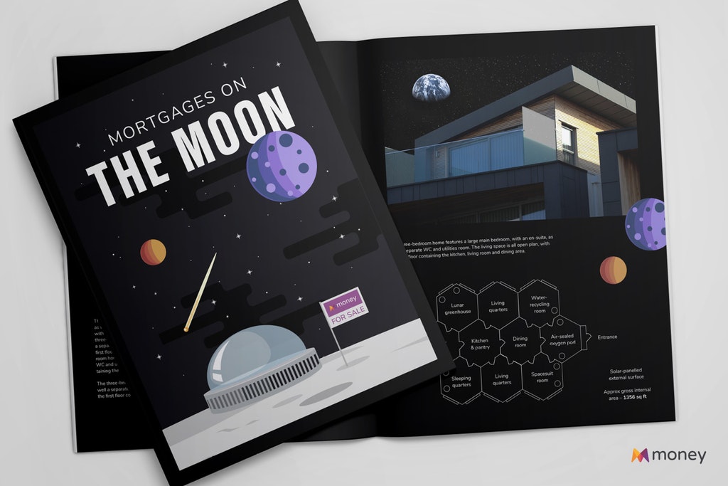
Mortgages On The Moon
Team: Rise at Seven
“People who know me will know how much I love anything space-related, so they won’t be surprised I picked this project for the Jealousy List 2021.
The visuals are simple and fun, making the whole concept seem plausible when you’re scrolling through the page. A lot of calculations have been done to reach the whooping figure of £44,525,536.42 as the expected cost to buy the first house on the Moon. I applaud the team behind this project, this was no small undertaking!” ~ @ichbinGisele
https://www.money.co.uk/mortgages/moon-mortgages
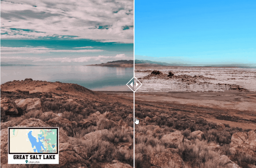
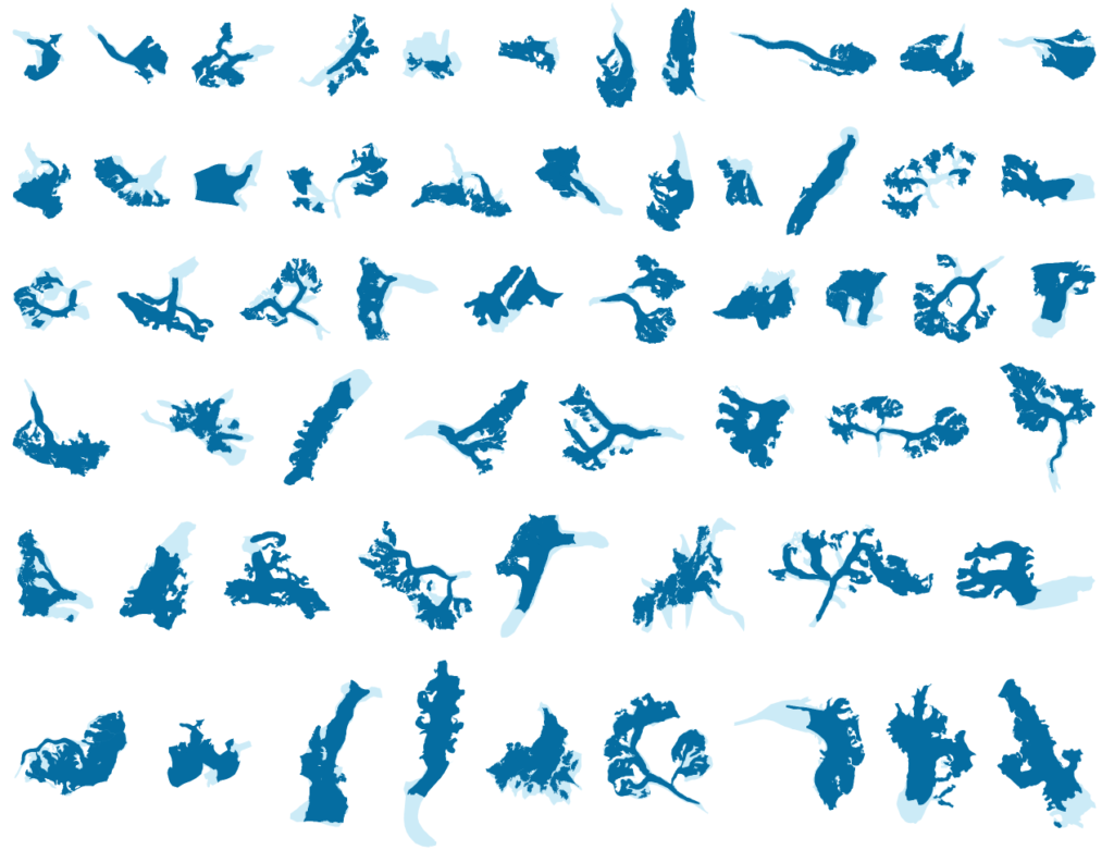
Glaciers Then and Now
Team: The Guardian
“This interactive reveals how the climate crisis is reshaping glaciers around the world. It’s simple, compelling and delivers an important message. Dream combination.” ~ @LukeDoylePR
https://www.theguardian.com/environment/ng-interactive/2021/apr/29/visualised-glaciers-now-and-then
‘Travel’ Postcards from Lockdown
Creator: Tomo Taka
‘I just really wanted to buy these…
I’m a big fan of any screencap feature in a video game. Some people spend hours completing difficult levels or finding every hidden item or speedrunning, but I’m spending all my free time getting Spiderman to do the perfect webswing in front of a nice sunset. J. Jonah Jameson would be proud.” ~ @jonnyaddy
Broken Screens
Team: Publicis Ecuador
“Art direction at it’s best – a smartphone screen is broken and the crackings looks like a map. With the message – that wherever you are in the city, you’ll find a way to fix it.” ~ @daknys
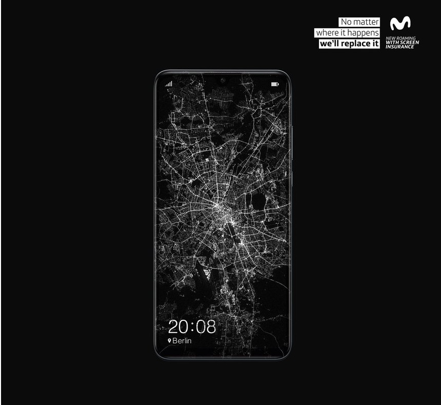
https://www.behance.net/gallery/104140179/MOVISTAR-SHATTERED-SCREENS-INSURANCE
The Most Beautiful Performance Cars According to Science
Team: Propellernet
“This was the first time I saw the golden ratio being utilised as part of a campaign, and I loved it! I’m a big fan of cars so this project interested me instantly as it uses a smart method to tackle the ultimate gearhead question: which are the most beautiful cars?” ~ @ichbinGisele

https://www.carwow.co.uk/blog/the-most-beautiful-performance-cars-according-to-science
Same Gender Lyrics
Team: The Pudding
“This project deep-dived into a topic that is so important for a large number of people, but again at the time hadn’t been given the platform it deserved. The way the data is presented with Lil Nas X sliding down a stripper pole as you scroll makes it so consumable and fun.” ~ @IonaJTownsley
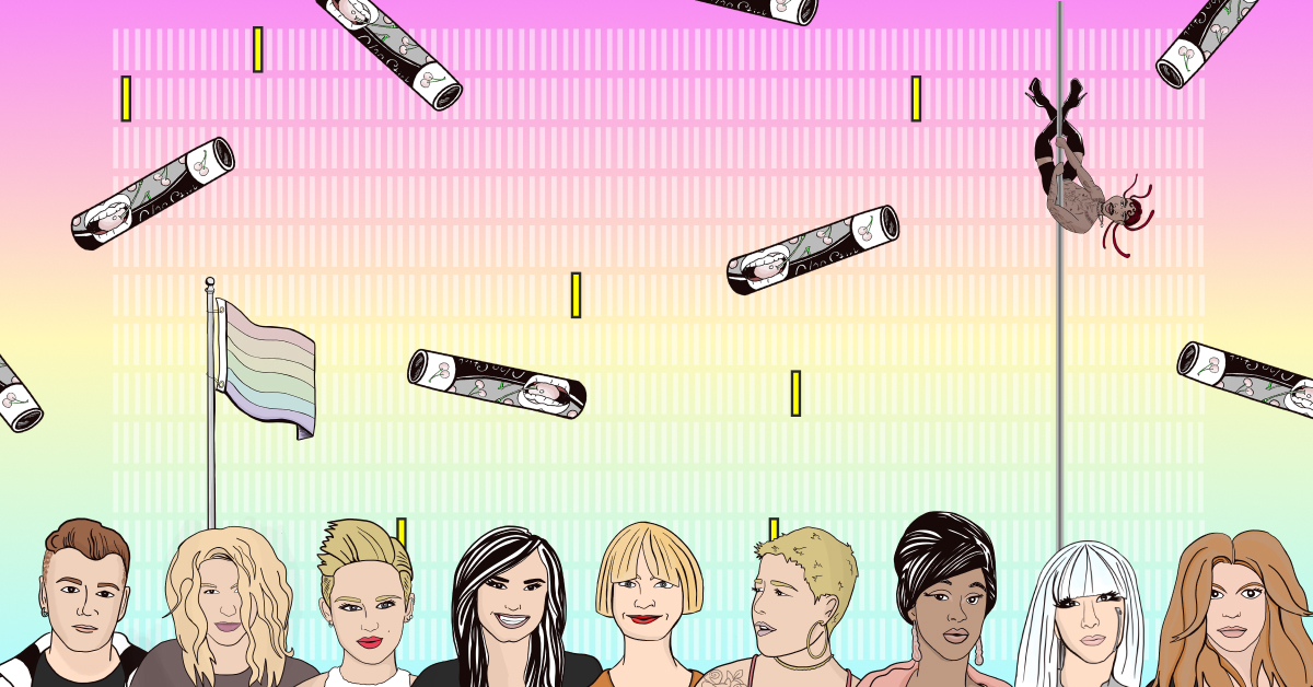
https://pudding.cool/2021/06/same-gender-lyrics/
The Pret Index
Team: Bloomberg Businessweek
“Bloomberg uses exclusive data from Pret based on the number of sandwiches they are selling week by week from locations across the world.
Every week this content is updated and really helps give you an idea of the current economic effects of the pandemic across a wide range of locations and areas.
Parallax content sometimes gets a bad name but Bloomberg shows that when executed flawlessly, it can be a great way to show a lot of information in a quick, efficient and engaging way. ” ~ @dannyashton
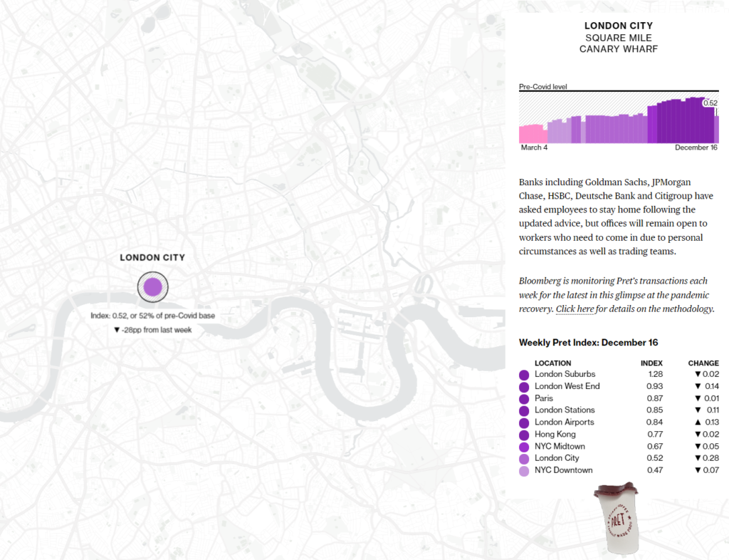
https://www.bloomberg.com/graphics/pret-index/
What Living With Dementia Looks Like
Team: Root Digital
“It’s a super simple use of slider images. They do a good job at switching perspective for the reader and the subtle with/without dementia differences are clearly explained under each image.” ~ @LukeDoylePR

https://www.amica.ca/conversations/what-living-with-dementia-looks-like
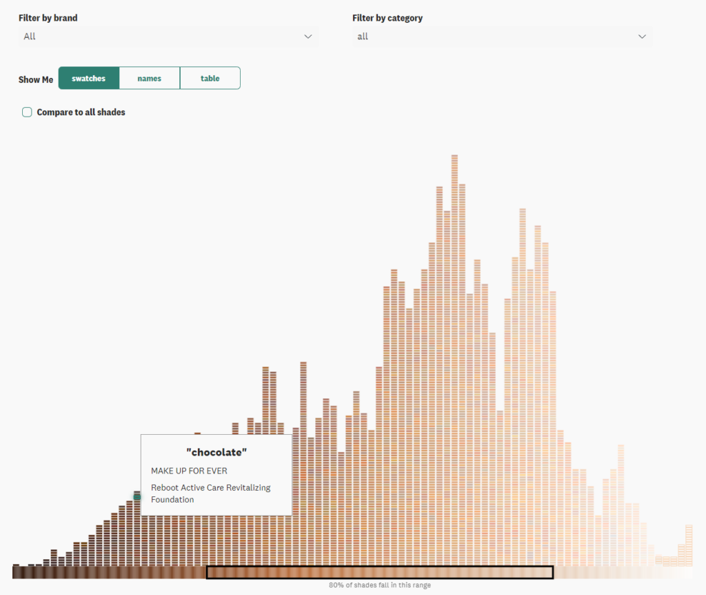
The Chocolate Box Collection
Team: Steven Stone
“We’ve seen Christmas chocolate campaigns before but this campaign by Steven Stone is just bloody delicious! It’s timely, it’s fun and the idea to combine a seasonal campaign with both their product and a product we all know and love, is genius.
Visually, it is stunning. The colours are rich and beautiful, and the level of detail in the jewel cuts is dreamy.” ~ @peaceyyy
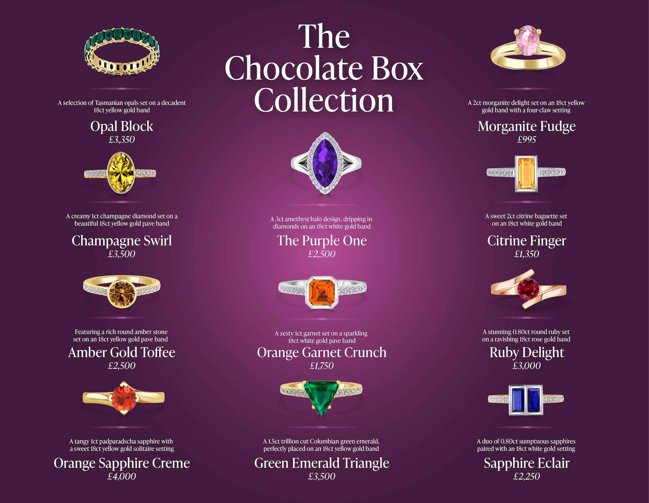
https://www.stevenstone.co.uk/quality-street
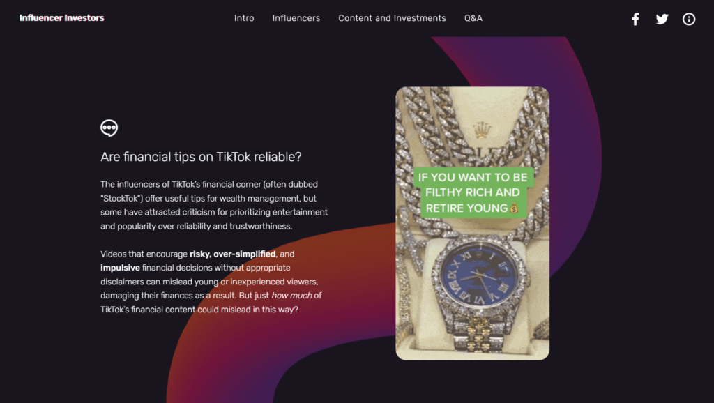
Influencer Investors
Team: Verve Search
“Team Verve is my agency crush and this project is a clear example of why that is.
The team set out to find out how common misinformation among TikTok’s finance influencers was at a time when everyone seemed to be talking about it. Articles on the topic were written without any hard data to back up the assumption of misinformation other than standalone examples, so that was exactly what Verve wanted to bring to the table: reliable data. They watched 25 consecutive videos by the top 50 most popular finance-focused TikTok accounts, and manually graded the advice that was misleading.
That must have taken A LONG time, but it definitely paid off considering their research was shared by the likes of the BBC, CNBC, The Conversation, and TheStreet just to name a few.
Verve’s Creative Director, Sean Fitzsimons, shared the behind the scenes of the project in this Twitter thread, so make sure to read it.” ~ @ichbinGisele
https://paxful.com/insights/influencer-investors/
The Classical Composer Worth Millions on Spotify
Team: Lemongrass Marketing
“I kicked myself when I first saw this campaign. The newsworthy hooks, the comparisons to modern-day songwriters, plus Bach in sunglasses — it was something I wish I had thought of! I’m a huge fan of the way this campaign takes historic people we have all heard of and brings them into the modern world using data analysis.” ~ @thetweetinglee

https://www.leipzig.travel/en/culture/music/
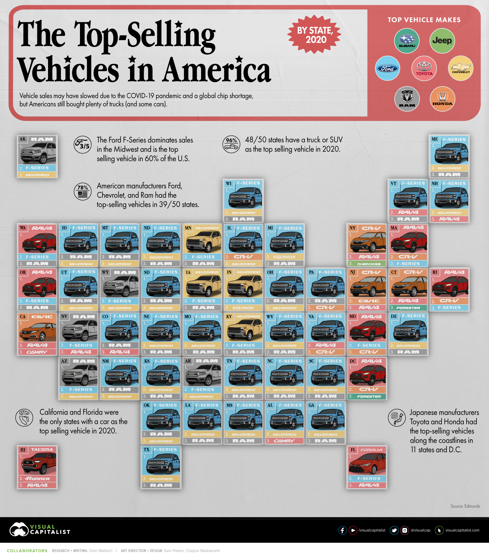
The Best Selling Vehicles in America, By State
Team: Visual Capitalist
“I love content that you can digest in less than a few seconds and this chart from Visual Capitalist is a great example of this.
Using simple imagery you are able to quickly get a grasp of the entire vehicle car market for the entire US by state” ~ @dannyashton
https://www.visualcapitalist.com/the-best-selling-vehicles-in-america-by-state/
Live Music Analyst
Team: The Pudding
“Last year, the Pudding Team gave us the iconic How Bad Is Your Streaming Music? campaign, where AI was used to judge your Spotify playlist. This year, they brought us the Live Music Analyst.
This time they built their own tool which allows us to compare studio recordings to some of the world’s biggest artists to their live performances of the same tracks. Launched during a time when music lovers were longing to return to gigs, this fun and interactive tool delivered. Anything which combines music and data gets a yes from me.” ~ @peaceyyy
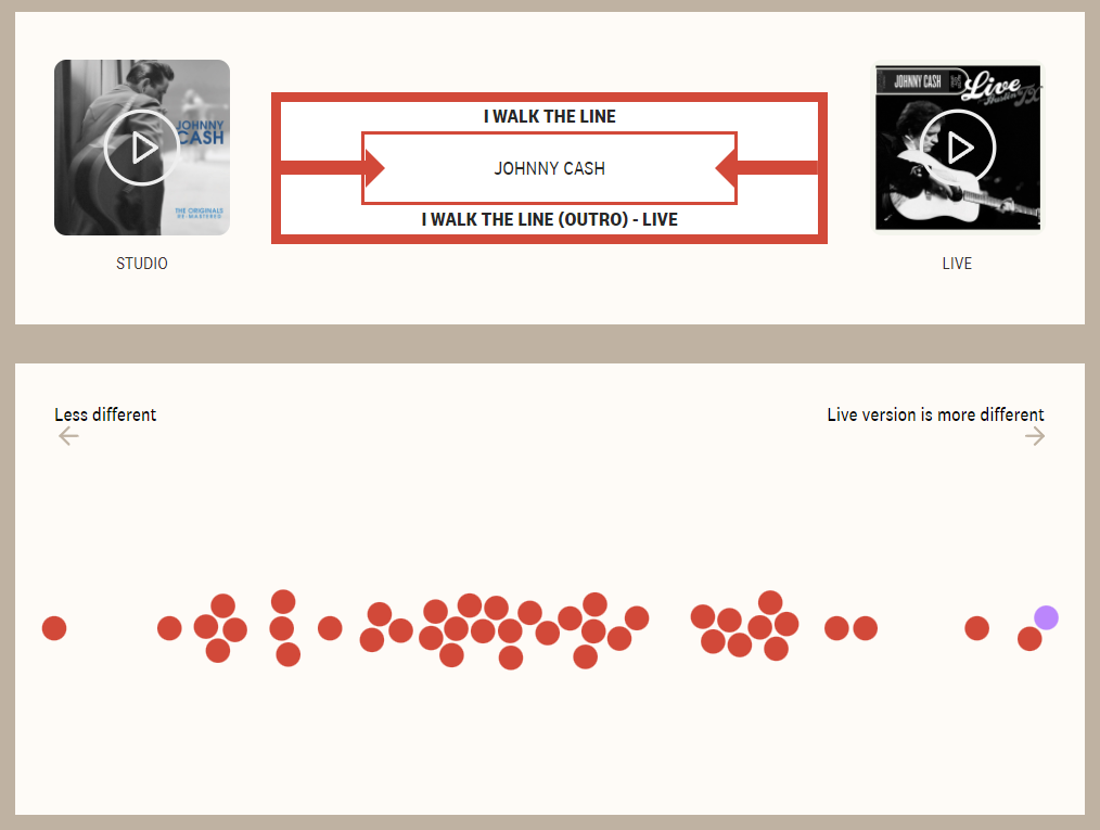
https://pudding.cool/2021/02/jukebox/
Volkswagen Horror Movie Posters
Team: DDB Sydney
“When this project was released, it was EVERYWHERE. Volkswagen created horror movie posters of some of the scariest things to happen on the road, taking mundane tasks that might be easy for some and highlighting how they’re the biggest nightmare for others.” ~ @IonaJTownsley
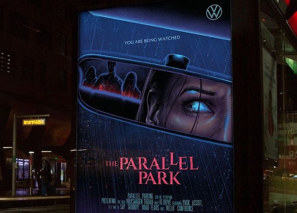
https://www.creativereview.co.uk/volkswagen-road-fears-horror-movie-posters/
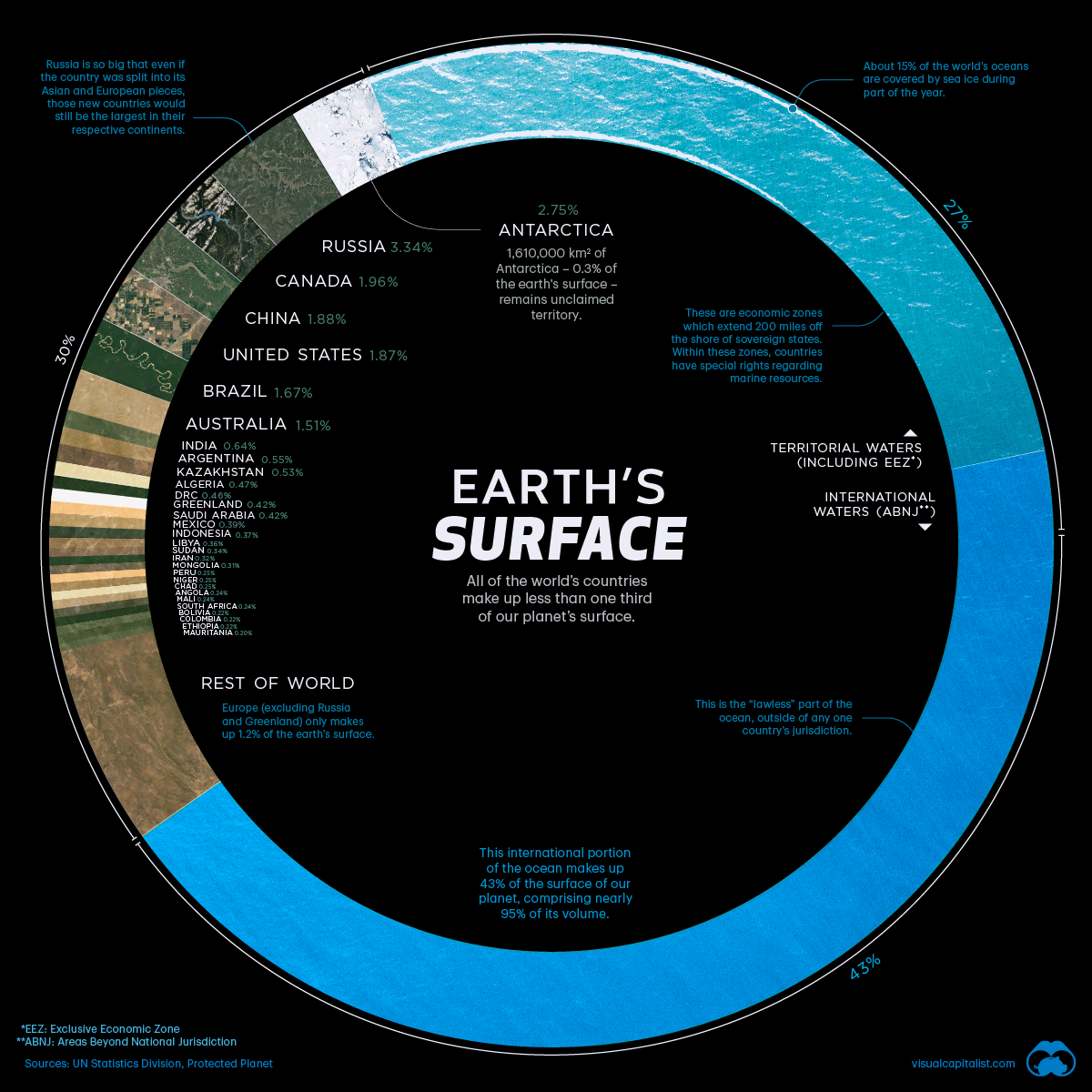
Visualizing Countries by Share of Earth’s Surface
Team: Visual Capitalist
“There is something so captivating about this visualisation, it keeps pulling me in no matter how many times I’ve seen it. I love it because it manages to simplify an awful lot of information into a simple, easy-to-digest graphic that anyone can understand.” ~ @ichbinGisele
https://www.visualcapitalist.com/countries-by-share-of-earths-surface/
What Are The Most Popular Takeaway Choices Around The World?
Team: Propellernet
“This is one of those campaigns that’s nice and straightforward, with some interesting results. I love how the map gives an at-a-glance insight into the appetite of each country. I also love the fact that the data was collated from 2020 (the year of the takeaway) making it all the more newsworthy for nationals and regionals.” ~ @thetweetinglee
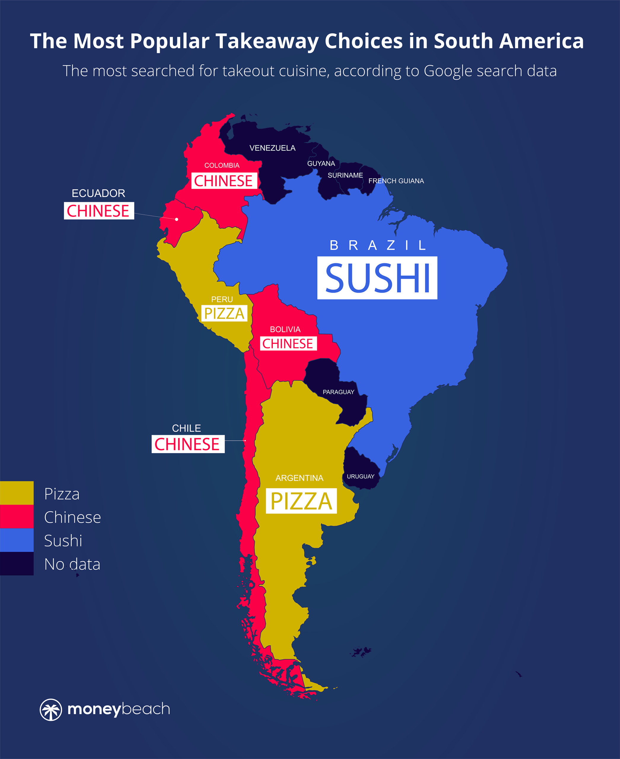
https://www.moneybeach.co.uk/the-boardwalk/the-worlds-favourite-takeouts/
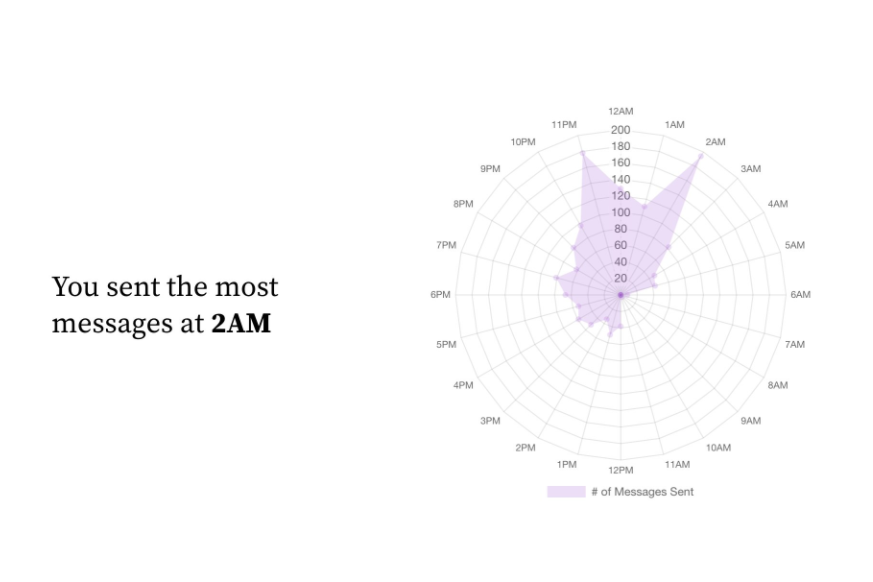
Hinge Wrapped
Creator: Niko Draca
“I don’t know if this is a campaign, but it sure makes me wish I had thought of it and made it into one. Earlier this year, my friend Sofi posted this tweet that I thought was really funny. Sadly I failed to see the opportunity for a great piece of content. Fast forward to last week, she shared this improved version of her “Hinge wrapped” that Niko Draka did.
Dating apps are a very hot topic and some very fun insights can be pulled from it. I would’ve loved to create a tool for people to see their year on dating apps and pull interesting stats that they’d want to share. I’m kicking myself for not s?t?e?a?l?i?n?g? borrowing my friend’s Sofi’s idea when I had the chance.” ~ @JazBatisti
Visualizing the Power Consumption of Bitcoin Mining
Team: Visual Capitalist
“At this point we had all seen the headlines for how much electricity bitcoin mining generates but this content really helped us to visualise how this compared to something concrete like Google or the country of Norway” ~ @dannyashton
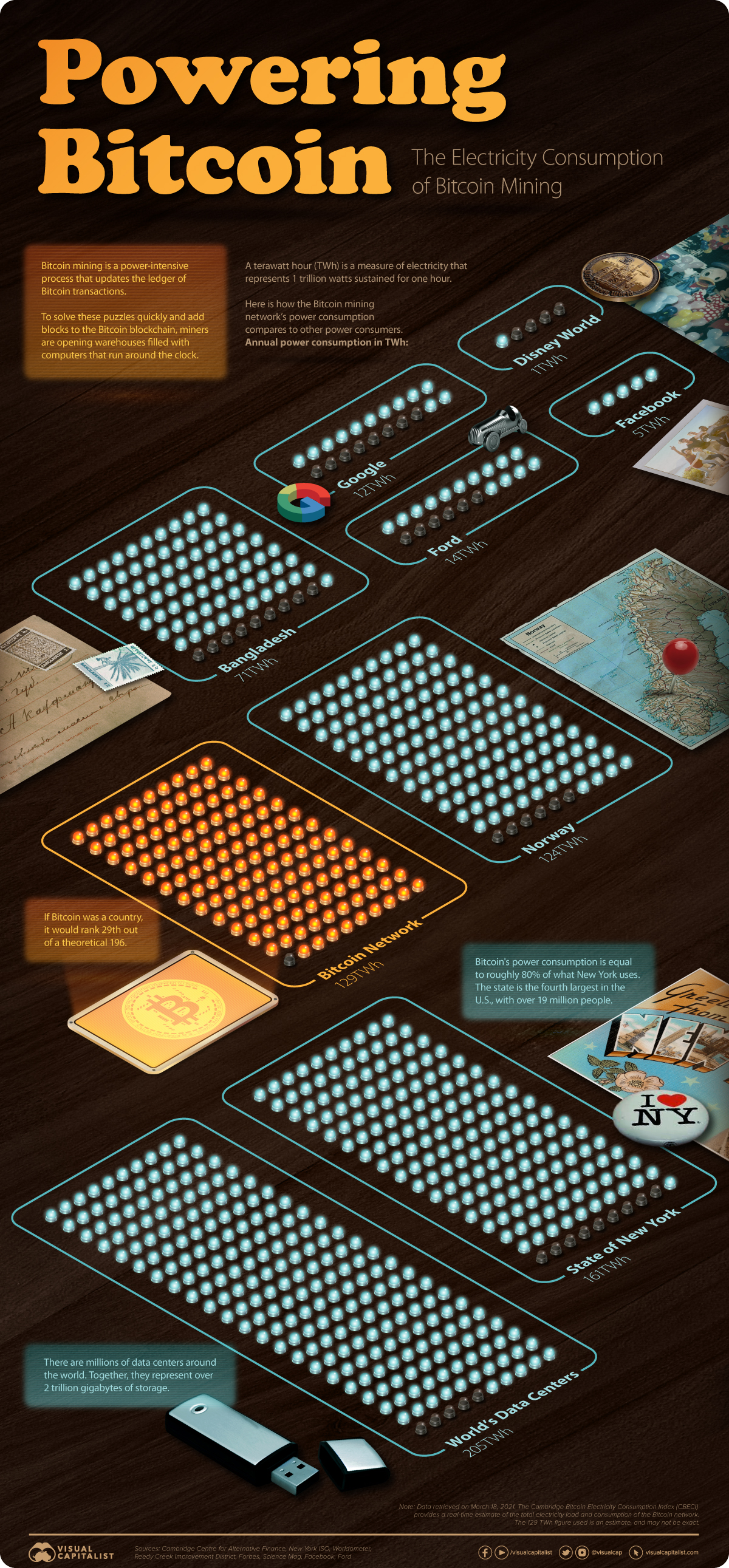
https://www.visualcapitalist.com/visualizing-the-power-consumption-of-bitcoin-mining/
How Inflation Works
Team: FinMasters
“This is hands down the best piece of informational content I’ve read this year.
This article not only defines inflation but it also: visualises how it has changed through the years in an engaging way + includes a calculator for the reader to quickly see how the buying power of the US dollar has changed over time + breaks down what causes inflation + curates the most unique products that can be found in the Basket of Goods from different countries + ranks the worst cases of hyperinflation in the last 100 years. A thing of beauty.” ~ @ichbinGisele
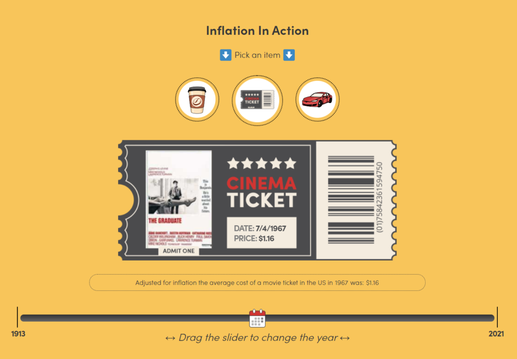
https://finmasters.com/how-inflation-works/
The 2021 Uber Lost & Found Index
Team: Uber
“This is a really clever use of internal data that picked up links around the world, showing that you don’t necessarily need visuals for a campaign to take off. It’s also a reminder that clients might be sitting on untapped data that could lead to a successful project.” ~ @LukeDoylePR
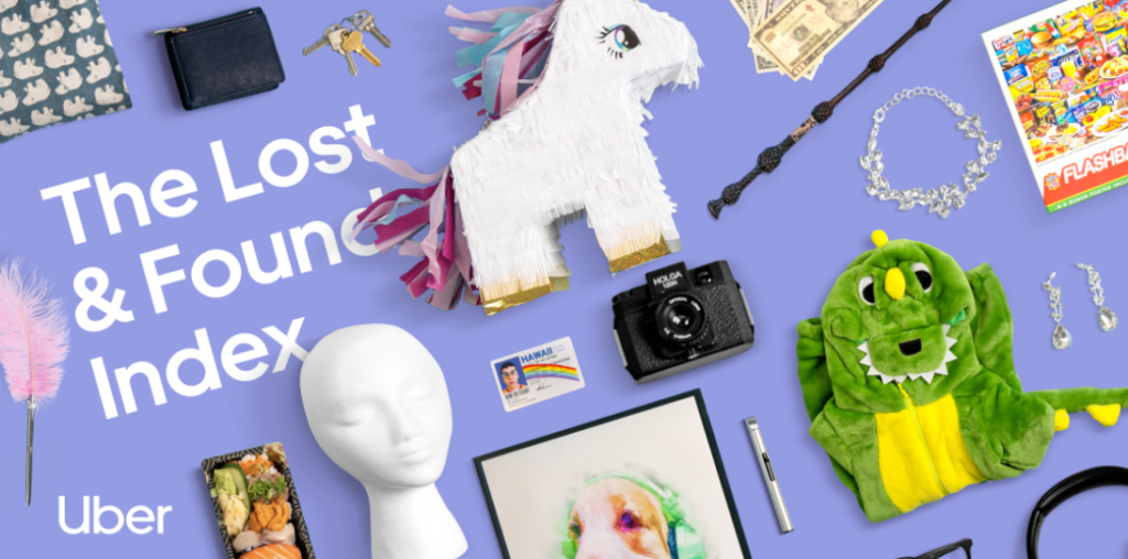
https://www.uber.com/newsroom/2021-uber-lost-found-index/
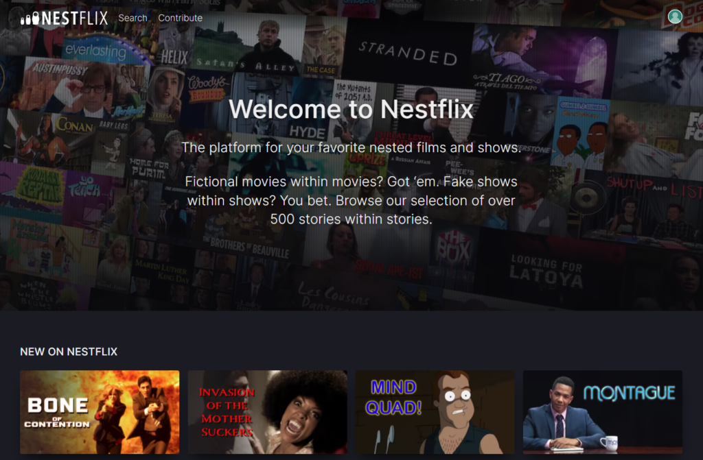
Nestflix
Creator: Lynn Fisher
“My favourite project of 2021. This was seemingly done for a bit for fun by designer Lynn Fisher, but I can’t help imagining how much of a dream this would have been to pitch (not that it would need it to get links, having already accrued well over 1,000).
The sheer number of fictional titles (over 500) to cycle through transforms what could have just been an esoteric diversion for film aficionados into a treasure hunt for all. A brilliant concept executed flawlessly.” ~ @JBarnesyy
Content that inspires
When we first set out to curate the content that inspired us throughout 2020, we did it to celebrate creativity and craftsmanship in a year when we were all going through a hard time.
We didn’t think twice about whether shining a light on other teams would make us look bad. We honestly didn’t care if it did; we just wanted to inspire others.
It meant so much to us that we decided to curate a new Jealousy List every year. We hope this year’s content inspired you as much as it inspired us.
Hats off to everyone behind these projects from the NeoMam team!


