

This is the third installment of our Jealousy List, a compilation of great digital content we wish we made that was originally inspired by the Bloomberg Businessweek’s team. You can browse through previous editions of our Jealousy List here: 2020 and 2021.
This year we watched as many teams moved away from hero campaigns (a.k.a. content that requires a big investment of time and money to produce) in favour of a reactive PR/newsjacking approach. We discussed whether it made sense to continue with our Jealousy List if this would mean most of the content won’t come from teams like ours. In the end, we decided to go ahead because great content has the power to inspire everyone, even if the end result will be reactive stories.
Keep scrolling for amazing content we wish we had come up with ourselves.
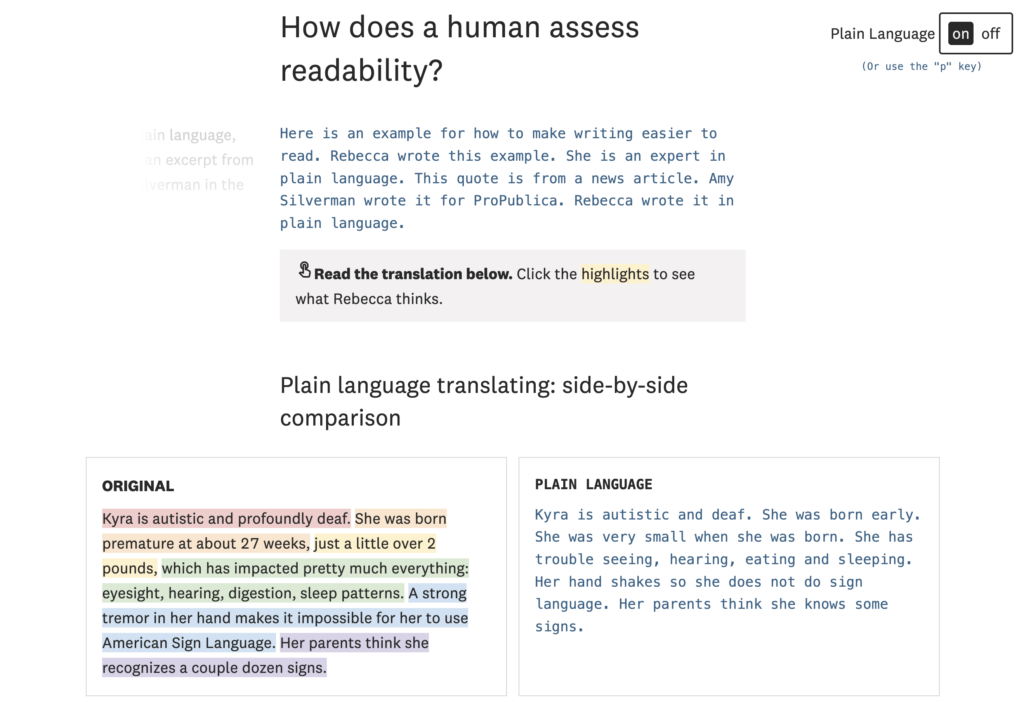
What Makes Writing More Readable?
by The Pudding
“I feel like recently there’s been a real push in making things more accessible, whether that’s in design or our everyday lives. This project by The Pudding highlights that we sometimes put up unconscious barriers for others in the way we write, whether for news media or academic papers. The authors do a great job of presenting us with the problem and helping us to explore the solution while simultaneously inspiring us to use plain language ourselves” ~ @IonaJTownsley
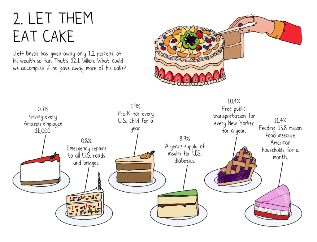
9 Ways to Imagine Jeff Bezos’ Wealth
by The New York Times
“I’m always a fan of content that puts big figures into perspective in the context of everyday life, and that’s exactly what this piece did. For example, if we imagined that the width of an Oreo represents the median net worth of a US household, then you could say that Bezos’ wealth is twice the width of the Grand Canyon ?” ~ @ichbinGisele
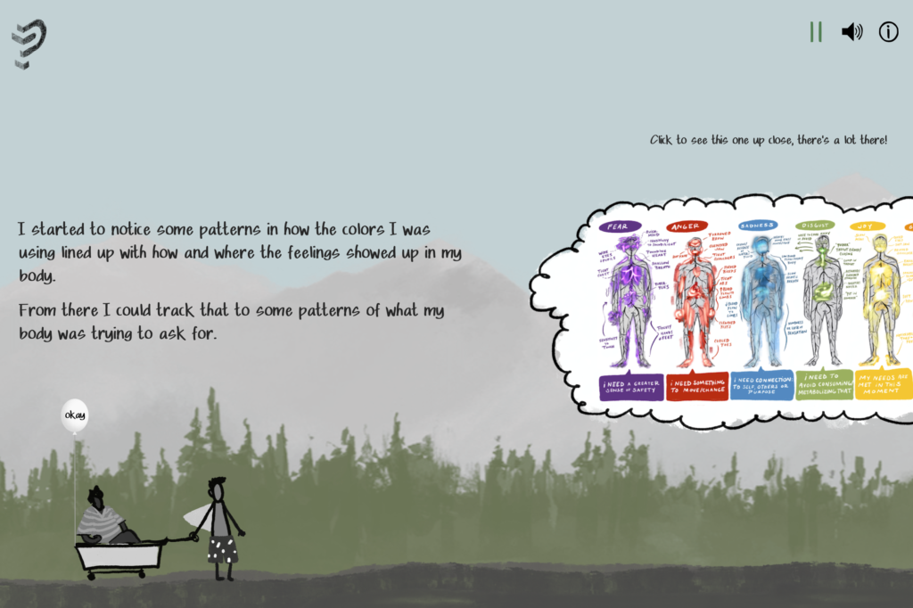
The Emotion Wheel
by The Pudding

“When it comes to data visualisation and storytelling, The Pudding are simply one of the best. This original concept takes a question that perhaps we often answer too simply or too quickly “How Are You Doing?” and offers tools and resources to encourage readers to gain emotional awareness and identify exactly how they’re feeling. Not only is it a good resource for those who struggle to describe their emotions, but the format of the Emotion Wheel also offers a beautiful, immersive user journey. ” ~ @peaceyyy
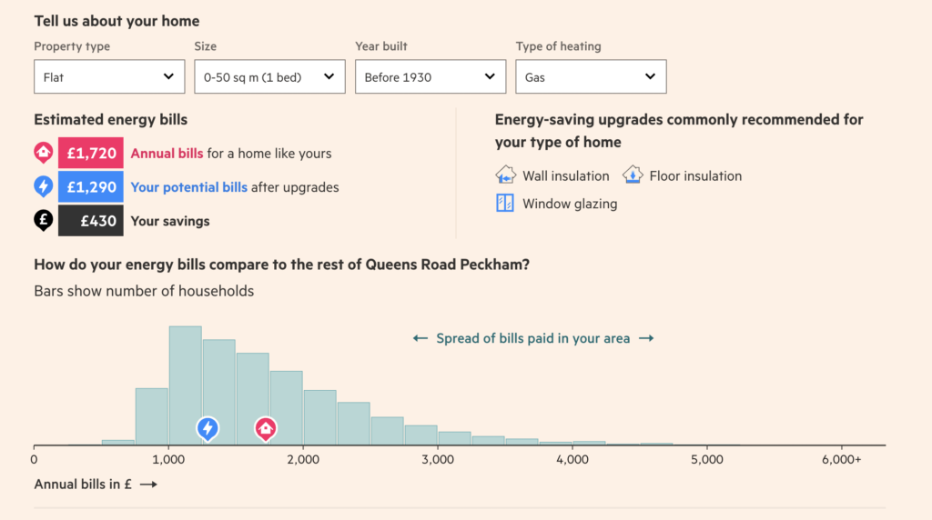
How UK Households Could Save £10bn A Year By Making Homes More Energy Efficient
by Financial Times
“The Financial Times’ energy savings tool explores two big questions that most of us were asking in 2022: how can I spend less money on energy? And how can I use less energy in general? Their research estimates how much can be saved nationally, per postcode, and in comparison to the rest of the country from common energy performance upgrades. It’s neatly visualised, encourages exploration and sharing, but also guides the narrative to inform the reader on some lesser-known, underlying issues related to the energy performances of the UK’s housing stock.” ~ @seand_f
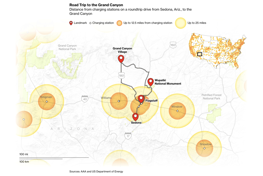
Great American Road Trips Are Impossible for Most Electric Cars
by Bloomberg Graphics
“I know first-hand the pain of having to factor in EV charging stations when planning a longish trip with the car, so this article drew me in as soon as I read the headline. The Bloomberg team did a brilliant job simplifying the topic of EV range by laser-focusing on the most popular American road trips as determined by AAA. Smart data analysis paired with clean and easy-to-understand visual execution is the recipe for content I wish our team has created.” ~ @ichbinGisele
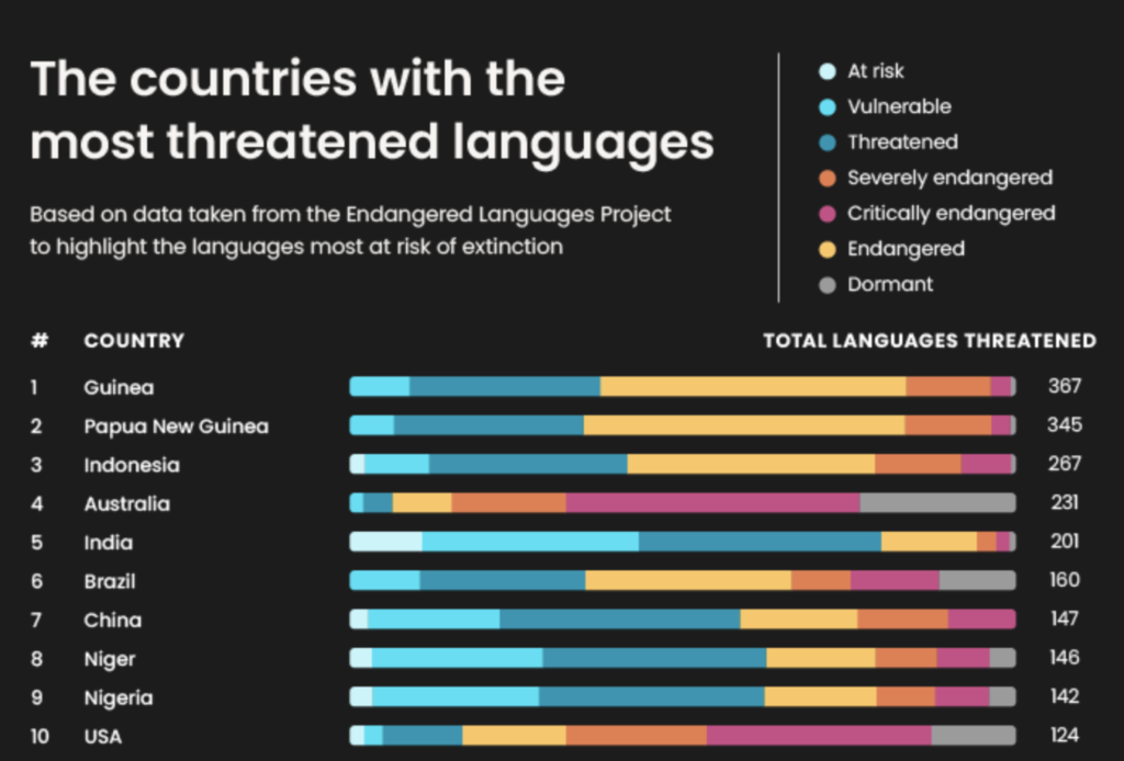
SOS: These Languages Are Most Endangered in the World
by Rise At Seven
“This was a great campaign for Preply, as it’s a perfect fit. Endangered languages isn’t a new topic by any means, but this campaign feels like it explored every corner of the world and it feels robust and like a granular report. This type of data is perfect for regional titles, who I’m sure were excited when they received it in their inbox.
I also really like the accompanying simple graphics that focus on the lost words and meanings, rather than anything else.” ~ @thetweetinglee
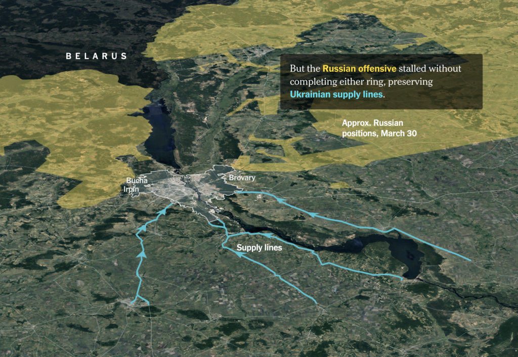
How Kyiv Has Withstood Russia’s Attacks
by The New York Times
“Using a combination of maps, satellite imagery and video and a slick interactive format, you get so much information in a digestible way. It helped me to understand what happened during that intense period spanning one month and six days.
My favourite part was the fact that the NY Times team reached out to seven major experts to help tell this story, and supported their explanations with satellite imagery and control area data from respected sources.” ~ @dannyashton
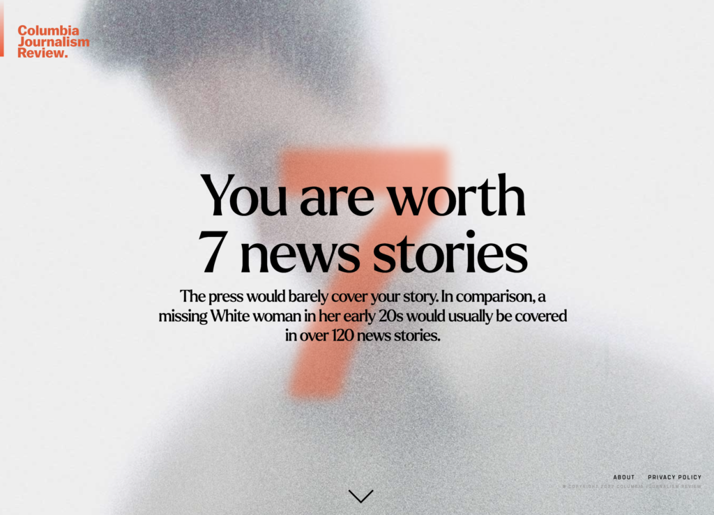
How Much Press Are You Worth?
by Columbia Journalism Review
“I love love love when people take tough topics to talk about and make them relevant to the reader. This project shows how much press you would be worth if you’d gone missing in America, asking for information such as your age, gender, ethnicity and location. It provides a stark reminder that not everyone is treated equally.” ~ @IonaJTownsley
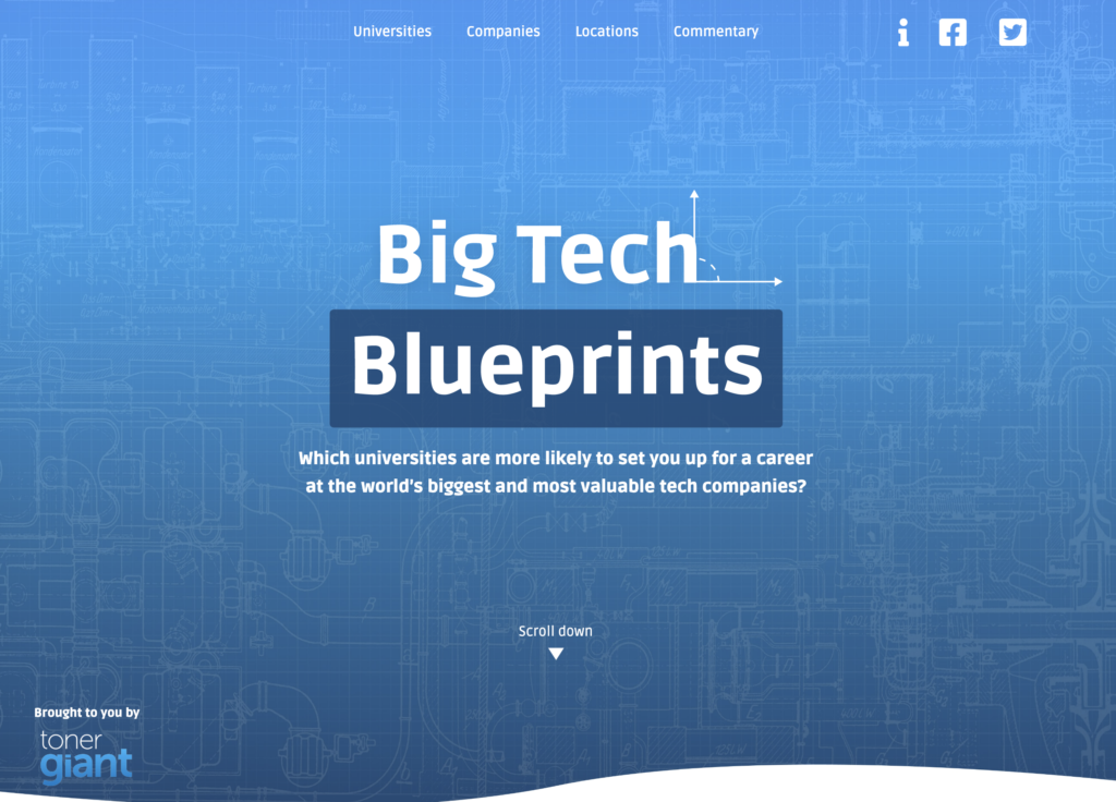
Big Tech Blueprints
by Verve Search
“Team Verve Search has a gift for creating truly interesting studies. With this project, they uncovered the universities more likely to set you up for a career at the world’s biggest tech companies. But they didn’t stop there, in addition to identifying the top universities, they also worked out the UK regions. and US states that produce the most big tech employees. A solid idea executed beautifully, in true Verve Search fashion.” ~ @ichbinGisele
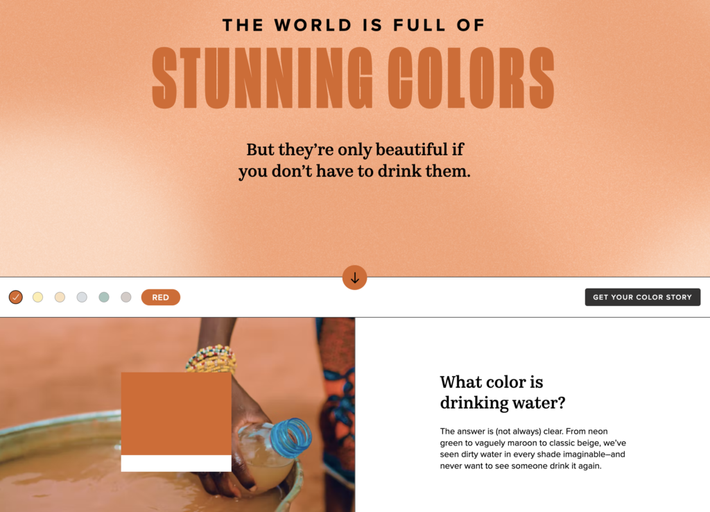
The Colour of Dirty Water
by Charity Water x Pantone
“I’m a sucker for a campaign with a cause. To recognise World Water Day, Pantone partnered with Charity Water to highlight how 1 in 10 people are living without access to clean water. While the colours may be nice to look at, they’re inspired by the authentic colour of drinking water found in communities around the world.
Although this isn’t a hero content campaign, it’s a strong example of how data visualisation can highlight important issues and get people talking. Thanks to Pantone’s colour expertise, and the detail of research, this simple but effective execution speaks volumes. ” ~ @peaceyyy
The Art Of The Problem
by Samsung
“Using data to inspire new art has been a common theme of 2022 when you consider that millions of AI-generated images are now appearing online each day. In this example, it was a targeted survey’s results that inspired the work of artist Quentin Devine to reimagine several famous artworks by depicting the most common concerns of Gen Z.
For me, this ‘reimagined’ format becomes even more meaningful and newsworthy when it’s reflecting both the views of a wider demographic and the imagination of an artist. Samsung launched this project as part of their Solve For Tomorrow competition, which asked 16 to 24-year-olds to design tech-driven solutions for some of modern society’s greatest challenges.” ~ @seand_f
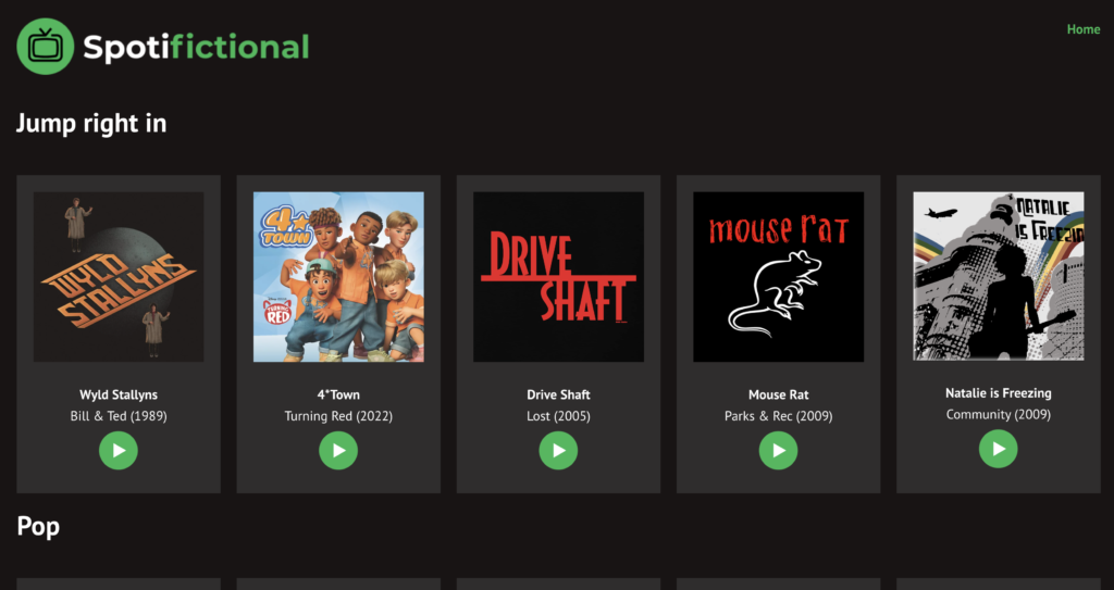
Spotifictional
by Alex Cassidy
“This year I’ve seen a lot of different projects inspired by the awesome Nestflix but none of them felt quite right until Spotifictional came about. This site is basically a sort of Spotify, but for fictional artists from film and TV. The similarity to Spotify makes this massive database easy to navigate, and Alex has gone the extra step by allowing users to actually play the music via YouTube or Spotify. Another cool thing about Spotifictional is that it offers the chance to readers to submit bands and artists that are missing through a simple contact form, allowing Alex to keep the website growing and evolving.” ~ @ichbinGisele
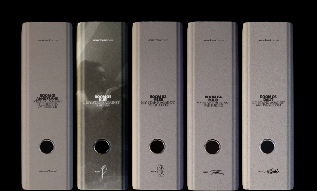
The Bookcase for Tolerance: Anne Frank House
by INNOCEAN
“The bookcase where Anne Frank hid from the Holocaust in 1942 was converted into a digital experience 80 years later. I love how stories about intolerance here were presented in innovative new ways. From digital design to app experience – all pieces came together perfectly to tell an engaging story and to fight discrimination through education.” ~ @daknys
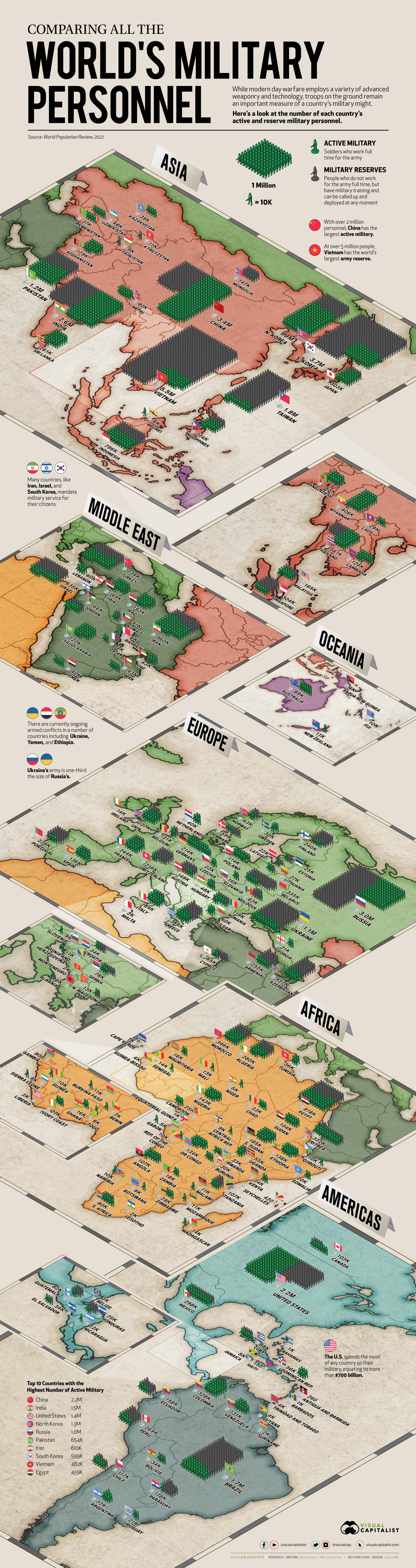
Mapped: All the World’s Military Personnel
by Visual Capitalist
“On 24 February 2022, Russia invaded Ukraine. This hit us close at NeoMam as our lead developer and his family are Ukrainian and lived there at the time. Reading more about military strategy helped me understand the news better, and this piece by VisualCap was part of those learnings. From a content perspective, I loved the execution of the map in an infographic format – particularly nice to explore on mobile.” ~ @ichbinGisele
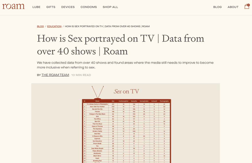
How Is Sex Portrayed on TV
by Novos
“I love content that analyses masses of dialogue from film and TV scripts. This campaign scraped 10 million lines of dialogue to search for sex-related keywords, revealing the most common themes in TV shows – from homophobia to pornography.
Not many clients could pull this off but it’s a perfect fit for Roam. While the content is lacking an interactive element, it’s thought-provoking and could lend itself to a series of follow-up campaigns.” ~ @LukeDoylePR
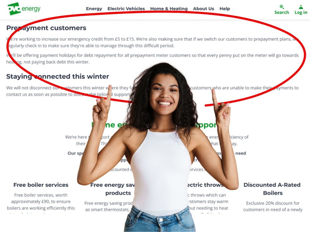
Nearly 300,000 Households on Prepayment Meters Face Debt Trap Headed Into Winter
by Tom J. for DebtBuffer
“This freedom of information request shows how powerful Digital PR campaigns can be with an exclusive, timely story that drives important conversations around an issue and forces positive change. Despite already retrieving interesting information from an FOI request to Ofgem, Tom spent more time researching why the dataset was so important and discovered a scandalous policy that UK energy companies were enacting on their prepayment meter customers who were already in debt. The impressive outreach results of this research were topped off by OVO energy announcing a winter debt repayment break for their customers to be able to heat their homes with 100% of their payments.” ~ @seand_f
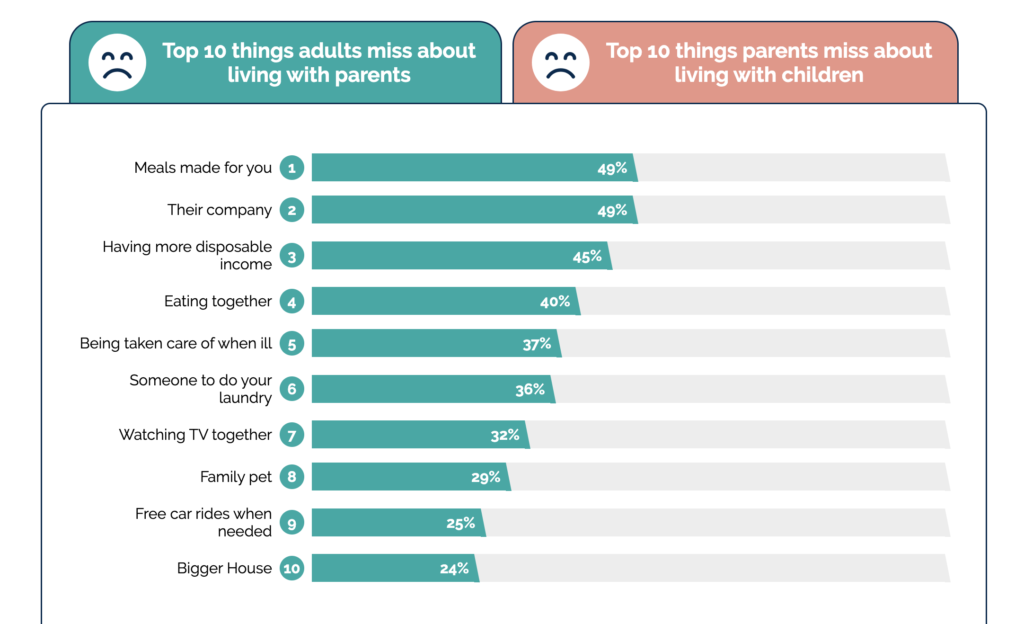
What Do Children Miss About Living With Their Parents?
by iProspect
“There is something so emotional and relatable about this piece of content… I could connect to it both as a daughter and as a mother, and it made me feel both nostalgic and grateful. I loved the idea, the design of this survey and the beautiful illustrations that break down the simple charts showcasing the survey results.” ~ @ichbinGisele
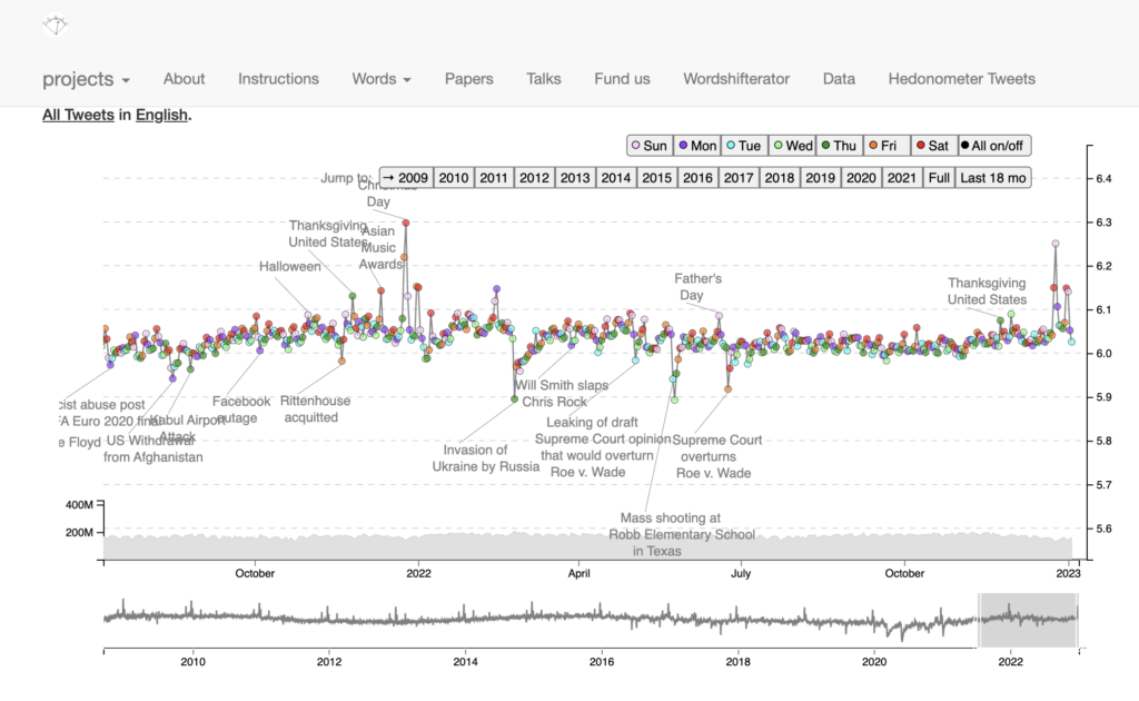
Average Happiness for Twitter
by Hedonometer
“I love the insight that this happiness tool gives. The simple graph shows the peaks and troughs of sentiment on social media. There are clear highs on days such as Christmas Day, and sharp lows at events that rocked the world such as the invasion of Ukraine by Russia.
This tool is simple yet very effective and gives us PRs room to think about when we should launch campaigns. If we’re going to launch an upbeat campaign while morale is low, should we wait?” ~ @thetweetinglee
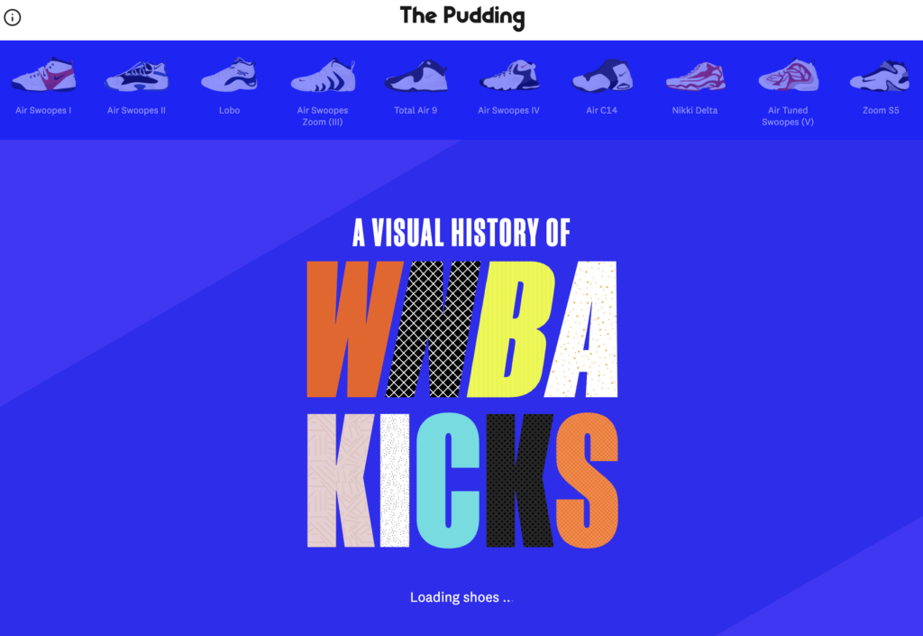
A Visual History of WNBA Kicks
by The Pudding

“The simple but bold execution of this piece from The Pudding is an absolute joy to explore. Featuring a series of key WNBA player signature models from 1995 to today, each shoe smoothly morphs from one to another using a javascript library called Flubber, and includes some useful context about each WNBA player and their pro model shoe.
Plus, for sneakerheads like me, you can even buy the collection as a poster. What’s not to love?” ~ @Ed_Duffill
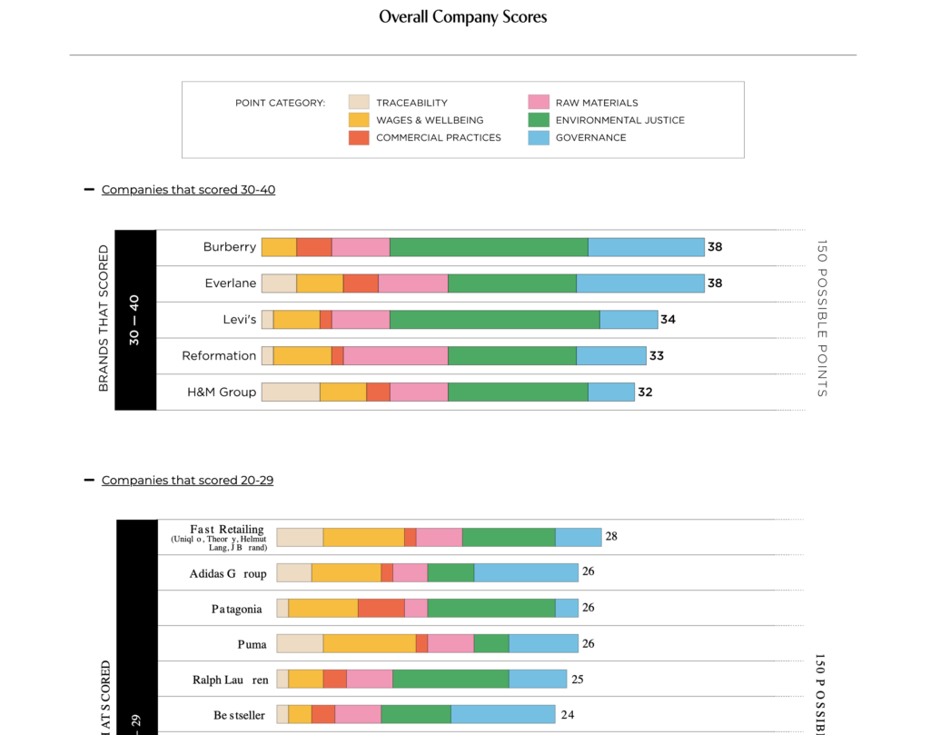
2022 Fashion Accountability Report
by Remake
“When companies go to the effort of slogging through tons of manual data in search for transparency, you know the campaign is going to be good. Remake created an index where they looked at the world’s largest fashion brands and scored them on metrics such as commercial practices, traceability and governance. They then compared each company and provided people with a transparent report to help them cut through the manipulation and greenwashing.” ~ @IonaJTownsley
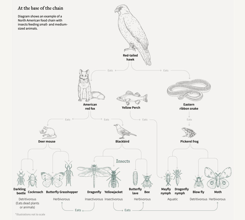
The Collapse of Insects
by Reuters Graphics
“Putting the global Insect Apocalypse into context. The example of one food chain with insects at its base caught my interest immediately and from there, I couldn’t stop scrolling to learn more. Excellent visual storytelling on an important topic most of us will hardly think about.” ~ @ichbinGisele
Honorary mentions
The Apple Car
by Evolved Search
“I’ve shocked myself by picking a car campaign, mainly because I never usually have an interest in anything automotive. But as this campaign idea uses patents from Apple, it really caught my attention. This shows it has mass appeal as if it sparked interest beyond its intended target audience. The renders are sleek, and the interactive tool gave it an added bonus. This would have been a fun one to outreach!
This project should have made it to NeoMam’s 2021 Jealousy List but I didn’t see it in time.” ~ @thetweetinglee
Fast Fashion’s Use of Dark Patterns
by Screaming Frog
“This project should have made last year’s Jealousy List as it was published in September 2021 but I didn’t see it till the beginning of 2022. I decided to include it because of how much I like it and how many times I’ve referenced it when talking to other people throughout this year. A smart methodology followed by a simple execution that went on to make headlines all the way to the BBC. Outstanding.”~ @ichbinGisele
Content that inspires
Inspiration is a tool for creation. The day we stop marvelling at the work of others is the day we stop growing. Nothing comes out of thin air, and that’s okay. Let us enjoy the full process, from inspiration to creation, and stop glamourising ‘aha moments’ born from pressuring yourself to be 100% original.
Hats off to everyone behind these projects <3 And thank you for making the internet a better place with your awesome content.


