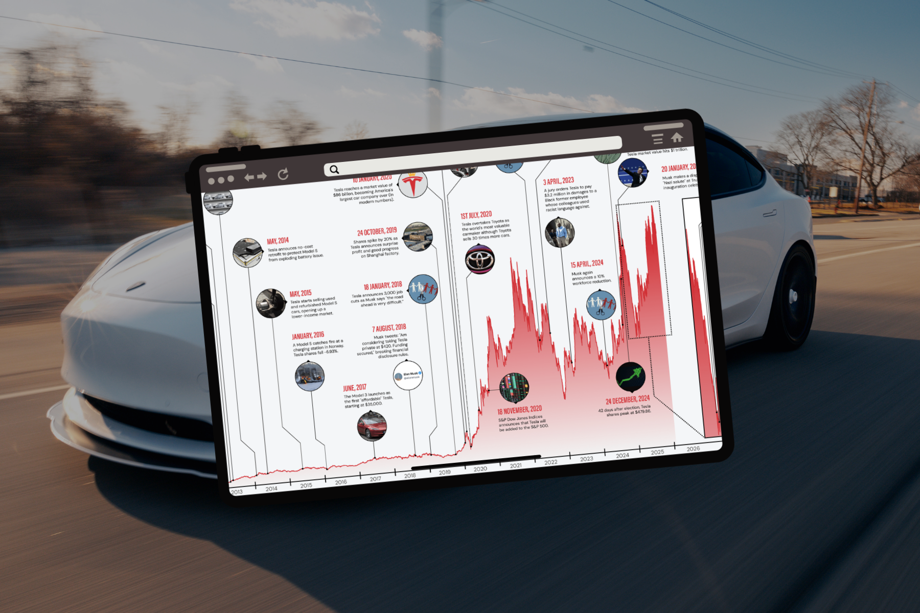
Infographics come in all shapes and sizes but they can roughly be categorized into eight distinct types.
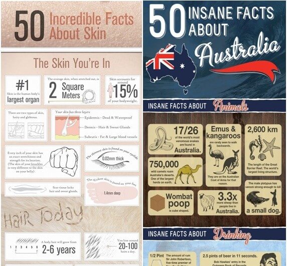
1. The Visual Article
Infographics like the above rely on a strong title for success. Just like a journalistic article, the viewer needs to be immediately engaged by the header so that they will carry on reading. Moreover, the content itself must be varied, interesting and plentiful so that readers do not come away disappointed. When done well, the visual article will thrive on social media platforms.
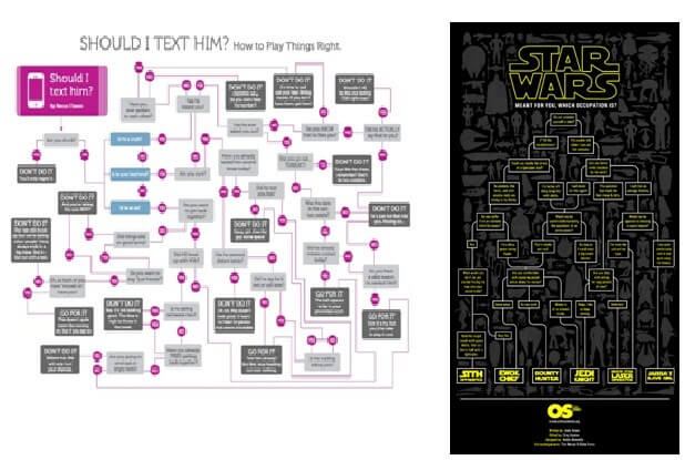
2. The Flow chart
Flow charts are guaranteed to hook in viewers if they answer a question the audience feels is important. Engaging the right audience will result in the infographic receiving plenty of attention on the relevant social media.Design-wise, simpler is better as clutter can be off-putting but to make the exercise worthwhile there needs to be plenty of options, otherwise viewers will feel forced into overly narrow categories, so some degree of balance is needed. A sense of humour is a definite bonus; hopefully no-one is basing a major life decision on an infographic so it’s okay to be a bit tongue-in-cheek.
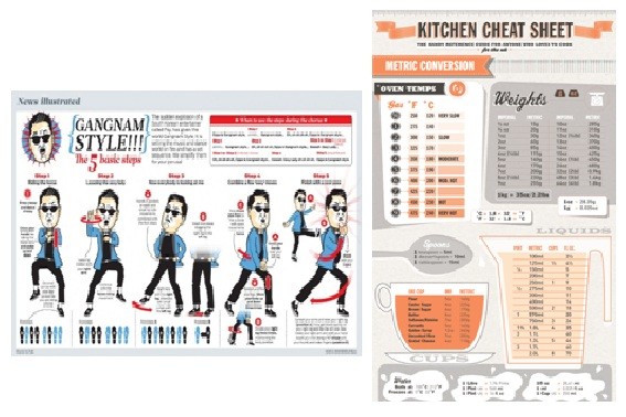
3. Useful Bait
When designing infographics like these it’s best to imagine them being printed out. As such, usability should be the priority with a straightforward design and content which is strictly relevant to the topic at hand. The ‘useful bait’ can do well on content sharing platforms like Pinterest and StumbleUpon.
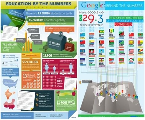
4. Number Porn
Numerical infographics boil down to lots of numbers with a little visualization to aid comprehension. The figures themselves need to be impressive and the design must be engaging (no-one wants to look at a spreadsheet) but other than that ‘Number Porn’ is straightforward to produce if a little unimaginative.
5. The Timeline
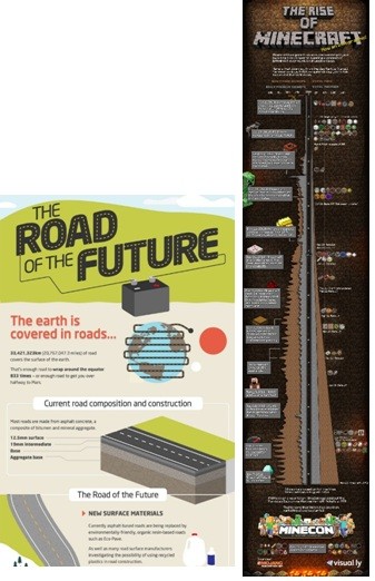
Each element of a timeline infographic should be visualized, see ‘The Road of the Future’ above, because it is crucial that the viewer feel that they are being taken on a journey. More important still, is that the journey is of interest to them. Such is the path of infographic wisdom.
6. Data Visualization
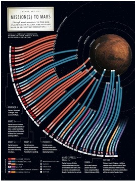
The bread and butter of the infographic world, and also where the format can really shine. If a picture is worth a thousand words, then a data visualization is worth a thousand more. Information is beautiful, as these examples show. A creative approach along with careful design can get great results and lead to placement on high-profile sites.
7. The Vs Informagraphic
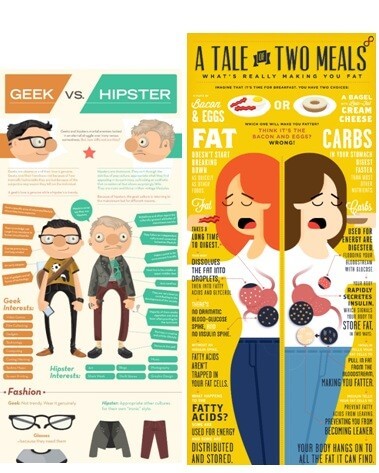
Again, getting the content right for the audience is crucial here. Both sides of the debate need to be characters or concepts that people care about. A common feature of the above infographics is a focus on both differences and similarities. A little humour and stylised design are a must if they are to succeed.
8. The Photo Infographic
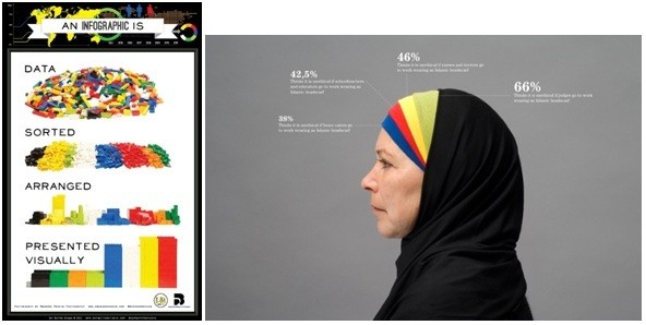
These infographics can often be the most visually arresting but are some of the most tricky to produce. Quality photographs and well-thought out design are a must if a photo infographic is to look anything other than amateurish.
What is your favourite type of infographic?


