Animated infographics are those that use the power of animation to explain something complicated.
A well made animated infographic provides more insight than what you can achieve using just a static format.
If the animation is just used to “prettify” the infographic, then it’s probably not a great example.
Coupling animation with engaging ideas can send the infographic into the viral stratosphere – these awesome infographics have been featured on the biggest sites on the web and for good reason.
Whilst the video format is used for many animated infographics, they should not be confused with video infographics (We got a list for that too!) as you can have some great animated infographics using GIF’s.
Enjoy the list of some of my favourite animated infographics [Taken from my personal swipefile.]
1. How to Build a Human
A designer who has really taken the gif-infographic format to new heights is Eleanor Lutz.
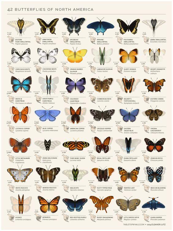
2. 42 Butterflies of North America
My personal favorite is this piece on butterflies -– I can’t imagine the painstaking labour that went into the gif conversion – see it full size here.
You can tell that, by simply looking at her work, Eleanor has a fervent passion for microbiology and entomology – and this manifests itself across her portfolio. On her site, she provides a breakdown of how she produces this style of gif-infographics and you can see that even simple animations require a serious investment of time and skill.
3. Fracking Explained
Kurz Gesagt has been producing one awesome video each month, so be sure to see his full collection.
The design is exceptional, but more importantly, the content goes into significant detail. It’s that level of detail that ensures the viewer feels they are learning, which explains how the above video got 1.7 million views and 3,790 comments on YouTube.
4. How Speakers Make Sound
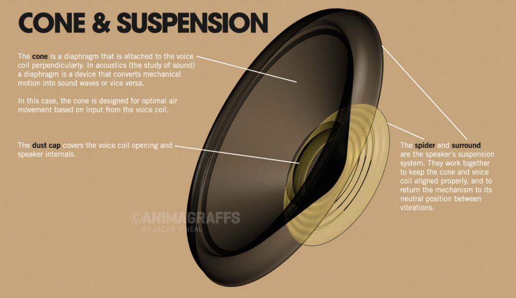
Jacob O’Neil is a talented infographic designer who has pretty much cornered the “gif-o-graphic”market. He has a whole site dedicated to the format which is definitely worth checking out – animagraffs.com
The full size version of this particular infographic – How Speakers Make Sound.
5. How a Car Engine Works

Another fine example of how the repeatable animation style can be used effectively – make sure to check out the full version that Jacob O’Neil produced here: animagraffs.com/how-a-car-engine-works
6. Growing Up
There’s a fantastic interplay between the child’s narration and the cut out animation style that nails the inspirational motif guiding the piece. Lasting just under 2 minutes, the pacing and execution are perfect.
7. Care to Click Infographic Animation
This infographic isn’t without its problems – the sudden shift in tone is a little jarring and a little on the nose – but it’s a great example of the possibilities afforded by video infographics: starting powerfully and layering the narrative.
8. How to Eat an Artichoke

I’ll probably stick to eating my artichokes straight from the jar
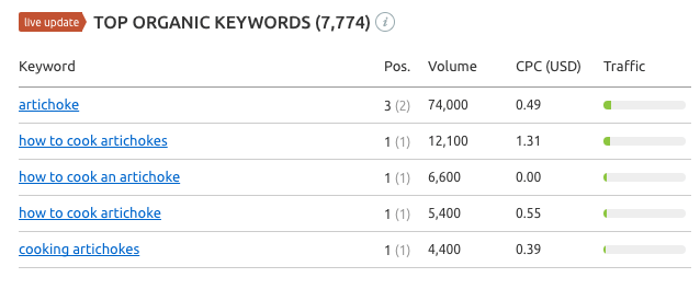
Whilst I have never eaten a fresh artichoke – I will after checking out this gifographic from the guys at Ocean Mist. You totally have to speak to Asda here in the UK and see if they can stock those bad boys.
It’s also great to see how ocean mist content marketing efforts have paid out big when it comes to search visibility:
9. 30 Years of Music in 30 seconds

Simplicity is key in this animated chart, and it really demonstrates the potential of the looping gif format for making a powerful impact on the reader.
BONUS. 13 Reasons Why Your Brain Craves Infographics
Some shameless self-plugging, but I couldn’t help but include an animated infographic we adapted from our interactive ‘13 reasons why your brain craves infographics’.
As you can tell, we were thrilled with the results.
Update 2020:
This post went live in 2015 but since then there has been a number of great animated infographics that have been published.
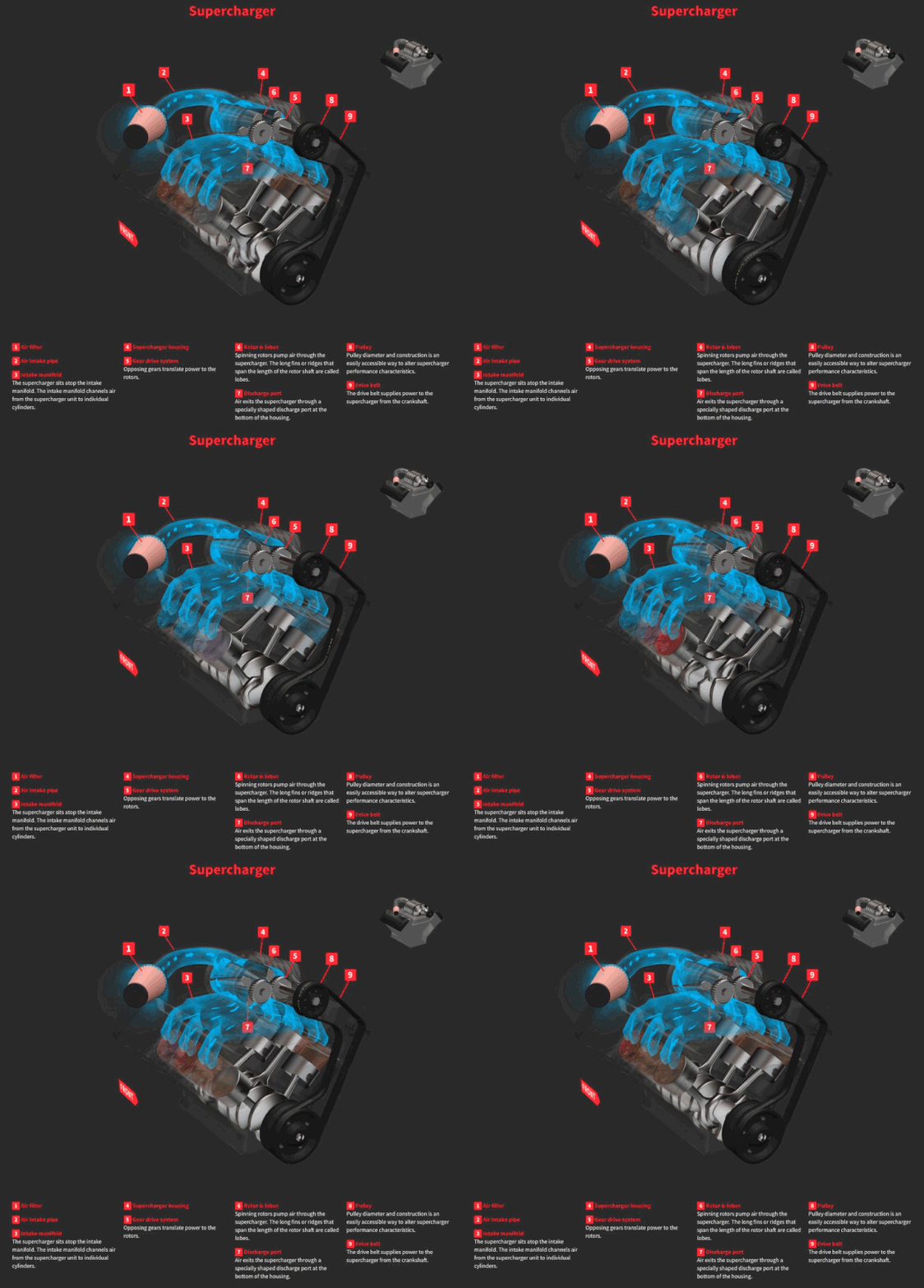
10. How Turbo Chargers Work
Thanks to Isabelle from Tyroola for sharing this one with me.
It’s another gifographic that looks at how superchargers and turbo work. Be sure to check out the full page to see all the designs.
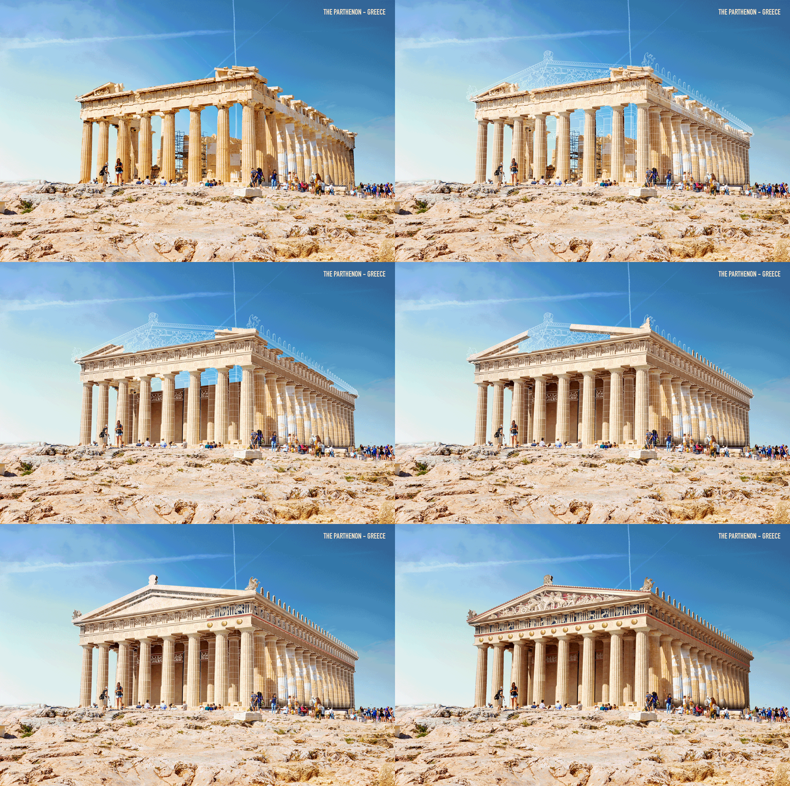
11. 7 Ancient Wonders Reconstructed
In this campaign the NeoMam team produced for Expedia, we used animation to show how 7 ruins could have looked.
This format allowed us to share something that would be impossible with a static format.
Check out the full list here: https://viewfinder.expedia.com/7-ancient-ruins-around-world-reconstructed/


