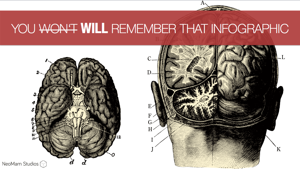
I’ve always respected AJ Kohn, who has been an active and sane voice within the world of online marketing/SEO throughout my career. However, I feel that I should write a response to this latest post: http://www.blindfiveyearold.com/you-wont-remember-that-infographic as he mentioned a few things that I wholeheartedly disagree with.
AJ’s main assumption is that the infographic is flawed because of its format. However I believe that a powerful concept executed well reinforces the site and brand, regardless of its format.
It’s not your content’s format, it’s your content’s content that counts.
Meet the Triangle of Memory
AJ introduced the concept of the triangle of memory, which he based on the project management triangle thus presenting three attributes to a piece of content, of which you can only have two at any given time.
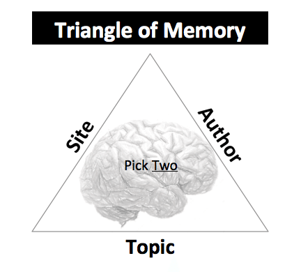
According to AJ, our memory only allows us to remember content at a very basic level: site, author and topic. The triangle of memory states that we can either remember:
Site + Topic Author + Topic Author + Site (rarely)
At this point, AJ introduces the problem with infographics: This format will somehow take over two sides of the triangle, leaving site/brand out of the equation. As many of you can imagine, this is the point in which I felt the need to dig deeper…
Rebutting the Theory of the Triangle of Memory
Moving forward, I am going to assume AJ is correct with his reasoning that a content consumer will remember 2/3 of the triangle and rarely, all 3 attributes.
On his article, AJ gives us the following example showing how we would remember site and topic, but not the author in most cases:
‘that post on Moz about Hummingbird’
- Site = Moz
- Topic= Hummingbird
- Author = Unknown
What I don’t understand is how is the infographic format so unique that it “gobbles up one of those three memory attributes leaving you with only one left to use”. AJ’s assumption is that everyone will immediately refer to the piece of content as ‘that infographic about [topic]’ and nothing more, reducing our triangle to the following:
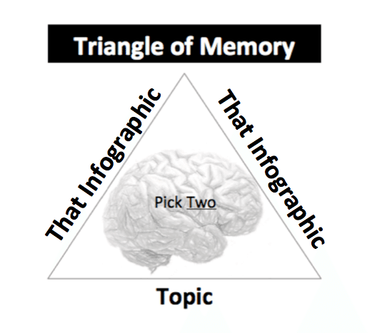
Surely, any piece of content could be just as easily defined by its format by some people, —e.g. ‘That video about Hummingbird’, ‘that blog post about Infographics’.
This leaves me wondering, has AJ produced any empirical studies around memory recall comparing infographics to blog posts or is this just based on his limited study of his existing clients recall?
When dealing with major publishers, they always take the time to understand the brand behind the infographic –often asking questions on the why/how of the content in order to provide some extra editorial insight on the story of the piece, its topic and the connection to the brand.
When high school teachers want to use the infographics we’ve produced, they’re very clear on which brand is behind the content when they reach out and ask our clients for permission to use them in school.
From the 800+ infographics we have produced and promoted here at NeoMam, there is certainly the odd occasion when blogs and smaller sites will feature the content without mentioning the brand. However in the vast majority of cases the sites are very clear in attributing the site / author.
In the cases where citation is lacking we reach out to them, asking for proper attribution, with positive results. Plus, we use this as an opportunity to start building a relationship with them: The fact they have featured branded content in the first place makes them far more open to being approached and audience accessed in future.
What Visual Content Is Not: Wasted Attention
In my experience, a content-consuming audience is far more intelligent than AJ Kohn is giving them credit for. They take time to consume visual content and really care about who has created it and why. The hypothesis that the infographic format is so overwhelming that it will completely destroy the average content user’s ability to define the author/site just doesn’t match with our experience.
Although I do agree with AJ about using attention wisely, visual content such as infographics are very powerful for attracting attention for lots of reasons —this is properly far easily explained by our infographic 13 Reasons Why Your Brain Craves Infographics. Either way, it is true that many brands are not making the most of the traffic they are driving to their site.
However, I disagree that the infographic format is the cause of this wasted attention, “attention without any lasting value.” It’s the infographic that brings in the hundreds of thousands of visitors to your site but I believe it’s the job of the site to keep this attention.
Does the content on the site match with the subject of the infographic? Do you use relevant content giveaways in return for e-mail signups? Are you making the most of click ways? Is the brand aligned with the content in the first place? Etc. Etc. Etc.
My point is that yes, infographics can lead to lots of relevant traffic but how you convert this to something meaningful should not just be left at the door of this one format. You wouldn’t expect one 400-words blog post to attract new users, build mailing list sign-ups and convert them into clients. As AJ mentioned, the infographic format must be part of a larger strategy, which I believe is true for every other content format.
When Why Infographics Work
From an audience attraction point of view, I stand behind the infographic format as being one of the most powerful content options in a content marketer’s toolbox versus $ spend.
What other type of content can get your brand featured on the top-tier magazines, blogs and newspapers, while driving thousands of visitors to your site? Especially when you consider that it can get non-brands in places that would normally take years to achieve that exposure and audience.
Of course we are not talking about a $500 spend but in comparison with the alternatives, infographics have no competition in terms of content produced with the aim of driving large audiences.
By the way, if you know about any other format, which shows more potential and power in that regard, please share it with me—my agency would be the first to jump on it 😉
Concept Will Always Kill Format
Infographics need to inspire an emotional reaction, but this goes beyond the simple LOL or OMG effect described by AJ on his article. We have actually identified that the best infographic ideas will incorporate one of these three concepts, based on Jonah Berger’s great book Contagious:
- Practical Value – Content provides an actionable solution,
- Social Currency – Sharing the content makes you look good in front of peers,
- Triggers – “Top of my mind, tip of tongue”or why people talk more about Cheerio’s than Disneyland
What is important to remember is that an emotional response will always depend on the audience you are targeting, so there is hardly a unified LOL/OMG emotion that will magically work for any brand. Emotional content created for the SEO audience would have a very different effect on a travel or parenting audience. That’s why here at NeoMam, we identify these audiences “limbic/emotional” nature as a step one and then use this information when evaluating potential ideas.
I would love to say that the concepts we use in the ideation stage of our infographics are completely unique but I would just be trying to big up my industry. The truth is that infographics are just a format for the content; the factors, which will define the failure or success of the piece will be concept + execution.
Unfortunately, this isn’t the first time I have argued against format bias from those in the SEO industry, but it has certainly been the most interesting of arguments against the format I’ve read. And the topic itself has lead my entire team to think about our processes, so now we have a far clear idea of why we do what we do how we do it.
Thank you, AJ! It has been a pleasure.
TL;DR
The infographic format itself can provide access to a large audience with its combined use of text and imagery* but like any content format, it cannot be expected to work without a larger content strategy.
When talking about content, the real factor to define success is concept and execution:
- A powerful concept executed well in a blog post = Reinforces the site and brand.
- A powerful concept executed well with an infographic = Reinforces the site and brand.
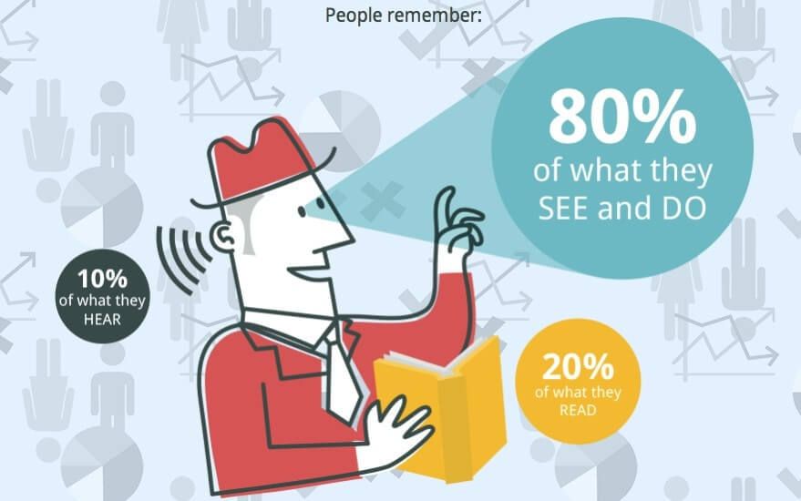
*“People following directions with text and illustrations do 323% better than people following directions without illustrations.”[source – https://neomam.com/interactive/13reasons/
I was wondering if I’d provoke anyone into a reasoned response! Now, mind you, you clearly have a bias here, though I suppose you might instead call it expertise. Tomato, Tomato. (That works less well in print.)
Here’s my rebuttal to your rebuttal.
Citations is not Branding
“In the cases where citation is lacking we reach out to them, asking for proper attribution, with positive results.” Getting the link or proper CYA attribution in place does not mean that users are remembering the brand in that infographic.
The site publishing it might (and building that relationship does have value but could be done in other cheaper ways) but what’s the motivation for the publisher? Will visitors to that site remember the infographic and connect it to the brand producer or the site publisher?
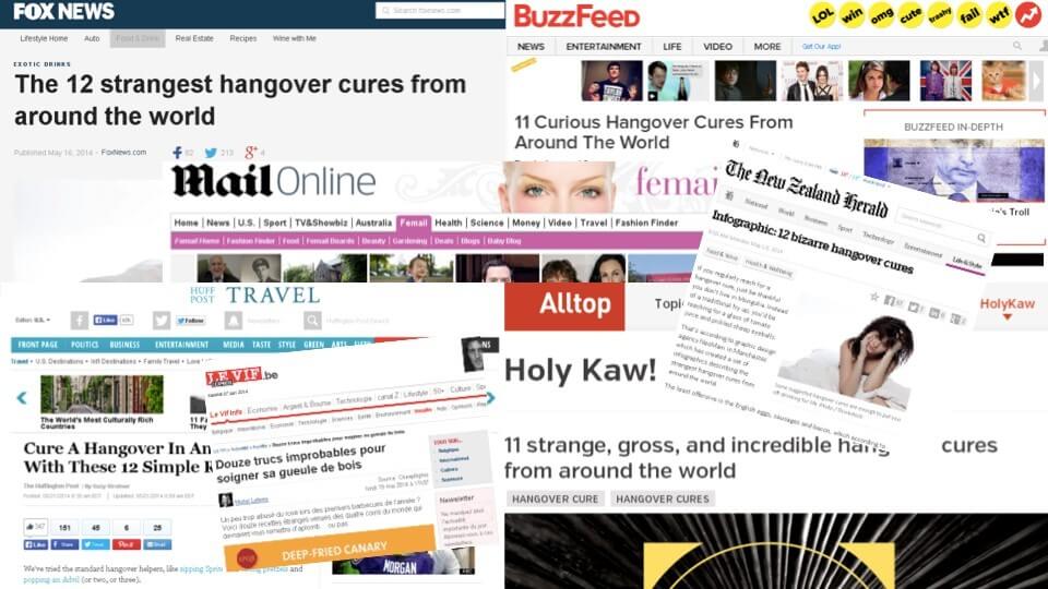
So getting an infographic on Buzzfeed or HuffPo may not move your brand because the bigger brand soaks up the memory.
Empirical Evidence
Is there empirical evidence? Sort of. There’s not a ‘Infographics repel brand recall’ study but here’s what I can put together and present.
We agree that most users scan instead of read (http://www.nngroup.com/articles/how-users-read-on-the-web/), which is one of the reasons visual content is powerful.
However, the time people spend looking at an infographic isn’t more. It may allow for more cognitive ease but you only have a small amount of time to make that impression (http://fivesecondtest.com/).
More to the point is how we remember it. Here’s research on visual short term and long term memory.
http://www.scientificamerican.com/article/why-memory-so-good-bad/
“In a recent review, researchers at Harvard and MIT argue that the critical factor is how meaningful the remembered images are—whether the content of the images you see connects to pre-existing knowledge about them.”
And from another Scientific American piece (http://blogs.scientificamerican.com/guest-blog/2012/12/26/meaning-on-the-brain-how-your-mind-organizes-reality/).
“We understand the meaning of an object in terms of the meanings of other objects – other chunks of reality to which our brains have assigned certain characteristics. In the brain’s taxonomy, there are no discrete entries or “files” – just associations that are more strongly or more weakly correlated with other associations.”
So we’re quickly and always grasping for ways to remember things and we do so through context, though what else we know. So if I know the topic or the site that’s most likely the association I’m going to make.
Video, Images, Text
You make a point of asking why infographics are so different. And it was Dan Shure in a comment on my post that made the best case in my view. Infographics are an amalgam of content an almost anonymized collaboration. The video features a person, the photo is taken by someone and the post is written by an author.
Infographics are in a word – impersonal. So the term – the medium – fills that void like Godzilla eating trains.
I’m a fan of images and memes for different reasons which I could go into in another post. And I like infographics in a much larger integrated strategy. But in my view they’re over-utilized by many (though i’ll try not to spread that around too much for your sake.)
Appreciate the healthy debate.
I agree with your point of the anonymity of the infographic, however this lack of content ownership remains one of it’s greatest strengths.
Lack of a strong personality in the content means that audience “gate-keepers” (a.k.a. publishers) and journalists are free to project their own editorial
angle onto the piece. Meaning it’s possible to get in front of audiences not normally available using other forms of content; it’s very hard to get a journalist to feature your latest blog post.
This is also why I wholeheartedly agree with your points about brand submersion and infographics being in isolation, which we wouldn’t recommend.
In our experience, infographics work best in two situations:
1. You’re a recognisable brand who has a clearly identified audience.
2. You’re building a brand who has a clearly identified audience.
For these kind of long term campaigns, the infographic can be the heavy artillery supporting the rest of the campaign and allowing fluid opportunities for audience engagement.
Over time, by getting consistent posts (and citations) on big sites like Buzzfeed and HuffPost, you are opening doors and windows to this new audience on a regular basis. As a result, the chances that you are building your own audience who will organically engage with your content are higher. The way I see it, you are effectively accessing their audience whilst building your own.
It’s also worth noting that having publishers and reporters recognising your brand (no matter how big or small) and interacting on a regular basis with your content provides lots of other opportunities —branding is not just restricted to the readers/users of the placements.
Really appreciate your rebuttal on my rebuttal 🙂
Well, kudos on trying to turn a negative into a positive. But … the fact that it’s hard is actually a sign that it’s more worthwhile. Getting people to reference your content is tough. No doubt. But that’s why it’s rewarded so highly by search engines.
Now, allowing a publisher to imprint their editorial angle on a piece sounds a lot like pirating the branding of that piece. Getting in front of an audience is rather meaningless unless – you guessed it – that person remembers and connects that piece to your brand.
If you look back at my piece I’m not saying that infographics aren’t remembered. I’m saying they’re not remembered in the ‘right’ or productive way.
Now, the parts we can agree on are the use of them in a more integrated or immerse strategy. If you’ve got the full medium and marketing mix going on all cylinders then infographics can make a lot of sense.
They can make a lot of sense for recognizable brands. But I think it’s more dangerous for a growing brand, even if they have a defined audience. Without the brand context – something to connect it to – you run the risk of that audience connecting it improperly (to the publisher) or not at all. For a growing brand (aka short on resources) that’s not a great return on spend. You’re playing craps and hoping for boxcars.
As I mentioned in my first rebuttal (this is looking like those booklets you get in California about voting on propositions), the relationships with the publishers is definitely of value. So if the infographic is the way you get to create those relationships then I’m all for it.
What I’d want to ensure in those situations is that the context of that relationship isn’t ‘when can you get me another infographic’ but ‘when can I expect more interesting content on this topic’. I know Larry Kim at Wordstream has been good at doing this type of thing and he’s parlayed (hitting on all the betting references FTW) it into further mentions and features including a TV interview.
At the end of the day infographics are a knuckleball problem (http://www.blindfiveyearold.com/the-knuckleball-problem) because a lot of things have to come together to pull it off. When you do, it’s awesome. But when you don’t you’re just throwing wild pitches. And there just aren’t many that throw the knuckleball, for good reason.
What an awesome debate!
I side with Danny on this one.
Like anything, if done properly the benefits will follow.
Although AJ seems sceptical, I believe quality content, appealing images and text, as well as ease and speed to read makes infographics the way of the future!