Since 2012 we have been creating and promoting infographics and since then we have stumbled across types of infographic that just work.
Many of these types were found accidentally as we tried out different ideas.
I hope this list can inspire you to create an infographic that gets shared around the web.
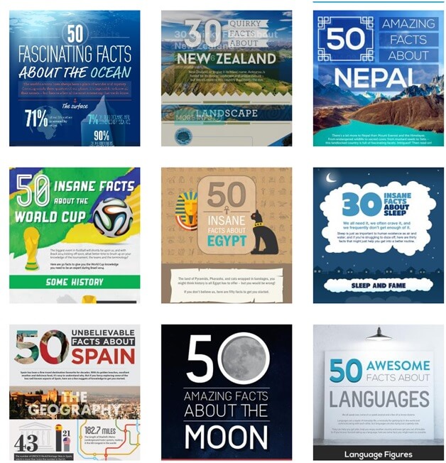
1. The Quizzical: X Facts About [Topic]
We stumbled on this very simple framework and based on the results we have applied the concept to lots of different subjects.
My 3 tips when trying this X Facts About [Topic] infographic:
- Illustrate every point – otherwise it can become a very long, dull list.
- Play with the design and be creative. From combining photos and illustrations to keeping the reader engaged through facts with a clear narrative, don’t shy away from trying out new layouts and styles.
- Make sure that you’re covering a topic that has mass appeal. Our experience shows that going too niche can damage the chances of a successful promotion campaign.
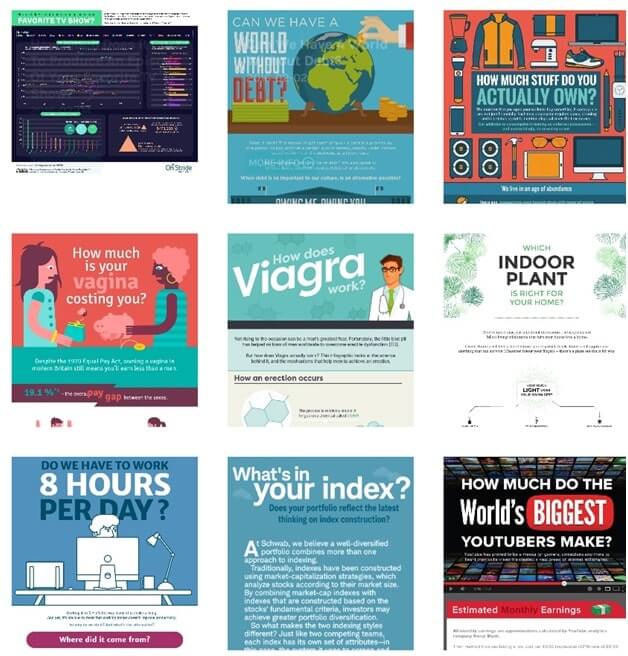
2. The Challenging: Visual Answer To a Question
One of the strongest starting points for developing ideas is to dive into questions that people are already asking. Once you’ve identified a topic, you can then create your own Visual Answer To a Question.
The challenge with this type of infographic is making sure you’re not choosing a broad question that can’t be explored in depth. We find that infographics work best when they provide a comprehensive and thorough answer to a very specific question.
A great example of this type of infographic is How Much Stuff Do You Actually Own?
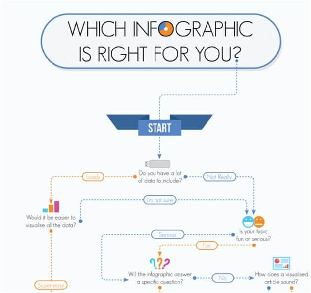
3. The Engaging: Flowchart
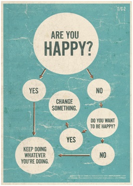
Flowcharts are a very powerful way to use visuals to provide information that readers can process far faster compared to an article, which is one reason why we love infographics. This type creates an interactive experience in a static format as every user will interact with the content in their own way.
A flowchart forces you to distill the most important points as you don’t have much space. The key is making sure that your final design is truly engaging and fun to use.
Be sure to share around the flowchart skeleton before moving onto the design stage to test its usability – focus particularly on whether the copy really flows, the paths make sense and the experience is enjoyable.
Great example of a simple flowchart that works:
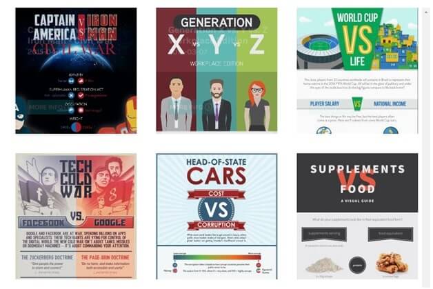
4. The Controversial: Versus Infographic
The Versus Infographic works because it simplifies complex issues.
Just remember to make sure each point is a like-for-like comparison and keep the design elements adjacent to each other.
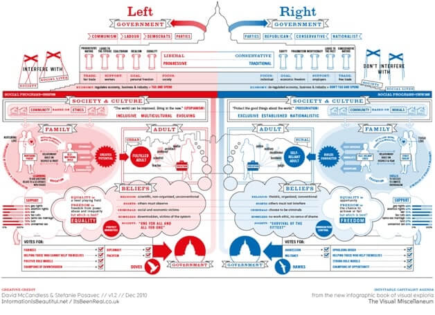
Simplicity is always a great design quality but Versus Infographics can be more complex and still work well, as shown by this example from http://www.informationisbeautiful.net/
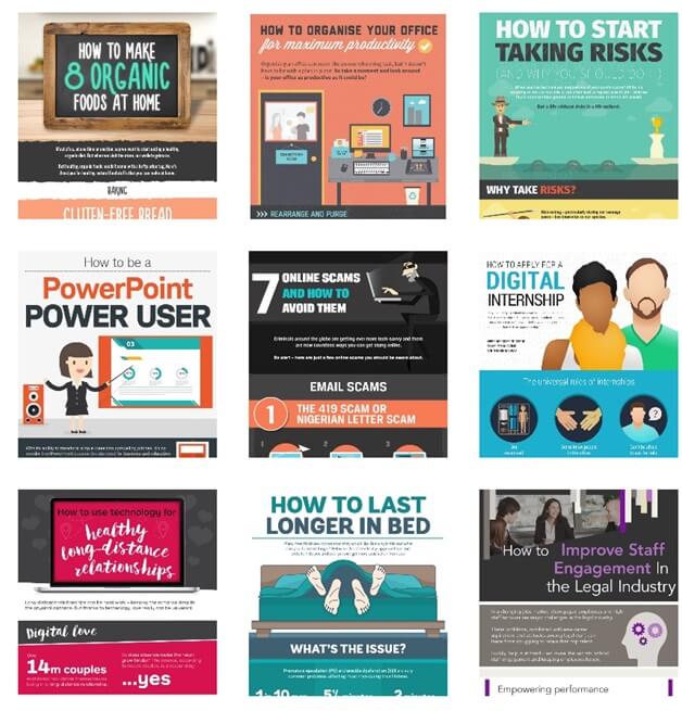
5. The Infallible: How-To
Another powerful type of infographic that we came across a while back. The How-To Infographic type opens up to as many sectors/niches as you can think of, so we’ve never stopped experimenting with this type – particularly because online communities love them every single time.
In the book “Contagious,” Jonah Berger talks about how practical value is seen in many ideas that get shared through word of mouth both offline and online.
The How-To type can be applied to lots of topics and the title itself promises something that will be easily understandable. A great example of an easy to use How-To is How To Disappear Online.
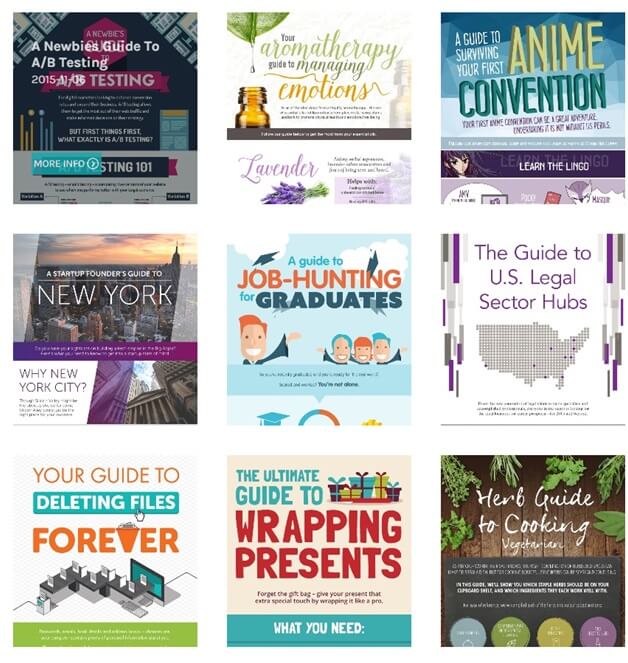
6. The Good Old: * Guide to [Topic]
Another infographic type that supports the powerful role of practical value content, a Guide To Infographic makes a series of guidelines easier to understand.
When working with Guides, our ultimate aim at NeoMam is to create something so useful and compelling, that a person would be inclined to print it out, keep it close and use it in their day to day.
The challenge is to ensure the images do the work as we want for the information to be clear and easy to process and visuals are the best possible medium for that purpose. Be careful not to create a visualised article: avoid combining chunks of text and using images as simple dividers between sections.
Here’s a fantastic example of this type is the Female Guide to Solo Travel, which included a variety of advice and stats, both clearly illustrated throughout the design.
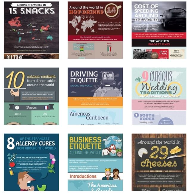
7. The Traveller: X Around The World
Another type of infographic that works for all sorts of niches and can be expanded across topics is the Around The World Infographic angle.
We know that people love to compare how things are different, so this type of infographic allows us to spark online conversation through the comparison of everyday things.
When comparing items, it’s worth spending time on finding the right images, whether working with illustrations or photos. Try to keep the design modular, that way each section can be used in it’s own right and publishers can pick and choose as well as feature your content within a photo-gallery.
You can check out 15 Snacks Around The World as an example of the engaging nature of this type.
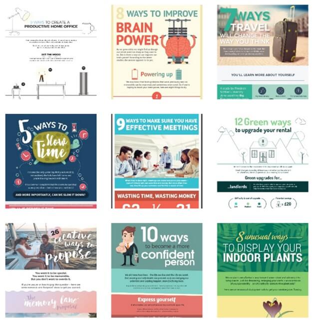
8. The Listicle: X Ways/Tricks/Tips to [Topic]
People still love lists – if you don’t believe me, just take a look at the front page of Buzzfeed.com.
With the amount of content out there, people are filtering content more and more. The X Ways/Tricks/Tips to [Topic] list provides the user with clear expectations on how much work is required to engage with this content.
You can read lots more about the power of lists here: A List of Reasons Why Our Brains Love Lists.
When producing these list based infographics, spend your time breaking down each point visually and use modular design so each number can be used individually.
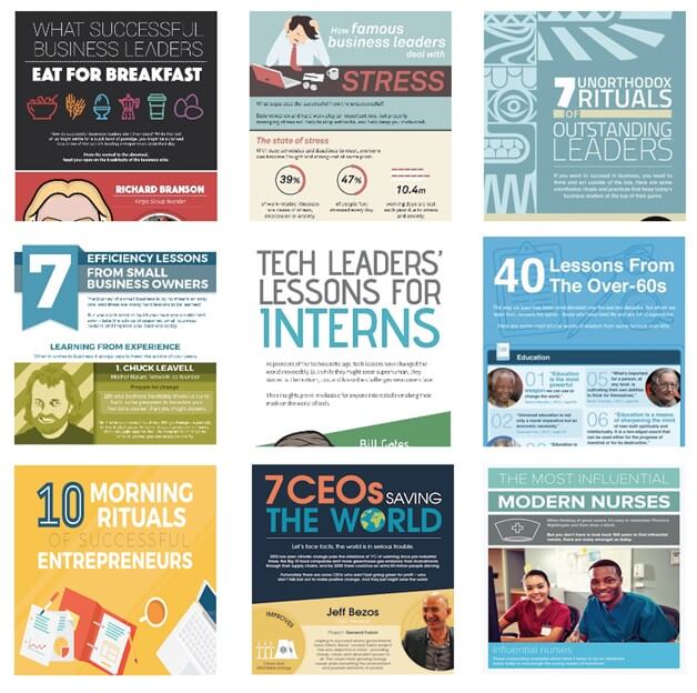
9. The Wannabe: X Lessons/Habits from [Successful People]
This type was found whilst analysing what content was performing the best for Inc.com. At that time we realised that the idea of inspirational rituals/habits came up again and again – that was the moment when the X Lessons/Habits from [Successful People] Infographic was born.
From efficiency lessons to in-depth advice to simple events such as what successful business leaders eat for breakfast, this type gets readers sharing every time we produce it.
We have also applied this concept to non-business markets with similar success. I wonder what Rand Fishkin and Danny Sullivan eat for breakfast?
// ]]>

