
One common problem brands face when building newsletters is retaining their identity while also providing something new. This was a challenge we faced when we decided to create our own at NeoMam.
Here’s how it went and what you can take away if you’re looking to extend your brand identity into new marketing formats.
Behind NeoMam Unpacked
Our goal was to publish a monthly newsletter in the form of a conversation between two members of our team. Each issue would focus on a different lesson we want to share with others in the content marketing and PR spaces, using our own campaigns and experience as evidence.
With this in mind, we wanted to ensure the design would stand out from the usual newsletters in our industry. One of our values is to ‘bring the cherry on top,’ which means quality has to extend to our marketing materials as well.
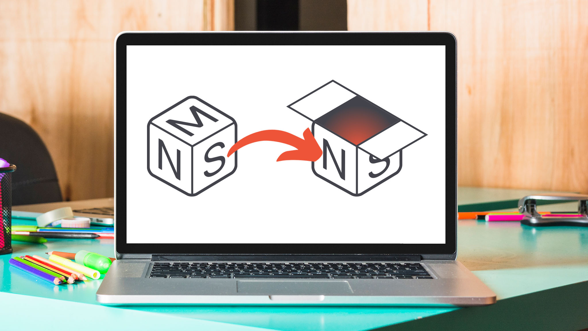
We aimed to create a brand identity for the newsletter that tied back to the original NeoMam logo while also allowing for creative exploration in future editions. The first step was giving it a name: NeoMam Unpacked. We wanted the name and logo to open up visual possibilities so that each edition could reveal something new, both in theme and design.
Coming up with something fresh that also retains the original value is hard fun. The good thing is we didn’t have to start from scratch. Our brand’s graphic resources could form the basis of new creations. So we started with the logo.
How to design a consistent logo for your newsletter
A brand’s logo reveals a lot about the brand itself. The shape and all the natural associations that come with it provide fertile ground for innovation while keeping the brand’s personality intact.
Let’s say your logo features an egg. Stage one is to think about what can be done with an egg. You could crack it or cut it in half to reveal the inside. You could make the yolk spill out, or cook it in a pan.
“Play with the shape, develop the concept,” should be your mantra.
In our case, NeoMam’s logo has been a cube for over a decade. We knew we wanted to incorporate the cube because geometric shapes are very versatile and can be used in many ways.
Inspired by our logo and the newsletter name, we developed the concept of a box opening to reveal something.
During the process, I asked myself: How many different ways are there to open a box? Should it open from the top or the side, or completely? Should it be more abstract or more literal?

At this stage, I was free to experiment. I came up with four options, translating all those questions about the logo into the visuals.
What would it look like if the contents were inside? Or scattered outside? What if the box were dismantled completely, revealing a single item?
This approach allowed me to create different alternatives, making it easier to decide on the right direction. We opted for an illustration style that best matched the NeoMam logo, as it made sense to maintain the same visual language of clean, isometric vectors.
How to incorporate your brand colors in your newsletter
Using your brand colors throughout this process helps to ensure that all your assets belong together.
Colors are crucial for brand consistency and recognition. They are what will differentiate you from your competitors. For brands with only one colour, there is room to introduce additional ones, as long as the original brand colour remains the focus.
We finally chose the first option for the logo because the fully unpacked version with all the squares looked too far from the original. It was the right decision: easy to spot and easy to remember. This version would also allow for future animations to be used on the landing page and shared on different platforms. This is a great way to tell a richer story, increase engagement and make the logo feel more alive and personable.
How to design a memorable header image for your newsletter
Next, we took some of the elements that we hadn’t used for the logo and used them to create another asset: a monthly banner image that we could update to bring some originality.
This is important because it means that work from earlier in your creative process can be reused or prove useful later on. Don’t discard any ideas that seem weak at first. Creative processes aren’t linear, and you can always come back to something later.
Displaying different banners creates a rhythm on your landing page and allows viewers to grasp the narrative of each issue more quickly. This way, when you see all the articles in a list, there will be clear differences between the monthly issues at a glance.

Normal Sport is an excellent example of this. Every week, they create a unique illustration for each banner and make the most of memorable, eye-catching images. (Or as illustrator Jason Page describes it “I dive into the illustrator’s pit totally unsure what will come up. Sometimes it goes well, often it goes sideways, but something always goes into the newsletter.”)

If you’re wondering where to start, take a look at different newsletters for inspiration on themes and visuals. Then decide whether to focus on illustration, photography, or abstract graphic treatments. Ultimately, the decision depends on what best suits your brand identity and what you think will encourage your audience to engage with your content.
| Tip: Beehiiv has a directory of expert newsletter designers that can serve as inspiration, given the quality of their work. |
How to adapt your brand’s identity while creating something fresh
We chose Beehiiv as our newsletter platform, and this was my first time using it. Designing the newsletter on a platform I had never used before required some exploration. I was surprised by how much could be done to adapt it to our brand identity. Everything can be changed, including fonts, images and colors.
If your brand guidelines include a font family, as they should, make sure it appears somewhere in your design. Titles, subheadings and CTAs are good places to start.
That said, moving to a new channel means you need to think about new things. I asked myself: Which fonts are available on the platform? What’s the best font for longer blocks of text? What overall feel am I trying to create?
In the end, I chose a serif font for the body text to improve readability. This combination works well if your brand font is sans serif, as it adds a touch of formality while maintaining a modern look. Stay flexible and try new combinations, as long as you keep at least one core element from your brand guidelines. Although Beehiiv is fairly intuitive, some settings take a bit of digging to find. Helpfully, the platform also offers short tutorials for certain features, which help you get familiar with the tools. Once you’re happy with the result, you can save the design as a template for future publications.

How to organize the information to keep the reader engaged
From the outset, we knew the newsletter had to be simple in structure and easy to update each month.
We made the decision early to have co-authors for each edition. It meant we could get different perspectives and topics on a monthly basis. But this presented a unique design problem.
We wanted the layout to feel like an online conversation between two people, so we added a photo of each author next to their paragraph. But this setup didn’t work well when the text was longer than the images. On mobile, the layout changed so that the text sat below the images, which made the newsletter much longer. It sometimes sequenced the photos together.
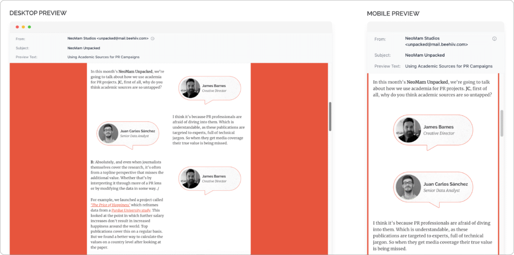
In the end, the best solution was to include the photos only at the beginning to introduce the authors and then continue with text alone. It was a good balance between what we wanted to achieve and what was technically possible.
Whatever layout you choose for your newsletter, remember that consistency is essential for brand recognition. And just as in any other designed experience, make sure to use hierarchy and clarity to help guide the reader’s eye.
| Tip: The layout should be responsive and easy to navigate across all devices. |
Experimentation within a well-known space
The design process becomes richer the more experimental it is. Even if you opt for a more conservative logo for the newsletter, experimentation will still benefit the banner image. Playing around with shapes allows you to create a diverse range of designs that can be used across all newsletter assets.
Looking ahead, each new edition will have its own distinctive characteristics in both content and banner design. That’s what will make every issue unique. However, they will all be built on the same foundation: the template created from the brand’s core elements.
The stronger your brand identity and guidelines, the easier this process will be. The clearer you are about your fonts, colours and all other visual elements of your brand, the better the outcome will be.
Some aspirations may have to be set aside, such as fully customising every feature of the newsletter or landing page. In the end, it’s the simple, consistent elements that make your newsletter instantly recognisable as part of your brand.


