
Hello reader, and welcome to NeoMam Studios’ 2025 Jealousy List.
This is the fifth Jealousy List we’ve made. The first, back in 2020, was inspired by Bloomberg Businessweek and set out to showcase the content that we wish we had made ourselves + celebrate the best work in our industry.
We hope our favourite pieces of content of 2025 go some way to inspiring you this year.
The daily scroll of the average social media user visualized
by Made Visual
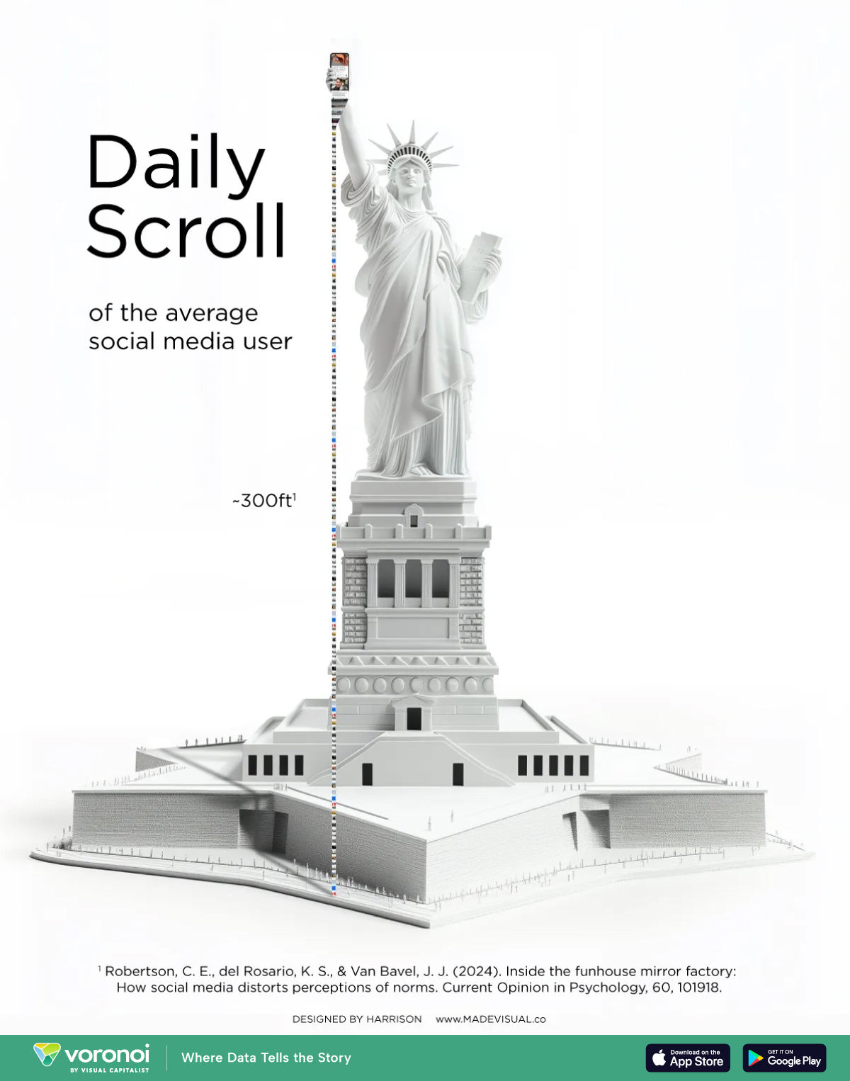
“This made me pause and say, Wow! I was drawn to the metaphor they used to illustrate scale, which makes the data understandable by giving it a physical form. Beyond showing how much the average person scrolls, it makes you reflect on intense social media use.”

Jazmin Lopez
Head of Design
OpenAI won’t say whose content trained its video tool. We found some clues.
by The Washington Post

“Reporters Kevin Schaul and Nitasha Tiku used Sora to create hundreds of videos that show it can closely mimic copyrighted content, such as pop culture characters.
The methodology is simple, effective and easy to replicate for anyone who wants to dig deeper. I particularly like how they incorporated images into the article to clearly explain the process they went through. Showing is always better than telling!”

Gisele Navarro
Operations Director
What trade war? China’s export juggernaut marches on
by The New York Times

“This project from the data team at The New York Times is an incredible display of elegant visualizations that tell the latest chapter of the US-China ‘trade war’ on their own, without any words required.”

Juan Carlos Sánchez Albarracín
Lead Data Scientist
Top colleges are too costly even for parents making $300,000
by Bloomberg Graphics

“For a few years, I’ve wanted to do a project on college affordability in America, but it’s near impossible to accurately reflect the average outlay with all the financial aid exceptions that exist, an oversight that’s led to robust media blowback from colleges cited in previous studies.
Bloomberg Graphics elegantly circumvents that issue by using data from a platform that’s supported by the colleges themselves, providing an accurate reflection of the expected costs (including grants) at different income levels.”

James Barnes
Creative Director
The 50 most food self-sufficient countries in the world
by Visual Capitalist
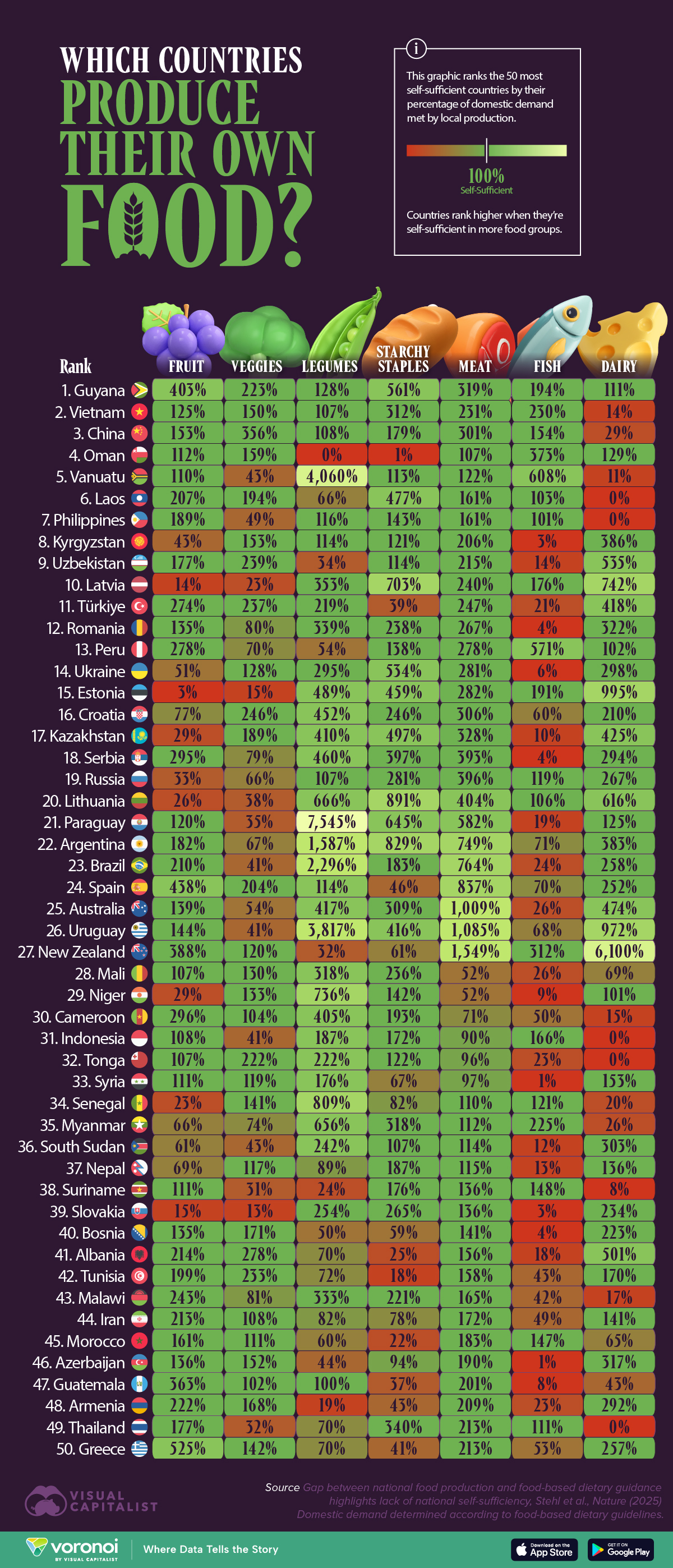
“My big aim for 2026 is to grow more of my own food. This might be tricky as I live in a small terraced house in a former industrial town, but my dreams are never tempered by reality. Anyway, while I’ve been researching ‘growing-your-own,’ I found this enlightening data viz from Visual Capitalist. It shows the 50 most self-sufficient countries by how much food they grow. I was unsurprised to see that my own country, the UK, didn’t make the top 50, as I’m aware we import around half of our food. But I was surprised to see that the U.S. didn’t make it either.”

Jonny Addy
Head of Delivery
The world’s most anxiety-inducing destinations
by Root Digital

“I really liked this project because it’s an interesting spin on the typical “best destinations for X” lists because it focuses on another side of travelling.
The study can also be useful for anyone struggling with anxiety, giving them a better idea of what places might feel overwhelming and which ones might be a better fit.”

Beverly Clair Pe Ong
Senior Outreach Specialist
Bears will be boys
by The Pudding

“Since becoming a dad, I’ve become aware of the bias I reflect in animals and pets. I default to “he” for things I maybe subconsciously perceive as masculine. That’s why I loved this thought-provoking analysis of gender in kids’ books, which shows a skew towards male pronouns in anthropomorphised animals across hundreds of popular books.
The added survey is the cherry on top. Data like this helps push social change along. I actively search for books with more balanced genders these days!”

Luke Doyle
Head of Outreach
Raw materials in your laptop
by Toon Vos
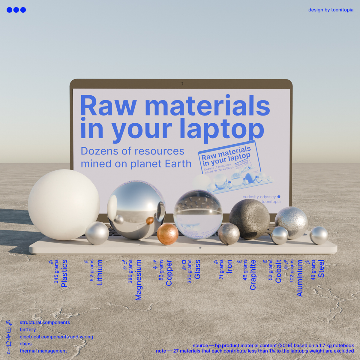
“We interact with so many objects every day. I must admit that my phone and my computer are neck and neck in the battle for first place. That’s why I was so curious to find out what a laptop is made of, to get a closer idea of how it is produced. It’s a perfect example of how design can convey complex ideas instantly.”
Jazmin Lopez
Head of Design
Ranked: Top 40 jobs at risk from AI
by Visual Capitalist
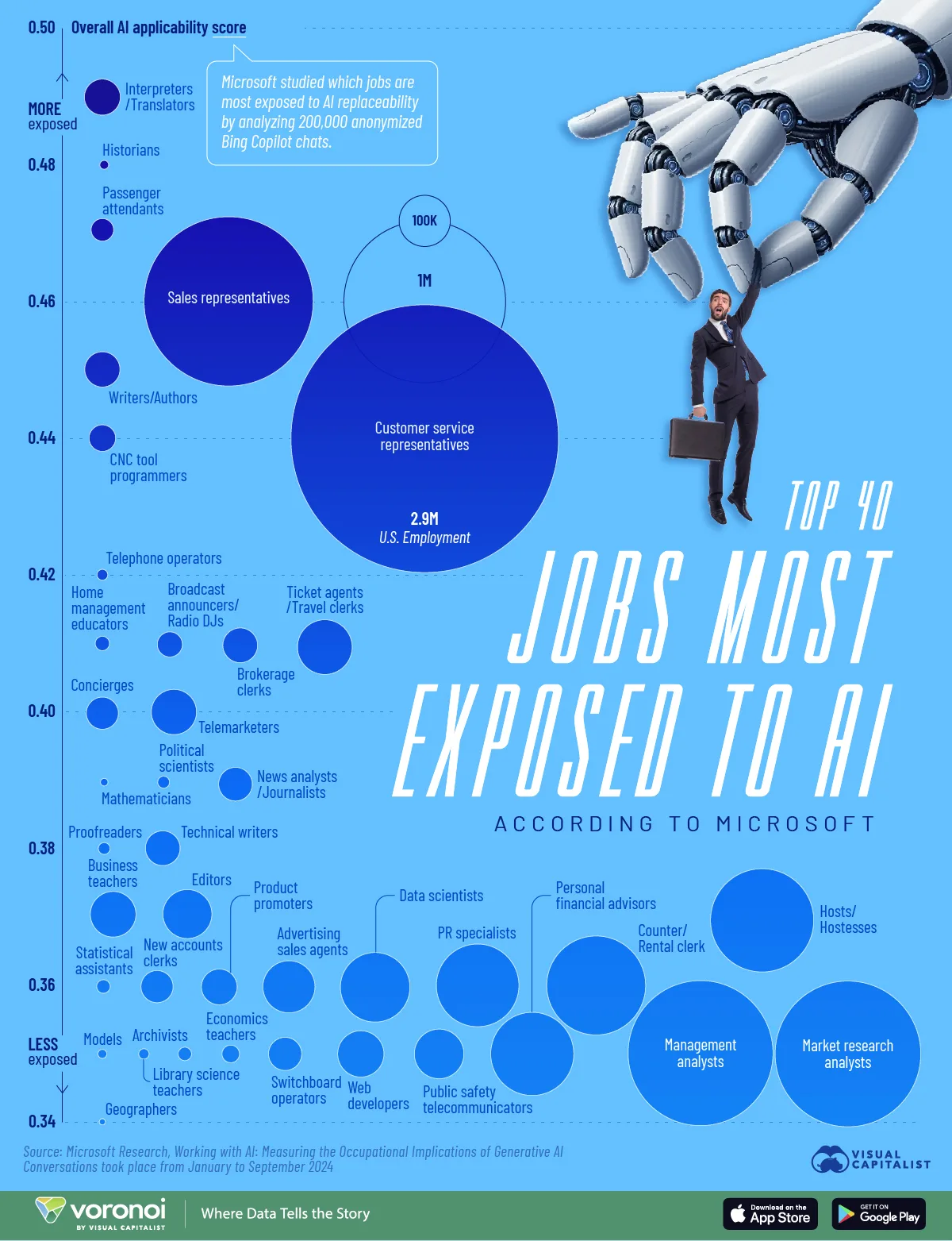
“This is a great chart that clearly conveys the findings of a dataset without the need for over-explaining.
You don’t need to see the axis label or check the legend for the size… Nothing. You know right away what it all means just with a title, a bubble height, and a shape.”
Juan Carlos Sánchez Albarracín
Lead Data Scientist
Health insurance costs
by Visual Capitalist
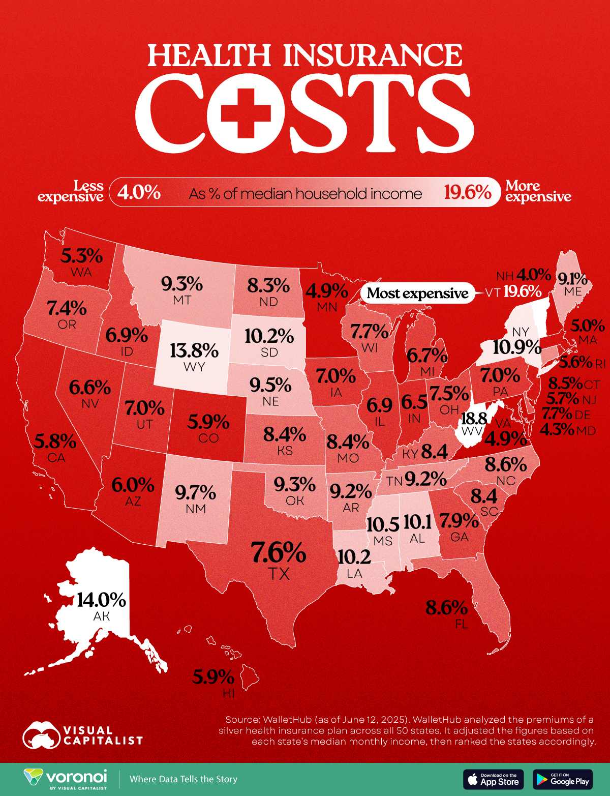
“I was out for a walk with my dog and got chatting to another dog walker about the NHS (UK’s free healthcare provider). Only last year, I had broken my arm and received exceptional care at no cost, and so was an ardent defender. This other dog walker believed he paid too much tax and that it would be cheaper if we had an insurance-based system. Long story, short, Visual Capitalist came to the rescue again with this simple, clear, and terrifying map that shows how much U.S. residents pay for their health insurance as a % of the median household income. I cannot imagine giving 19.6% of my monthly income to an insurance company. Although it is a stunningly beautiful state, I’m very thankful I don’t live in Vermont.”
Jonny Addy
Head of Delivery
We analyzed 47,000 ChatGPT conversations. Here’s what people really use it for.
by The Washington Post

“I remember when the first indexed pages of ChatGPT conversations started showing up on Google, I realised a ton of information was being shared on the open web without people realising.
This study uses the Internet Archive and a combination of human review and ChatGPT to categorise how people use the platform, following the same methodology as ChatGPT’s published studies.
The result is incredible journalism that runs counter to previous studies showing how people were using this generative AI chatbot.”

Danny Ashton
Founder
Data shows what’s driving forest loss around the world
by World Resources Institute and Google DeepMind

“We all know that deforestation is a huge problem, but most people probably aren’t aware of the different drivers behind forest loss. I love how the interactive elements in this article take the reader on a journey across the globe, zooming in and out to illustrate points in different regions. It ends with an interactive table that lets readers add countries – allowing a quick comparison of doughnut charts.
Dataviz that highlights environmental issues hits the sweet spot for me.”
Luke Doyle
Head of Outreach
Visualizing the cost of the American dream in 2025
by Visual Capitalist
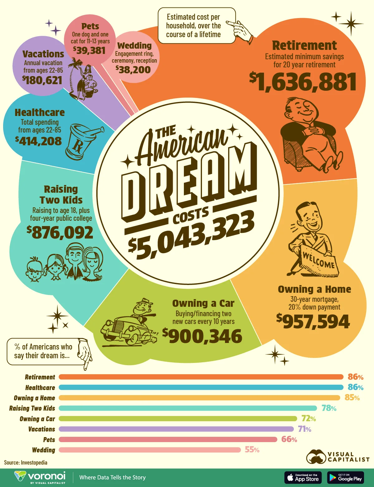
“The Visual Capitalist team took Investopedia’s data and turned it into a colorful chart that breaks down how the cost of the American Dream now exceeds $5 million.
The retro design contrasts nicely with today’s numbers, showing just how expensive the dream has gotten. And the cartoon characters remind me of the classic Monopoly illustrations, which feels fitting since the game is associated with money, property, and financial ambition.”
Beverly Clair Pe Ong
Senior Outreach Specialist
OpenAI, Nvidia fuel $1 trillion AI market with web of circular deals
by Bloomberg Graphics

“I’ve seen this graphic so many times since it was first published! I’d say it’s probably one of the most viral data visualizations of 2025, and it makes sense because it helped explain the convoluted circular nature of AI investments in an easy-to-digest way.
The best part? It was timely. The news of these investments was sitting right there for anyone to visualise, and the team at Bloomberg was quick on their feet.”
Gisele Navarro
Operations Director
How many humans have ever lived?
by Our World in Data

“These numbers are almost impossible to grasp, and that’s why the metaphor works so well. I absolutely love how it makes something overwhelming feel accessible. Despite the data limitations, this is a perfect example of how you can create an excellent visualisation based on historical knowledge, as long as you are transparent about it.”
Jazmin Lopez
Head of Design
50 species that save us
by The Washington Post

“This is a simple idea with beautiful execution. The kind of images you’d want framed on display at home. It reminded me of the ‘Unknown Tourism’ posters Verve Search produced for Expedia many years ago.
The image cards flip to show readers ways animals and plants have enriched human lives. Some of these are fairly obvious, some not so much. It’s super interesting, and it helps raise awareness of the value of each different species. Almost half of them are endangered.”
Luke Doyle
Head of Outreach
Jmail
by Luke Igel and Riley Walz

“Jeffrey Epstein’s emails have been the political story of 2025. It’s data with global implications and seemingly involves every major CEO, celebrity, and politician over the last 30 years. But how do you go about sorting 20,000 pages of two decades of digital correspondence?
Jmail puts those emails in their correct context, and something we can all understand, a Gmail interface. Not only does this help navigate critical information, but it also helps democratize access to data. A brilliant piece of content marketing and journalism that may well go some way to revealing who is complicit in these crimes to a wider audience.”

Alex Cassidy
Managing Director
An antidote to AI slop
In the half a decade since our first list, we have seen a fundamental shift in the industry and the web. The pivot to contentless approaches, the shrinking of journalist teams, and the rise of AI-generated slop are suffocating social feeds.
It’s becoming harder and harder to find great content in the mess of the modern internet, so we think that curation has become even more critical.
As part of the antidote to these (largely unwelcome) changes, we wanted to take the Jealousy List offline as well. Finding a way to extend the creativity of the work into the execution of the collection itself.


