Good content is at the heart and soul of any successful infographic campaign. We’ve learnt that the content publishers will be excited about sharing has to be trusted and offer a lot of value against the content that is already out there.
We’ve learnt the easy way (through successes) as well as the hard way (our mistakes). Here’s 5 mistakes that we’ve learnt from, and never want to make again.
1. Using low authority sources
We’ve made the mistake of including sources in our research that are from low authority sites, or biased blogs such as religious, opinion-based or user submitted content sources.
When working on the first draft of an infographic on how to make better decisions, we based an entire body on one particular source:
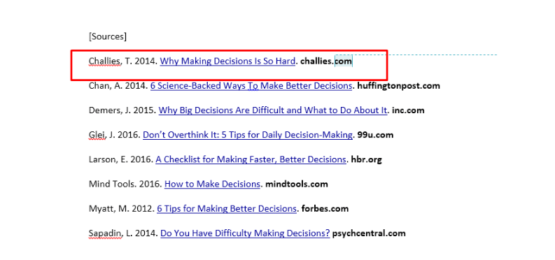
At first sight, the article was indeed about how difficult it is to make decisions, which was the main focus of the first section of the infographic we were working on:
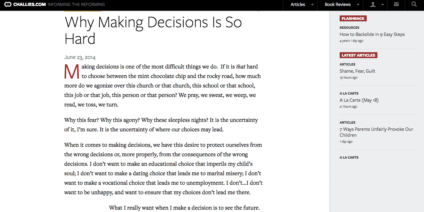
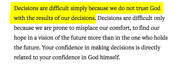
But when reading through the article it was clear that this was a biased article:
Now, there’s nothing wrong with the article in itself but this wasn’t exactly what we were looking for – we actually wanted to make a strong, scientific-backed point on why making decisions can be so daunting, before moving onto a series of practical tips.
When publishers and the rest of the online community take a closer look at your research and discover that you’ve actually used user-submitted content, tabloid newspapers or religiously/politically biased sources, suddenly the true value of the piece falls away completely. Publishers will not trust the content enough to share it with their readers, and the audience will rip it apart.
This is a challenge we face every day when producing content on behalf of our clients. We go great lengths during research stage to ensure that online audiences find value in our work and don’t feel like what we’re sharing is biased by our client’s views or business. Now we know that there’s a lot more to consider.
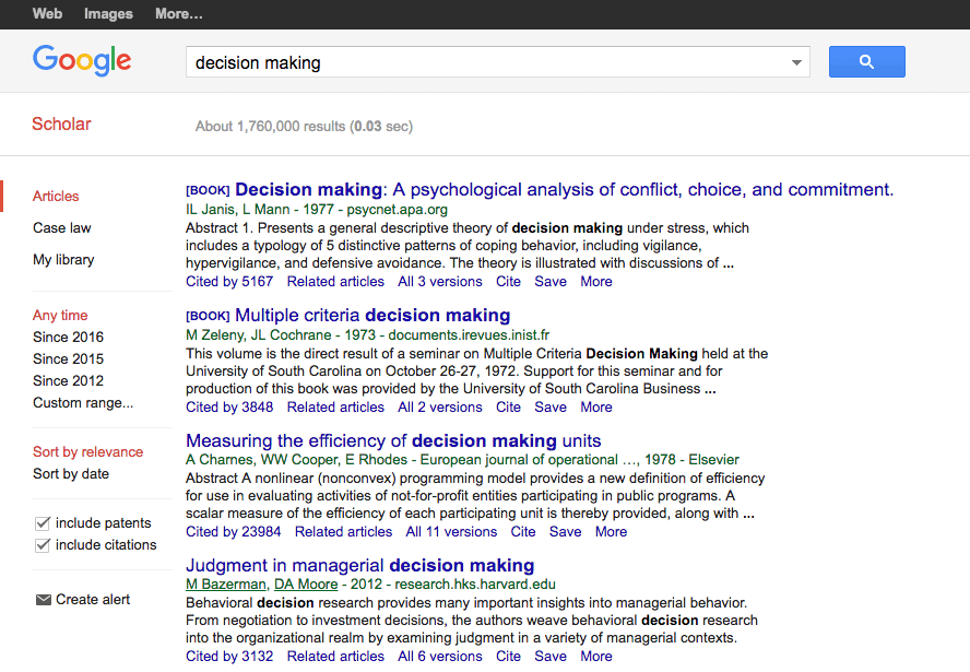
After the situation above, we have tightened up our research process to ensure our pieces are highly authoritative and backed by science or statistics. Our rule is to now find the primary source for any science or social based study used and only consider highly trusted references.
Tip: Google scholar is great tool to find high value research from books and journals.
2. Not researching deeply enough
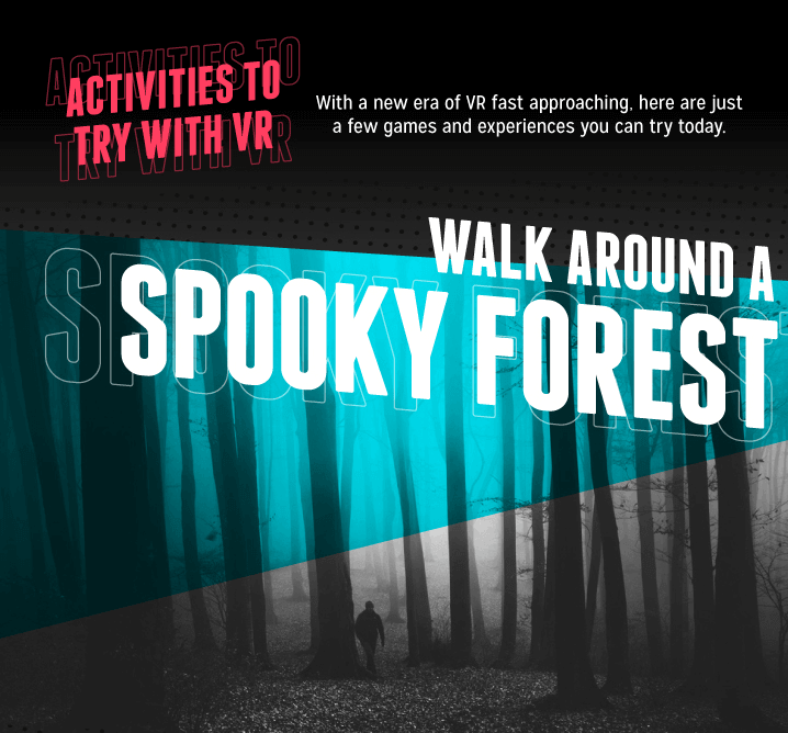
In the past, we’ve tried to cover a topic too broadly just to end up presenting a very light overview of the subject matter. For example we did a piece of 6 virtual reality experiences that will blow you away that could have been really interesting but failed at gaining traction.

Virtual reality was a trending topic at the time -and still is!- with a lot of scope on the huge range of interesting angles we could have taken, from its applications to the technology behind it.
Unfortunately, we didn’t dig deep enough into the world of virtual reality and the range of possibilities around it. Instead, our curation of VR experiences were obvious, a tad boring and didn’t have the wow factor that the topic offers.
Tip: Dig deeper into the research for a topic.
Try to find data or practical advice that goes beyond what most people already know. This way, you can create an expert resource that people will genuinely want to read and share.
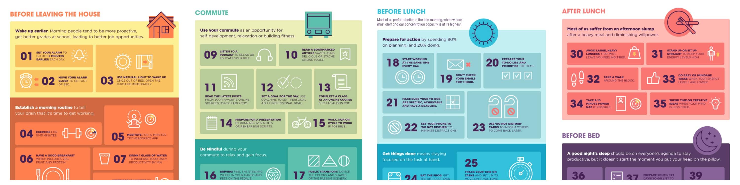
Try choosing less key points and presenting the information in more depth, or create a big collation of information to cover one topic effectively. For example, one of our latest successes dug deep into how to be productive in order to offer 44 unique tips on how to improve your productivity from dawn till dusk.
3. Not reading sources properly
We’re all keen skim readers, and naturally so with the amount of content that is thrown at us every day. The problem is that if you don’t read sources properly, you can make the mistake of misreading and misrepresenting facts in your piece.
We recently made this mistake in one of our infographic ‘What Is The Future of Meat?’ in which we claimed that dried locusts have more pound to pound protein than beef. We were lucky that we found out about this misrepresentation of data during our Reddit Community Feedback stage:
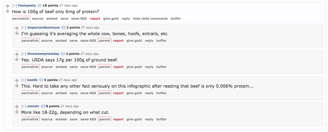
After further research, we discovered that dried locusts have more IRON than beef, it has nothing to do with protein.
Tip: Google any facts you’re unsure about to find additional sources that explain them
It might sound like a basic tip, but you shouldn’t underestimate the power of Google when it comes to fact-checking. If other publishers have written about the same topic and using the same facts, finding those articles will help you confirm your angle on the facts at hand.
Learn how to use Google’s search operators so you can search for facts inside of documents using the “file:” operator (file:pdf) or inside specific domains with the “site:” operator (site:factcheck.org).
4. Using too many words
As a writer or journalist, sometimes it can be hard to edit down the amount of copy. As an infographic copywriter, words can in fact be the enemy: It’s all too easy to get carried away with using too many words to describe something simple.
When it comes to design, visualising copy that consists of multiple paragraphs or chunks for text can be quite challenging. As a result, the final piece becomes less powerful and harder to digest for our generation of skim readers compared to those infographics where information is reduced to a few key points.
For example this piece on common money mistakes that businesses make looked nice, but the copy was unnecessarily wordy:
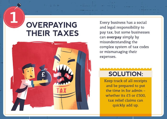
The main point is that companies can overpay, and it’s important to keep a good bookkeeping system to avoid making this mistake. Rather than sticking strictly to this point, the infographic goes on to talk about companies having a responsibility to pay tax.
If the content could be trimmed down to the main point, there would not be heavy blocks of text, which would create a greater impact for the reader.
Tip: Say more with less
Think about how to present information for aiding understanding and keeping the reader engaged throughout the entire piece.
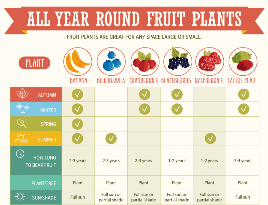
For example, in this infographic about how to grow fruit all year round we presented the data in an easy to consume table, rather than a long description of methods. It helps to create additional value for readers, who may be scanning to look for specific fruits:
5. Not testing your content before launching it into the world
Sometimes the content seems perfect to you and your team members, and you’re excited to share your work with publishers around the world. Suddenly disaster strikes; an editor picks up an error or a journalist emails you back asking lots of questions as she doesn’t understand an aspect of the piece. What happens next is your biggest fear: they both decide not to share your work with their audience.
Tip: Share your content with a live online community for a last round of feedback
By implementing a community feedback stage into your content production process, you can pick up any last minute errors or oversights from experts in the field.
We use Imgur and Reddit to check all content we produce before setting them live on our client’s site. This has been amazing at helping us to make last minute changes that could impact on the successful uptake of the piece.
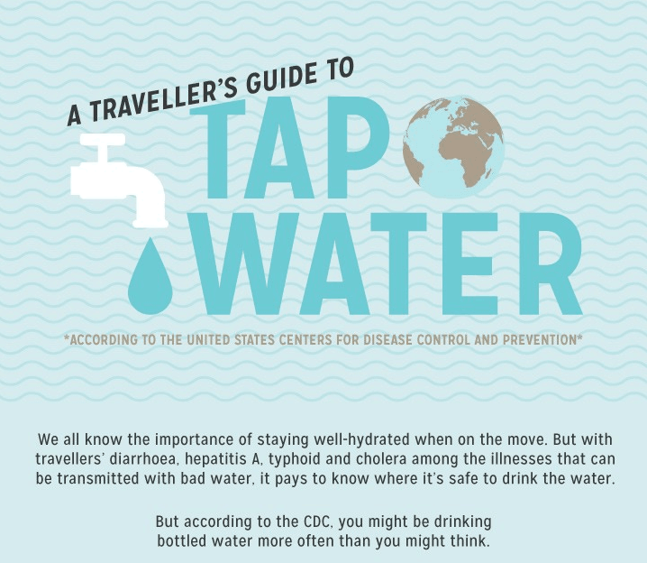
For example, we created a piece a while back called ‘A traveller’s Guide to Tap Water‘ based on data from the US Centre for Disease Control and Prevention. The final design was a map, showcasing where was it safe to drink water from the tap all over the world.
When we shared the infographic with Reddit, readers complained that it was an inaccurate and biased piece, as it was not clear that it was a taken from the CDC – they felt this was our personal opinion over tap water:
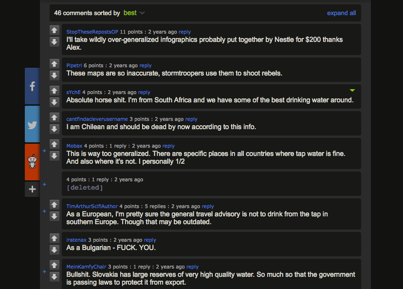
We then decided to change the header and introductory text to make it clear that the piece was a visualisation of the figures provided by www.cdc.gov:
The results of the campaign were fantastic, and we weren’t hit by the haters who would have flooded our blog with comments about how inaccurate our dataset was.
TL;DR
- Always go for the best source you can find; a highly trusted content can be a great resource.
- Don’t just provide a general overview of a topic; either go deep into a few points, or provide a super comprehensive overview.
- Always read your sources in depth, to ensure you’re not misrepresenting data.
- Keep your word count down to let the visuals do the talking.
- Test your content on a real community, such as Reddit.
What’s the worst content mistakes you’ve made? What tips do you have for creating better content? Be sure to reach out if you have any questions, you’ll find me on @amyashton8.
Image Source: Mistakes by Peter Lindberg