

Some people in our industry really hate infographics.
I’ll be honest:
I never woke up one day and said “I want to create a couple thousand infographics.”
But I did like getting top tier links for our clients and at the time, infographics were the best tool to achieve this.
The reason was simple: Most publishers didn’t have the design capability in-house but they knew that readers love this type of content so the marketers could fill in the gap and in exchange get exposure for their clients.
And this was the reason why we chose to double down and only produce infographics for the last couple of years.
Fast forward to 2017 and visual content is no longer new.
Lots of publishers now produce their own simple infographics.
Infographics, even great ones, are finding it hard to push through the noise.
So, should we all close up shop and start selling guest posts?
Thankfully not, there are lots of format types beyond infographics and in this post I will share with you 13 great examples you can use in future campaigns.
And the great news is, if you’ve ever made a great infographic, you can apply the same skills to creating different types of great visual content; creativity, research, copywriting and design.
I have purposely ignored interactive content such as:
- 35 Years Of American Death
- National Corndog Day (amazing!)
- Will Robots Take My Job
- Supercharger vs. Turbo
- My Grandmother’s Lingo (warning: sound autoplays)
It adds another layer of complexity (development) that is not already part of the core skills mentioned above that you’re currently applying to infographics.
1. Maps
Maps are often given as an example of the original infographic with the first known map seen in back in 600 BC.
Maps work well because they are something that we can call recognise and understand.
They don’t need to be boring maps like you find in an atlas, they can be as creative as you want.
If Frodo Had Google Maps

Source: Reddit
The Meaning Behind The Names of Every State in the United States
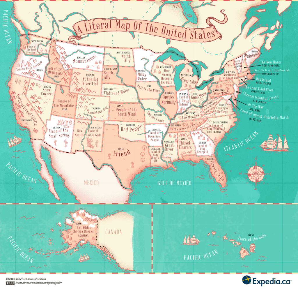
Source: Expedia Canada
The World’s Tourism Slogans Mapped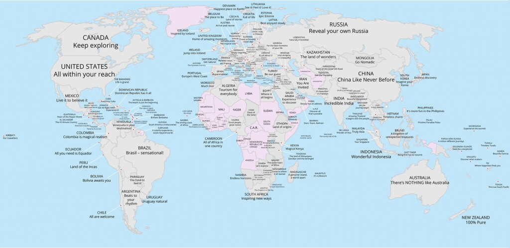 Source: Familybreakfinder
If you want to get inspired, feel free to take a look at the sub-reddit: https://www.reddit.com/r/MapPorn/
Don’t be put off by the name as it’s safe for work and has a community of over 300k subscribers and lots of people that create original content.
2. Charts
I would like to give Rand Fishkin a nod for bringing this topic up back in 2013: Why Visual Assets > Infographics – Whiteboard Friday.
As history has proven, Rand was a little quick to declare infographics as losing effectiveness back in 2013. But he was right about moving to a visual assets and charts at some point.
Good charts work well because they take something complex and make it easier for the reader to understand.
Every audience will have some issue that is very complex that can be made easier using a good chart.
Fidget Spinners are Over
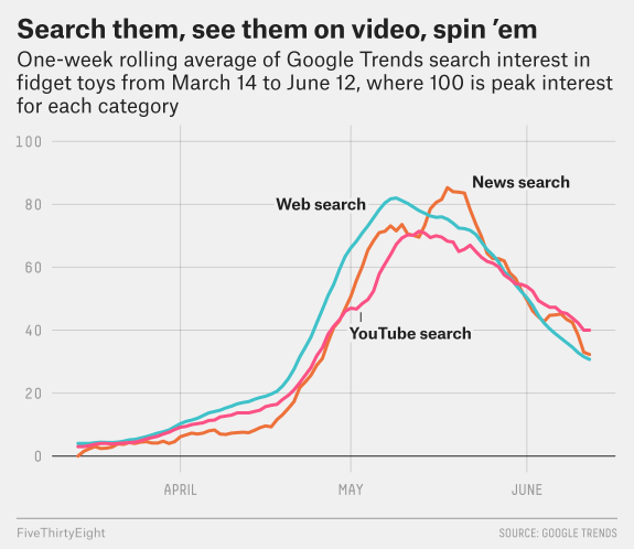 source: FiveThirtyEight
Year-Over-Year Market Share Growth Rate, by Operating System
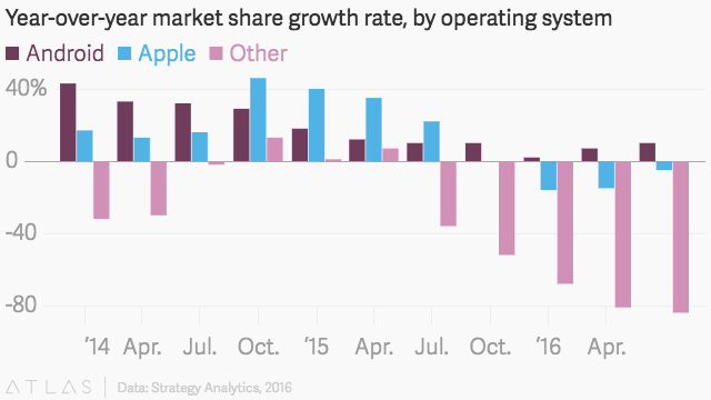
Source: Quartz
If You Bought a Case of Beer at a Ballpark
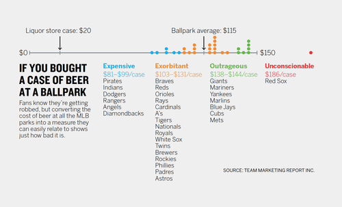
Source: Scott Berinato
Having the confidence to produce just one chart is tricky and forces you to focus your ideation, research, content and data visualization design but the end results can be phenomenal.
3. Photo Manipulation
Photo manipulation used to be something only available to those with massive budgets.
You will be amazed at what can be done with a creative idea and someone who knows how to use Photoshop.
Perceptions of Perfection
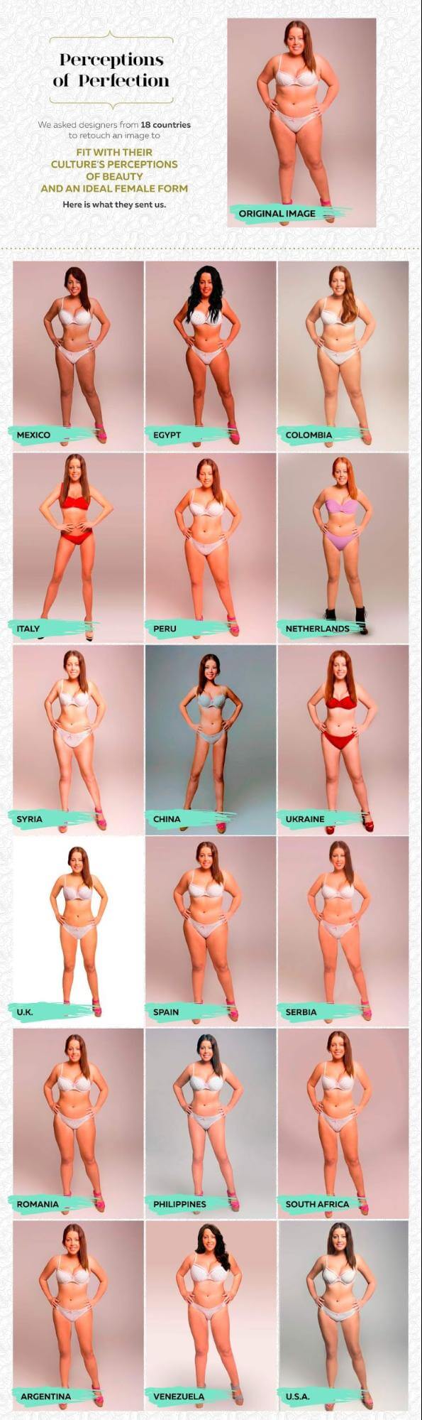
Source: Superdrug
Update 8th January 2018:
Since this post was published, the team at NeoMam experimented with photo manipulation and developed seven hybrid cities for Expedia.com.
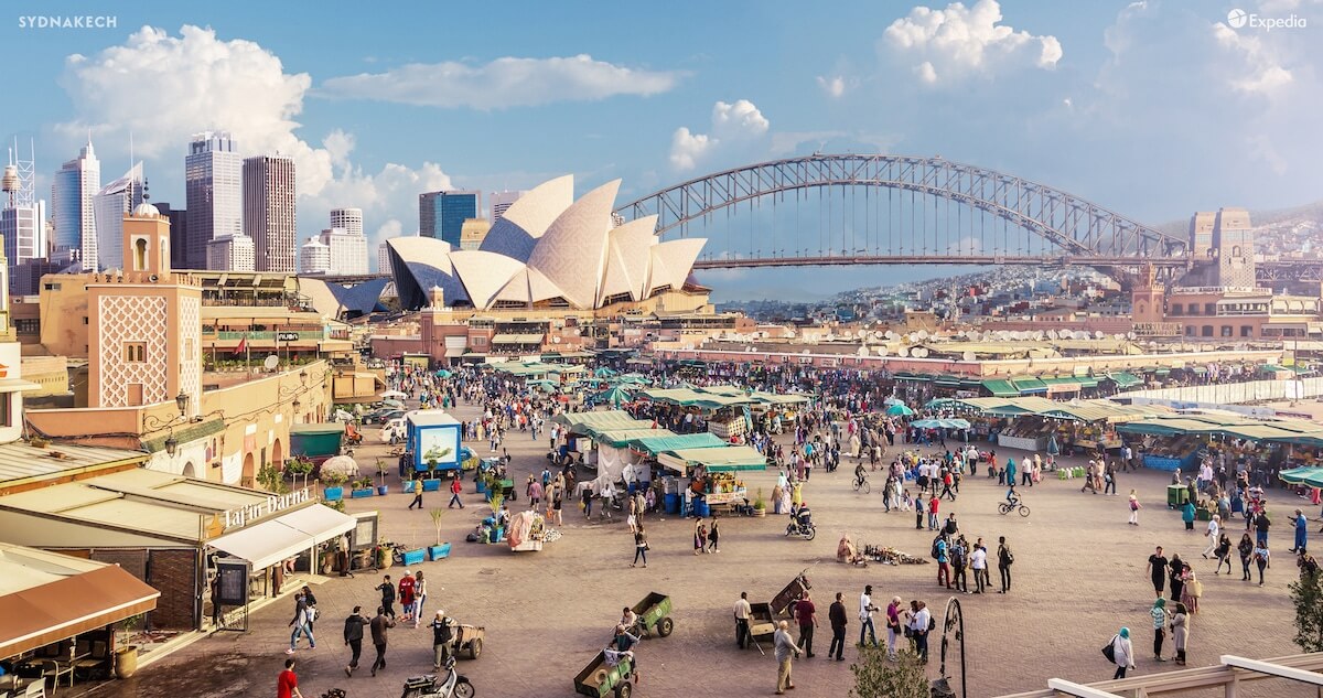
It was a lot harder to pull off then we expected, but we are pleased with the result. With regards to results, this content got featured on the web with some standout features from Lonely Planet and Archdaily, and the team are still promoting it around the web.
4. 3D Design Renders
Another benefit of the increase in computing power available to consumers are the 3D renders.
It provides you with the ability to create something totally unique.
Star Wars Landscape Renders
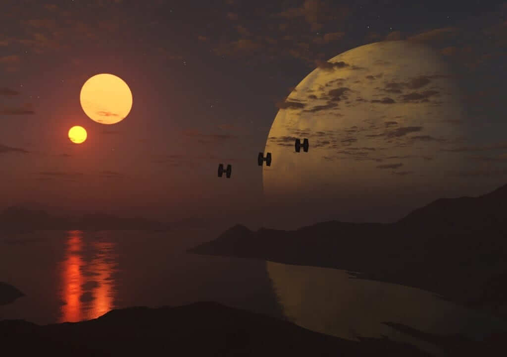
Source: /u/BundeswehrBoyo
This Render of the Samsung Galaxy S8 Design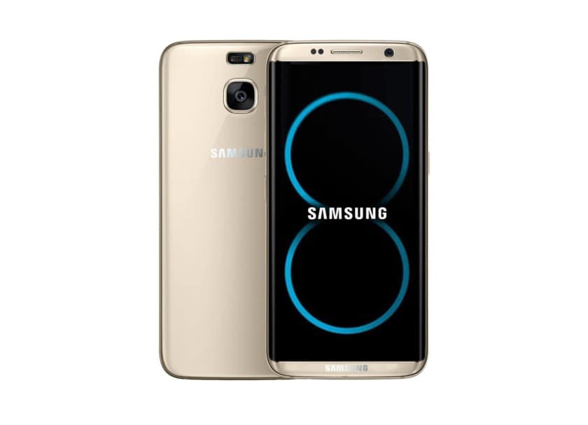 Source: Android Authority
Seven Vehicles To Survive The End Of The World

Source: WhoCanFixMyCar
We have used it a lot for our auto clients, but don’t let that put you off from trying something totally different for another audience.
5. Architectural Plans / Technical Drawing
If you follow our work at NeoMam you will have seen that we produced a number of floor plans for a campaign and got over 100 referring domains.
See below.
The Floor Plan of Joyce’s House From Stranger Things
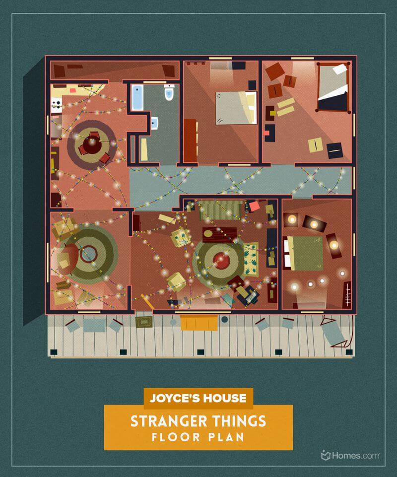
Source: Homes.com
Doctor Who: Dalek Blueprint
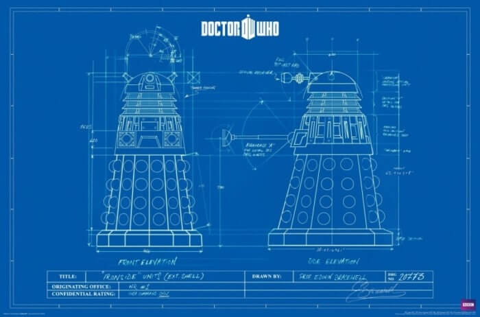
Source: Atomic Toasters
6. Posters Series
Someone once said that infographics were just posters online and I really liked that concept.
However, with this format, we are keeping close to the aesthetic style of posters of previous eras.
This format has already performed well for ourselves and other agencies yet there is still plenty of opportunity for something new.
Space Tourism Posters
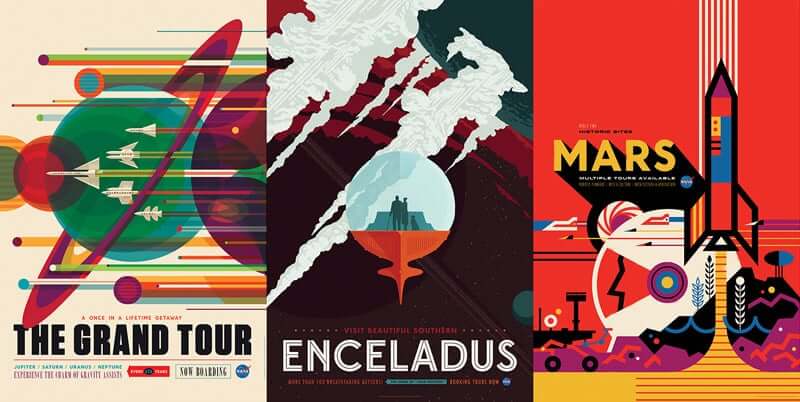
Source: NASA
Stranger Things Alternative
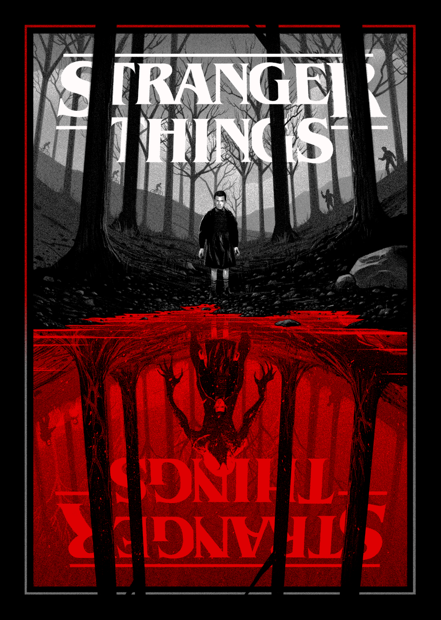
Source: MleegArt
Unknown Tourism – Commemorating the Wildlife We’ve Lost
Source: Expedia.co.uk
Bonus points for giving your readers a way to receive it in the real world such as a printing service.
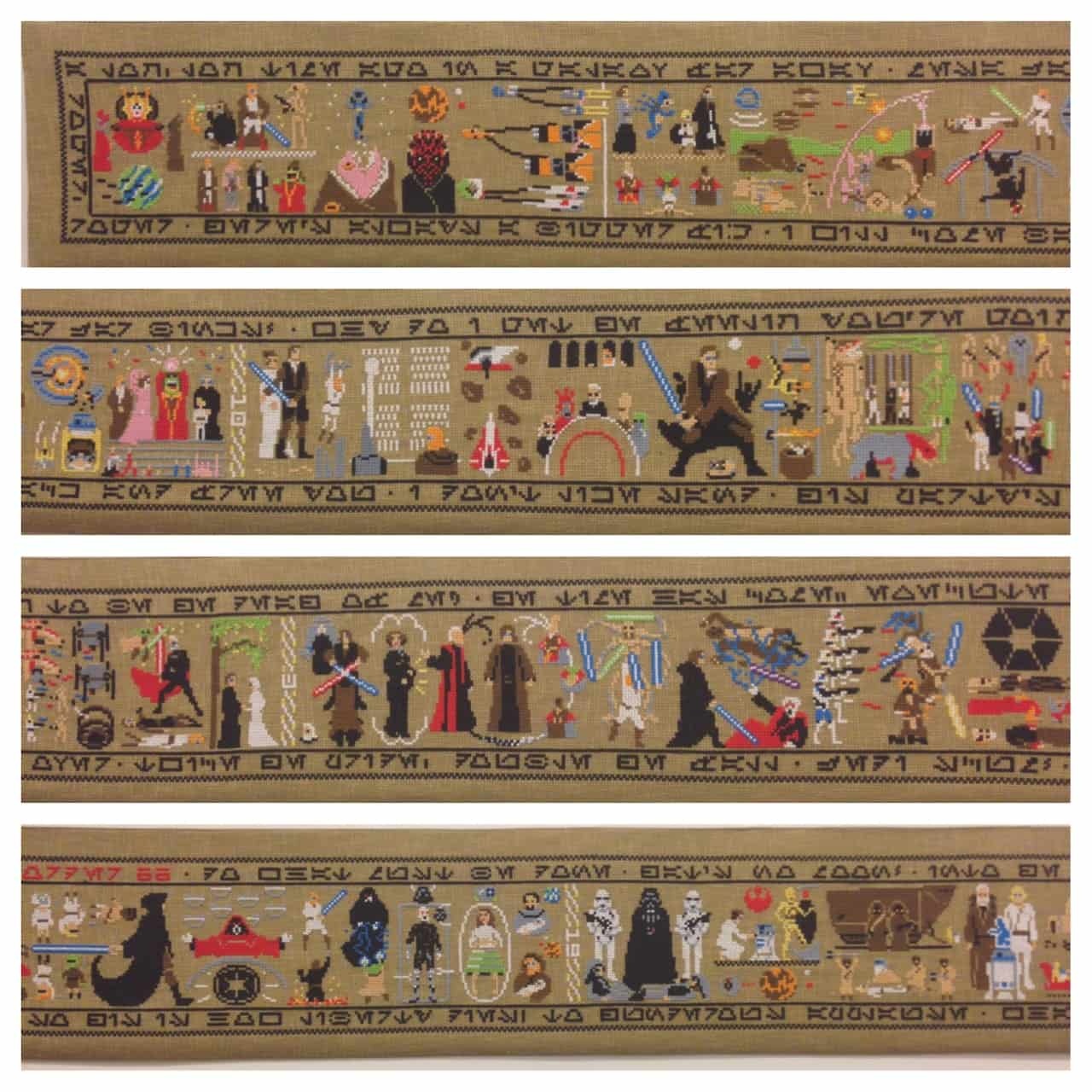
7. ‘Real World Stuff’
Vinyl is coming back so why not create online content offline.
This is certainly not for the faint hearted but I am certainly excited about getting crafty and producing something unique for clients.
Star Wars Recreated In Cross Stitch Tapestry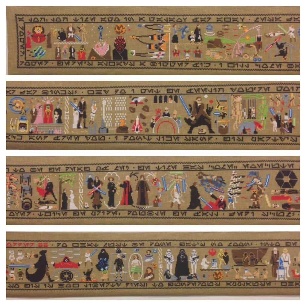 Source: Aled Lewis
Korean Barista Turns Cups of Coffee into Amazing Works of Art
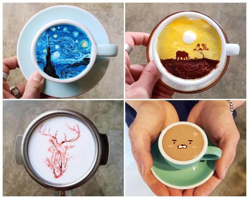
Source: Kangbin Lee
Recycled Glove How-to: Make a Chipmunk Softie
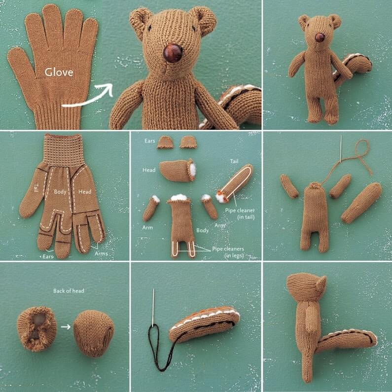
Source: Etsy
8. Looking at Everyday Objects in a New Way
Great creative ideas are often born out of creating something new from something old.
This format takes recognisable ideas but brings them to life in a new and innovative way.
Retracing Reggae Record Sleeves Photographed in London
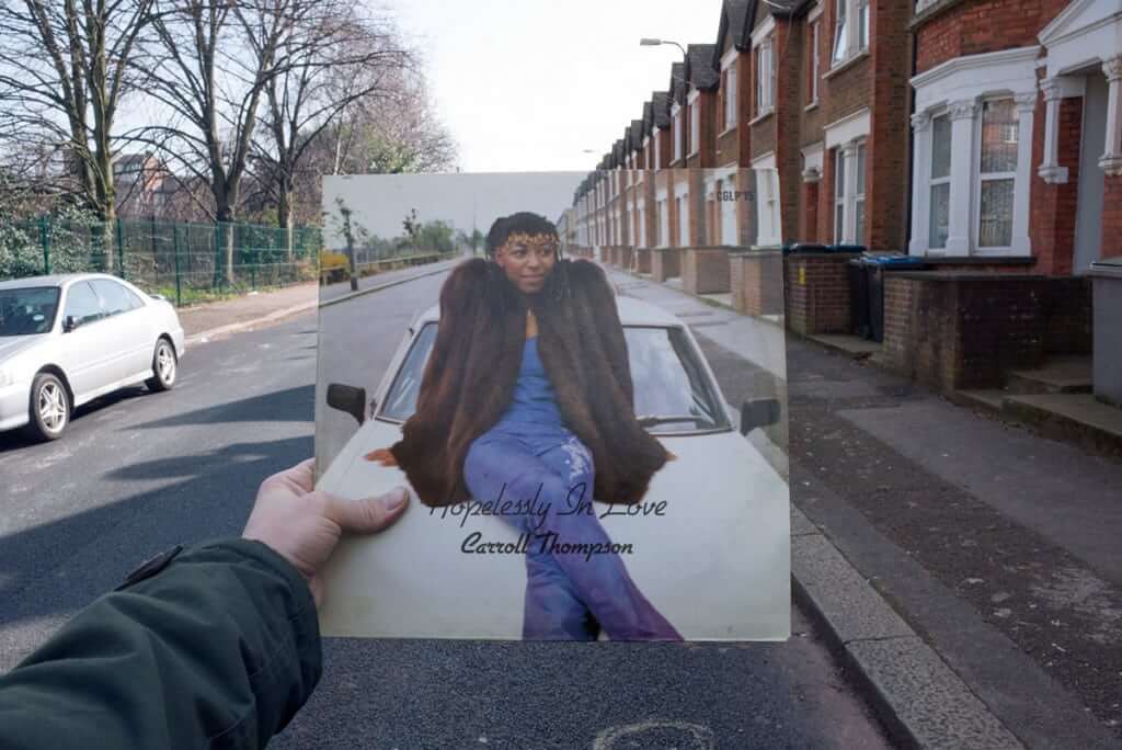
Source: Alex Bartsch
National Flags Created From the Foods Each Country Is Commonly Associated With
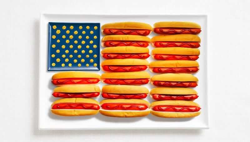
Source: WHYBIN\TBWA
For every audience, there will be something recognisable that can be tweaked to create something unique and awesome.
A Collection of Artist Interpretations of Emoji
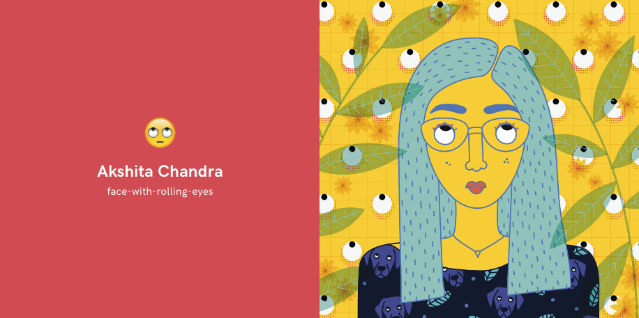
Source: Emoji Book
U.S. Dollar Bills Re-Designed
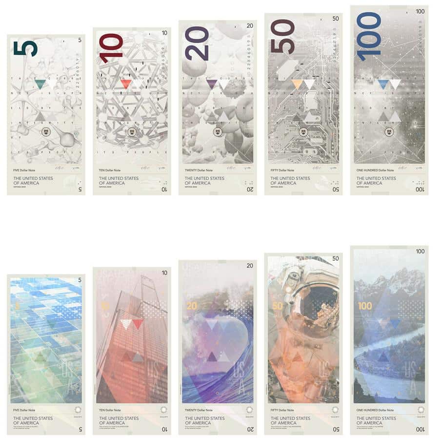
Source: Travis Purrington
Update 8th January 2018
At the end of 2017, we produced an idea that took something we all knew and loved – The Simpsons home and re-imagined it in 8 different architectural styles.
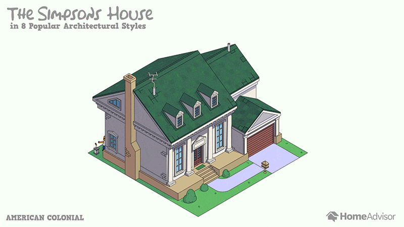
We also decided to use a simple gif transition and then ended up with the above. This campaign went everywhere and 98 features across the web including Boingboing and apartmentherapy.com
Based on the results of this campaign we are going to do a lot more ideas that take something we can all relate to and show it in a new way.
9. Flow Charts
We all remember reading flow charts in the back of Cosmogirl back in early 2000’s?
Maybe that was just me, but you get the idea.
Flow charts are simple to digest but a real pain to produce, often a good sign when it comes to content.
As the producer of the content you are responsible for presenting the information, so the reader can easily digest it without reading and understanding lots of text.
The Beatles – Hey Jude Flowchart

Source: Sarah Emerson
Should You Call That Meeting?
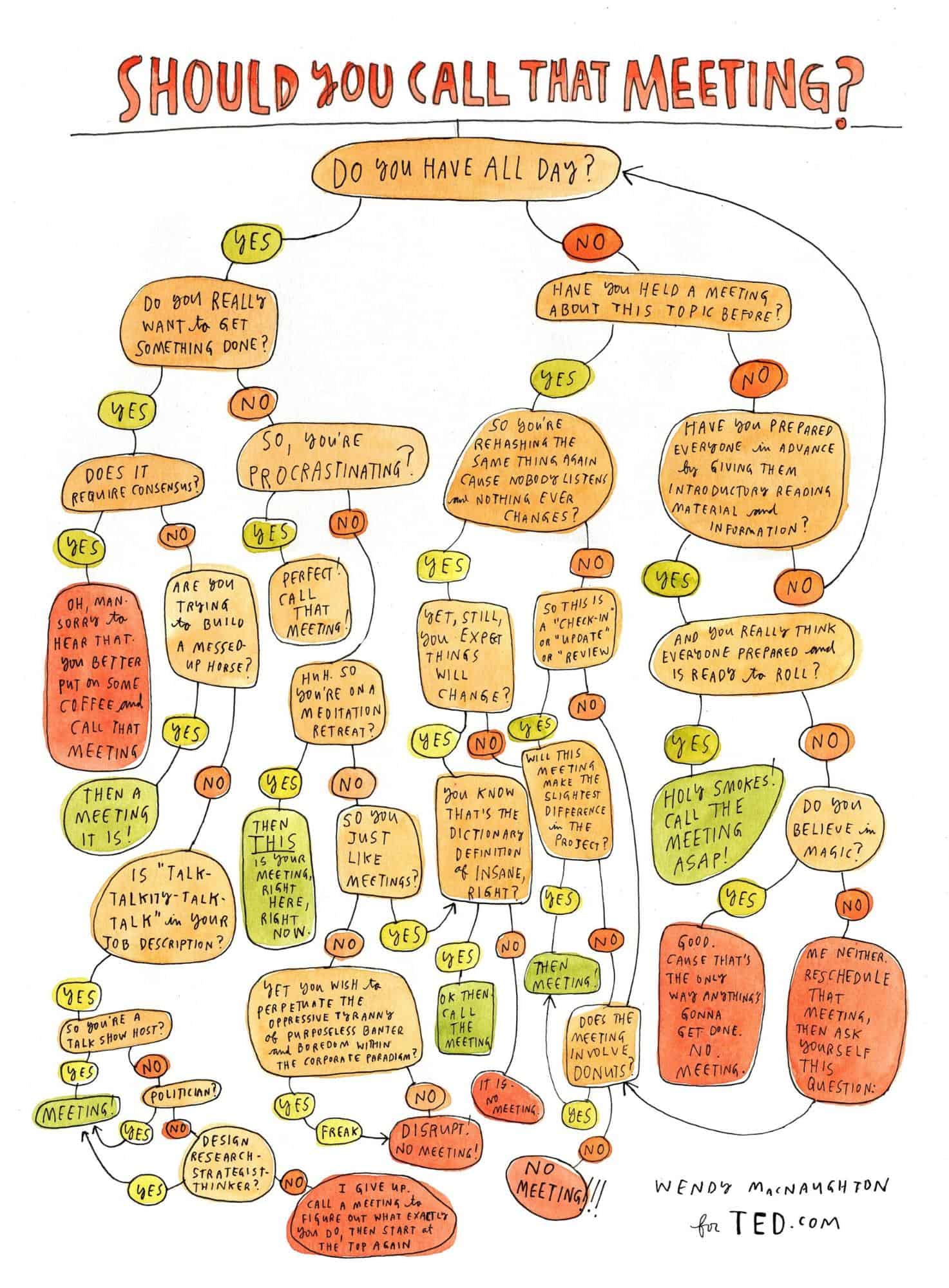
Source: Ted.com
Should You Friend Your Parents on Facebook?
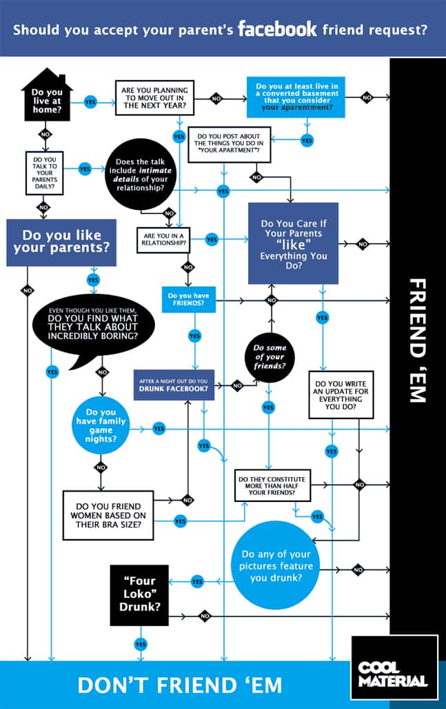
Source: Mike Newman
I often recommend this format to people who have lots of time but no money for expensive design.
10. Crowd Sourced Visuals
Getting interesting research is a major challenge for creating content that stands out.
With this format, you don’t just rely on your individual research as you can tap into the collective knowledge of a community.
The View from Here
Moving photos taken from windows around the world.
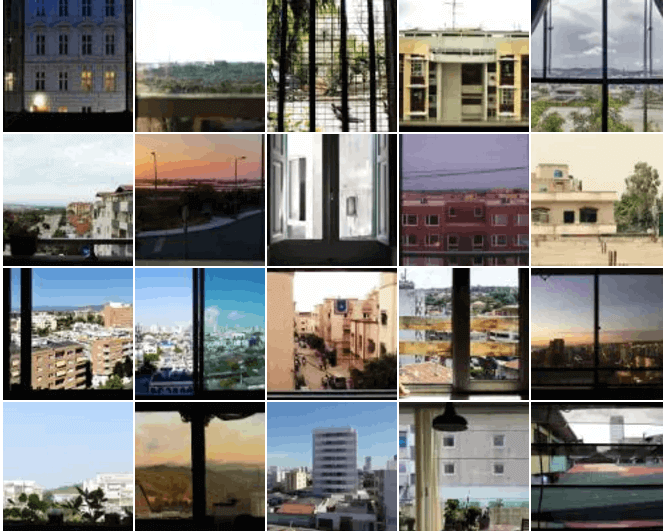
Source: Somfy Systems
15 immigrants give their first impressions of America.

Source: #100DaysofUSArrivals
Cafe Art’s MyLondon Calendar Project
A photography calendar created by people who have been homeless. Unique photos, inspiring stories.
The logistics are not easy as you actually have to get input from lots of different people. But when it works, journalists love it.
11. Illustrations
Custom illustrations allow you to create something totally unique.
As everyone now has access to a stock image service, lots of visual content looks really similar.
But no one will have has access to the illustrations that you create.
In an effort to sustain results for the long form infographic, we have moved to an illustration dominant style but we have also seen many uses of illustrations on their own.
The Literal English Translation of Unusual Foreign Phrases

Source: Paul Blow
2 Kinds of People
Source: João Rocha
Illustrations That Explain Arabic Words’ Meaning

Source: Mahmoud El Sayed
The great thing with this format is how flexible it can be and you are restrained only by your creativity.
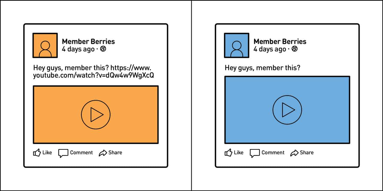
12. Animated GIFs
Gif’s are well and truly back as you can see by checking out the popular tab on Reddit.com.
And today, designers can do some really awesome things with them. I have covered Eleanor Lutz before when I last talked about animated infographics.
Eleanor Lutz and Jacob O’Neal show you that you can do more with the format than just create animated memes.
Planet Earth Control Deck
What Earth’s control panel might look like if it was a spaceship piloted by humans.
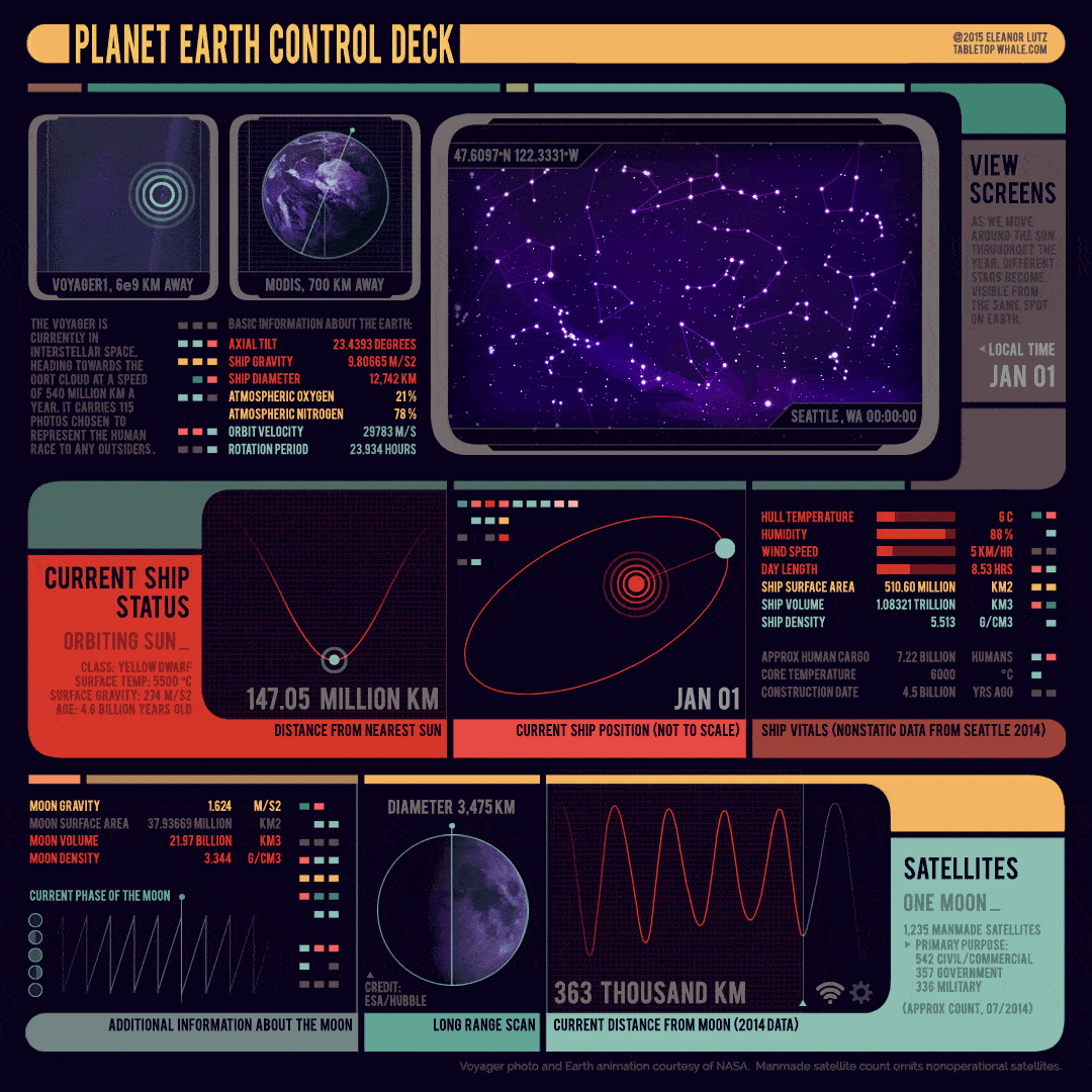
Source: Tabletop Whale
The Time Escape Series
Where would we travel if we could travel in time?
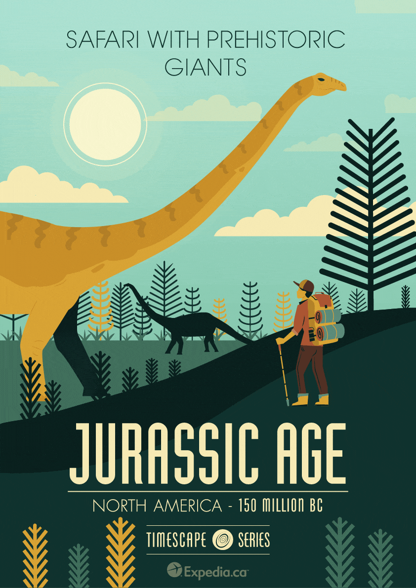
Source: Expedia Canada
Just be careful as if they become too complex, they can turn into a clunky mess.
13. Taxonomy
I didn’t actually know what the word taxonomy meant until it was proposed as an idea to me by someone on our team.
To save you a Google, it simply means “a scheme of classification.”
The reason I love taxonomies is that they can be applied to any sector and can be really fun as the examples from Pop Chart Lab below show you.
The Taxonomy of Fruits & Vegetables
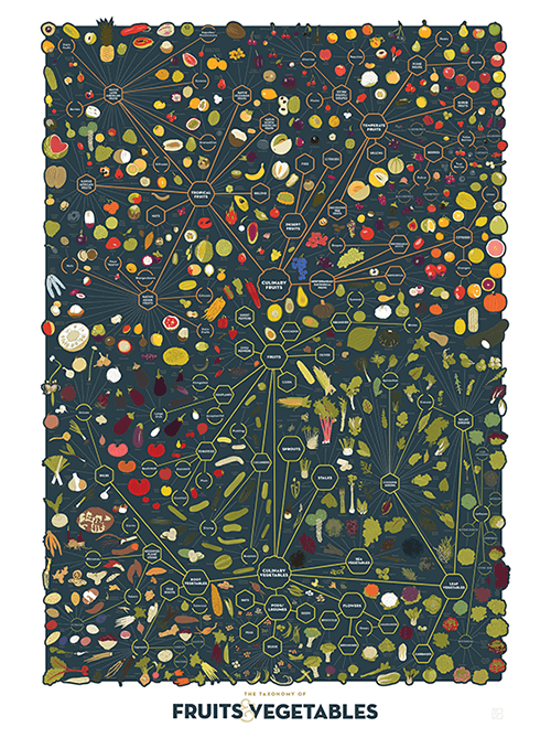
Source: Pop Chart Lab
The Cartography of Kitchenware
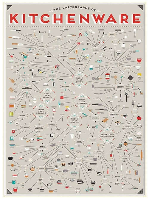
Source: Pop Chart Lab
A Plotting of Fiction Genres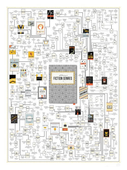 Source: Pop Chart Lab
Conclusion
I really hope this post has been useful and that it will inspire you for your next campaign.
This list is certainly not complete, so I would appreciate if you could share any content you have seen or even created yourself that deserves to be included.
Finally, remember the best content in the world is no good unless you know how to promote it.
Download the same template our outreach team uses below.
Until next time.
Featured Image Source: ValeStock / Shutterstock.com


